返回风格库
布局风格expressive

卡片堆叠布局

Card Stack

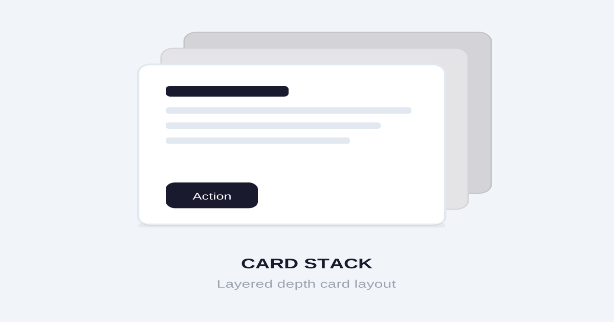
卡片前后重叠的立体布局,通过 Z 轴层叠和偏移创造深度感,适合轮播、步骤展示、卡组选择。

卡片堆叠布局视觉预览
主色#1a1a2e
次色#f0f0f5
强调色 1#6c5ce7
强调色 2#00cec9
强调色 3#fd79a8
强调色 4#ffeaa7

AI 实现规则

You are a frontend expert specializing in Card Stack layout. All generated code must strictly follow these constraints:

## Absolute Prohibitions

- Do NOT stack too many visible cards (max 3-5)
- Do NOT overlap cards completely (need visual distinction)
- Do NOT forget interaction feedback
- Do NOT use overly complex animations
- Do NOT use complex gestures on mobile
- Do NOT leave back cards static during hover (kills depth illusion)

## Must Follow

- Use transform for positioning: scale, translateY, rotate
- Use z-index for layering: z-30, z-20, z-10
- Progressive opacity: 100%, 80%, 60%
- Smooth transitions: transition-all duration-[400ms] ease-out
- Clear hover/active states
- Limit visible cards: 3-5 maximum

## Animation & Interaction Rules

- Deck Shuffling: On group-hover, back cards fan out sideways with different rotate + translate-x values, like shuffling a deck of cards.
- 3D Peeling: Top card on hover should significantly lift (group-hover:-translate-y-6 group-hover:scale-105 group-hover:shadow-2xl), simulating physical card being raised.
- Smooth Return: Use ease-out so cards snap back naturally from fast to slow.
- Stack Peek: Slightly change back card opacity on hover to hint their presence.

## Stack Structure

Container:
- relative position with group class for sibling interactions
- flex center alignment
- Fixed height for consistent layout

Cards (front to back):
- Card 1 (front): z-30, scale-100, opacity-100
- Card 2 (mid): z-20, scale-95, translateY-4, rotate-2, opacity-80
- Card 3 (back): z-10, scale-90, translateY-8, rotate(-3), opacity-60

On group-hover:
- Card 1: -translate-y-6, scale-105, shadow-2xl
- Card 2: rotate-6, translate-x-(-5), translate-y-8
- Card 3: -rotate-6, translate-x-5, translate-y-14

## Self-Check

After generating code, verify:
1. Cards are visually layered with different scale + opacity
2. group-hover fans back cards out to the sides
3. Front card lifts dramatically on hover
4. Max 3-5 visible cards
5. Mobile-friendly touch targets

组件预览与实现

font-medium rounded-full transition-all duration-200 bg-zinc-900 text-white hover:bg-zinc-800 hover:shadow-xl active:scale-[0.97]
button

切换按钮

用于切换卡片的导航按钮,hover 时上浮

<div className="flex items-center gap-4">
  <button className="
    w-12 h-12
    flex items-center justify-center
    bg-white
    rounded-full
    shadow-lg
    hover:shadow-xl hover:-translate-y-0.5
    active:scale-90 active:shadow-md
    transition-all duration-200 ease-out
  ">
    <svg className="w-5 h-5" fill="none" stroke="currentColor" viewBox="0 0 24 24">
      <path strokeLinecap="round" strokeLinejoin="round" strokeWidth={2} d="M15 19l-7-7 7-7" />
    </svg>
  </button>
  <button className="
    w-12 h-12
    flex items-center justify-center
    bg-white
    rounded-full
    shadow-lg
    hover:shadow-xl hover:-translate-y-0.5
    active:scale-90 active:shadow-md
    transition-all duration-200 ease-out
  ">
    <svg className="w-5 h-5" fill="none" stroke="currentColor" viewBox="0 0 24 24">
      <path strokeLinecap="round" strokeLinejoin="round" strokeWidth={2} d="M9 5l7 7-7 7" />
    </svg>
  </button>
</div>
card

堆叠卡片组

三层堆叠,hover 时底层向两侧散开,顶层揭起

<div className="relative w-80 h-96 group">
  {/* 底层卡片 */}
  <div className="absolute inset-0 bg-blue-100 rounded-2xl shadow-sm border border-blue-200 translate-y-8 scale-90 -rotate-3 group-hover:-rotate-6 group-hover:translate-x-5 group-hover:translate-y-12 transition-all duration-[400ms] ease-out" />
  {/* 中层卡片 */}
  <div className="absolute inset-0 bg-purple-100 rounded-2xl shadow-md border border-purple-200 translate-y-4 scale-95 rotate-2 group-hover:rotate-5 group-hover:-translate-x-5 group-hover:translate-y-6 transition-all duration-[400ms] ease-out" />
  {/* 顶层卡片 */}
  <div className="absolute inset-0 bg-white rounded-2xl shadow-lg border border-gray-100 p-8 flex flex-col group-hover:-translate-y-6 group-hover:scale-105 group-hover:shadow-2xl transition-all duration-[400ms] ease-out z-10 cursor-grab active:cursor-grabbing">
    <div className="w-12 h-12 bg-gradient-to-br from-purple-500 to-pink-500 rounded-xl mb-6" />
    <h3 className="text-xl font-bold text-zinc-900 mb-3">Top Card</h3>
    <p className="text-zinc-500 text-sm">Hover the stack to reveal the deck beneath.</p>
  </div>
</div>
input

卡片搜索

在卡片堆中搜索

<div className="relative">
  <input
    type="text"
    placeholder="Search cards..."
    className="
      w-full px-5 py-3
      bg-white/80 backdrop-blur
      border border-zinc-200
      rounded-xl
      text-zinc-900
      placeholder-zinc-400
      focus:outline-none focus:ring-2 focus:ring-purple-500/30
      focus:border-purple-400
      transition-all duration-200
    "
  />
  <svg className="absolute right-4 top-1/2 -translate-y-1/2 w-5 h-5 text-zinc-400" fill="none" stroke="currentColor" viewBox="0 0 24 24">
    <path strokeLinecap="round" strokeLinejoin="round" strokeWidth={2} d="M21 21l-6-6m2-5a7 7 0 11-14 0 7 7 0 0114 0z" />
  </svg>
</div>
nav

卡片指示器

显示当前卡片位置

<nav className="flex items-center justify-center gap-2">
  <button className="w-2.5 h-2.5 rounded-full bg-purple-500 transition-all duration-200" />
  <button className="w-2 h-2 rounded-full bg-zinc-300 hover:bg-zinc-400 transition-all duration-200" />
  <button className="w-2 h-2 rounded-full bg-zinc-300 hover:bg-zinc-400 transition-all duration-200" />
  <button className="w-2 h-2 rounded-full bg-zinc-300 hover:bg-zinc-400 transition-all duration-200" />
</nav>
hero

卡片堆叠展示

完整的卡片堆叠布局,hover 散开

<section className="py-20 px-4 bg-gradient-to-br from-slate-900 to-slate-800 overflow-hidden">
  <div className="max-w-6xl mx-auto">
    <div className="text-center mb-16">
      <h2 className="text-4xl font-bold text-white mb-4">Choose Your Plan</h2>
      <p className="text-slate-400">Tap or hover to browse, click to select</p>
    </div>

    <div className="relative h-[420px] flex items-center justify-center group" tabIndex={0}>
      {/* Card 3 (Back) */}
      <div className="
        absolute w-64 sm:w-80 p-6 sm:p-8
        bg-white rounded-2xl shadow-lg
        scale-90 translate-y-8 -rotate-3 opacity-60
        group-hover:rotate-6 group-hover:translate-x-5 sm:group-hover:translate-x-10 group-hover:translate-y-12 group-hover:opacity-80
        group-focus-within:rotate-6 group-focus-within:translate-x-5 sm:group-focus-within:translate-x-10 group-focus-within:translate-y-12 group-focus-within:opacity-80
        transition-all duration-[400ms] ease-out z-10
      ">
        <div className="w-10 h-10 bg-amber-100 rounded-lg mb-4" />
        <h3 className="text-lg font-bold text-zinc-900">Enterprise</h3>
      </div>

      {/* Card 2 (Middle) */}
      <div className="
        absolute w-64 sm:w-80 p-6 sm:p-8
        bg-white rounded-2xl shadow-xl
        scale-95 translate-y-4 rotate-2 opacity-80
        group-hover:-rotate-5 group-hover:-translate-x-5 sm:group-hover:-translate-x-10 group-hover:translate-y-8 group-hover:opacity-90
        group-focus-within:-rotate-5 group-focus-within:-translate-x-5 sm:group-focus-within:-translate-x-10 group-focus-within:translate-y-8 group-focus-within:opacity-90
        transition-all duration-[400ms] ease-out z-20
      ">
        <div className="w-10 h-10 bg-emerald-100 rounded-lg mb-4" />
        <h3 className="text-lg font-bold text-zinc-900">Professional</h3>
        <p className="text-zinc-600 text-sm mt-2">Most popular choice</p>
      </div>

      {/* Card 1 (Front) */}
      <div className="
        absolute w-64 sm:w-80 p-6 sm:p-8
        bg-white rounded-2xl shadow-2xl z-30
        group-hover:-translate-y-8 group-hover:scale-105 group-hover:shadow-[0_30px_60px_rgba(0,0,0,0.2)]
        group-focus-within:-translate-y-8 group-focus-within:scale-105 group-focus-within:shadow-[0_30px_60px_rgba(0,0,0,0.2)]
        transition-all duration-[400ms] ease-out
        cursor-grab active:cursor-grabbing
      ">
        <div className="w-10 h-10 bg-gradient-to-br from-purple-500 to-pink-500 rounded-lg mb-4" />
        <h3 className="text-xl font-bold text-zinc-900 mb-2">Starter</h3>
        <p className="text-zinc-600 text-sm mb-4">Perfect for getting started</p>
        <div className="text-3xl font-bold text-zinc-900 mb-4">
          $9<span className="text-lg font-normal text-zinc-500">/mo</span>
        </div>
        <button className="w-full py-3 bg-zinc-900 text-white rounded-xl font-medium hover:bg-zinc-800 transition-colors">
          Get Started
        </button>
      </div>
    </div>

    <div className="flex items-center justify-center gap-8 mt-8">
      <button className="w-12 h-12 flex items-center justify-center bg-white/10 rounded-full text-white hover:bg-white/20 hover:-translate-y-0.5 active:scale-90 transition-all duration-200">
        <svg className="w-5 h-5" fill="none" stroke="currentColor" viewBox="0 0 24 24">
          <path strokeLinecap="round" strokeLinejoin="round" strokeWidth={2} d="M15 19l-7-7 7-7" />
        </svg>
      </button>
      <div className="flex gap-2">
        <div className="w-2.5 h-2.5 rounded-full bg-white" />
        <div className="w-2 h-2 rounded-full bg-white/30" />
        <div className="w-2 h-2 rounded-full bg-white/30" />
      </div>
      <button className="w-12 h-12 flex items-center justify-center bg-white/10 rounded-full text-white hover:bg-white/20 hover:-translate-y-0.5 active:scale-90 transition-all duration-200">
        <svg className="w-5 h-5" fill="none" stroke="currentColor" viewBox="0 0 24 24">
          <path strokeLinecap="round" strokeLinejoin="round" strokeWidth={2} d="M9 5l7 7-7 7" />
        </svg>
      </button>
    </div>
  </div>
</section>

交互展示

适用范围与设计理念

应用场景

marketingsaasdocs

视觉关键词

卡片堆叠立体层叠轮播3Dexpressiveboldvibrant表现力

Card Stack(卡片堆叠布局)是一种利用 Z 轴创造深度感的布局方式,多张卡片前后重叠,形成视觉层次。

核心理念:

- 深度感知:通过层叠暗示更多内容

- 焦点引导:最前面的卡片获得最多关注

- 交互预期:暗示可以翻阅或切换

- 空间节省:在有限空间展示多个选项

- 洗牌动感:hover 时牌堆像手持扑克般散开

设计原则:

- 视觉一致性:所有组件必须遵循统一的视觉语言,从色彩到字体到间距保持谐调

- 层次分明:通过颜色深浅、字号大小、留白空间建立清晰的信息层级

- 交互反馈:每个可交互元素都必须有明确的 hover、active、focus 状态反馈

- 响应式适配:设计必须在移动端、平板、桌面端上保持一致的体验

- 无障碍性:确保色彩对比度符合 WCAG 2.1 AA 标准,所有交互元素可键盘访问

应该这样做

  • 使用 transform 和 z-index 创建层叠效果
  • 后方卡片缩小和偏移 scale-95 translate-y-4
  • 添加渐进的透明度 opacity-80, opacity-60
  • 支持拖拽或点击切换卡片
  • 添加流畅的过渡动画 transition-all duration-[400ms]
  • 限制可见卡片数量(通常 3-5 张)
  • 提供视觉提示说明可以交互
  • group-hover 时底层卡片向两侧散开(不同 rotate 和 translate-x)
  • 顶层卡片 hover 时显著上浮 + shadow-2xl,模拟揭牌感

避免这样做

  • 禁止堆叠过多卡片导致混乱
  • 禁止卡片完全重叠看不出层次
  • 禁止忽略交互反馈
  • 禁止动画过于复杂影响性能
  • 禁止在移动端使用过于复杂的手势
  • 禁止底层卡片在 hover 时静止不动(缺乏景深感)

全局 CSS

/* Card Stack Global Styles */

/* Stack container */
.card-stack {
  position: relative;
  display: flex;
  align-items: center;
  justify-content: center;
  perspective: 1000px;
}

/* Base card in stack */
.card-stack-item {
  position: absolute;
  transition: all 0.4s cubic-bezier(0.4, 0, 0.2, 1);
}

/* Stack positions */
.card-stack-item:nth-child(1) {
  z-index: 30;
  transform: translateY(0) scale(1);
  opacity: 1;
}

.card-stack-item:nth-child(2) {
  z-index: 20;
  transform: translateY(16px) scale(0.95) rotate(2deg);
  opacity: 0.8;
}

.card-stack-item:nth-child(3) {
  z-index: 10;
  transform: translateY(32px) scale(0.9) rotate(-3deg);
  opacity: 0.6;
}

.card-stack-item:nth-child(n+4) {
  z-index: 0;
  transform: translateY(48px) scale(0.85);
  opacity: 0;
  pointer-events: none;
}

/* Fan out on hover — deck shuffle effect */
.card-stack:hover .card-stack-item:nth-child(1) {
  transform: translateY(-24px) scale(1.05);
  box-shadow: 0 30px 60px rgba(0, 0, 0, 0.2);
}

.card-stack:hover .card-stack-item:nth-child(2) {
  transform: translateY(32px) scale(0.95) rotate(6deg) translateX(-20px);
  opacity: 0.9;
}

.card-stack:hover .card-stack-item:nth-child(3) {
  transform: translateY(48px) scale(0.9) rotate(-6deg) translateX(20px);
  opacity: 0.8;
}

/* Tinder-style swipe */
.card-stack-swipe .card-stack-item.swiping-left {
  transform: translateX(-100%) rotate(-10deg);
  opacity: 0;
}

.card-stack-swipe .card-stack-item.swiping-right {
  transform: translateX(100%) rotate(10deg);
  opacity: 0;
}
/* Card Stack Design Tokens */
:root {
  --card-stack-primary: #1a1a2e;
  --card-stack-secondary: #f0f0f5;
  --card-stack-accent: #6c5ce7;
  --card-stack-glow: rgba(26, 26, 46, 0.3);
}

@keyframes card-stack-fade-in {
  from { opacity: 0; transform: translateY(8px); }
  to { opacity: 1; transform: translateY(0); }
}

@keyframes card-stack-pulse {
  0%, 100% { opacity: 1; }
  50% { opacity: 0.7; }
}

.card-stack-card {
  position: relative;
  overflow: hidden;
}

.card-stack-card::before {
  content: "";
  position: absolute;
  inset: 0;
  opacity: 0;
  transition: opacity 0.3s ease;
  background: linear-gradient(135deg, rgba(26, 26, 46, 0.05), transparent);
  pointer-events: none;
}

.card-stack-card:hover::before {
  opacity: 1;
}

.card-stack-gradient {
  background: linear-gradient(135deg, #1a1a2e, #6c5ce7);
}

.card-stack-gradient-text {
  background: linear-gradient(135deg, #1a1a2e, #6c5ce7);
  -webkit-background-clip: text;
  -webkit-text-fill-color: transparent;
  background-clip: text;
}

.card-stack-frosted {
  backdrop-filter: blur(12px) saturate(180%);
  -webkit-backdrop-filter: blur(12px) saturate(180%);
  background: rgba(26, 26, 46, 0.08);
}

.card-stack-accent-corner {
  clip-path: polygon(0 0, 100% 0, 100% calc(100% - 2rem), calc(100% - 2rem) 100%, 0 100%);
}

.card-stack-animate-in {
  animation: card-stack-fade-in 0.5s ease-out both;
}

布局、色板与 Tokens

主色#1a1a2e
次色#f0f0f5
强调色 1#6c5ce7
强调色 2#00cec9
强调色 3#fd79a8
强调色 4#ffeaa7
{
  "border": {
    "width": "border",
    "color": "border-zinc-200",
    "radius": "rounded-2xl",
    "style": "border-solid"
  },
  "shadow": {
    "sm": "shadow-md",
    "md": "shadow-xl",
    "lg": "shadow-2xl",
    "none": "shadow-none",
    "hover": "hover:shadow-2xl",
    "focus": "focus:shadow-xl",
    "colored": {}
  },
  "interaction": {
    "transition": "transition-all duration-300 ease-[cubic-bezier(0.4,0,0.2,1)]",
    "active": "active:scale-95",
    "hoverScale": "hover:scale-105"
  },
  "typography": {
    "heading": "font-bold tracking-tight",
    "body": "font-sans",
    "mono": "font-mono",
    "sizes": {
      "hero": "text-3xl md:text-4xl lg:text-5xl",
      "h1": "text-2xl md:text-3xl",
      "h2": "text-xl md:text-2xl",
      "h3": "text-lg md:text-xl",
      "body": "text-sm md:text-base",
      "small": "text-xs md:text-sm"
    }
  },
  "spacing": {
    "section": "py-16 md:py-20 lg:py-24",
    "container": "px-4 md:px-8",
    "card": "p-6 md:p-8",
    "gap": {
      "sm": "gap-2 md:gap-3",
      "md": "gap-4 md:gap-6",
      "lg": "gap-6 md:gap-8"
    }
  },
  "colors": {
    "background": {
      "primary": "bg-gradient-to-br from-slate-900 to-slate-800",
      "secondary": "bg-white",
      "accent": [
        "bg-[#6c5ce7]",
        "bg-[#00cec9]",
        "bg-[#fd79a8]",
        "bg-[#ffeaa7]"
      ]
    },
    "text": {
      "primary": "text-zinc-900",
      "secondary": "text-zinc-600",
      "muted": "text-zinc-400"
    },
    "button": {
      "primary": "bg-zinc-900 text-white",
      "secondary": "bg-white/10 text-white"
    }
  },
  "forbidden": {
    "classes": [
      "rounded-none",
      "shadow-none",
      "border-4",
      "border-8"
    ],
    "patterns": [
      "^rounded-none$",
      "^border-[48]"
    ],
    "reasons": {
      "rounded-none": "Card Stack uses generous rounding (rounded-2xl) for soft stacked cards",
      "shadow-none": "Card Stack requires shadows to convey depth and layering",
      "border-4": "Card Stack uses subtle or no borders, relying on shadows for definition"
    }
  },
  "required": {
    "button": [
      "rounded-full",
      "shadow-lg",
      "hover:shadow-xl",
      "transition-shadow"
    ],
    "card": [
      "rounded-2xl",
      "shadow-xl",
      "transition-all duration-300",
      "bg-white"
    ],
    "input": [
      "bg-white/80 backdrop-blur",
      "border border-zinc-200",
      "rounded-xl",
      "focus:outline-none",
      "focus:ring-2 focus:ring-purple-500/30",
      "transition-all"
    ]
  }
}

示例提示词

定价方案选择

堆叠展示不同定价方案

Create pricing cards with stack layout:
1. 3 cards stacked: Starter, Pro, Enterprise
2. Front card fully visible with details
3. Back cards scaled down, offset, and slightly rotated
4. On group-hover: back cards fan out sideways with different rotations
5. Front card lifts with scale-105 and large shadow on hover
6. Each card: plan name, price, features list, CTA
7. Navigation arrows on sides with hover feedback
Dark gradient background, white cards

产品卡组

类似 Tinder 的产品浏览

Create a Tinder-style product card stack:
1. Stack of product cards (5 cards, 3 visible)
2. Swipe right to like, left to pass
3. Each card: product image, name, price, rating
4. On hover: top card peels up (scale-105, shadow-2xl, -translate-y-6), back cards fan out
5. Swipe animation with rotation + opacity fade
6. Undo last action button
7. Fun, interactive, mobile-friendly design

步骤引导

分步引导的卡片堆叠

Create an onboarding flow with card stack:
1. 4 step cards stacked
2. group-hover causes back cards to fan out with rotate + translate-x
3. Front card lifts with scale-105 and shadow-2xl
4. Click Next to advance (card slides out with rotation)
5. Progress indicator dots
6. Each card: step number, title, illustration, description
7. Final card has CTA button
Clean design with duration-[400ms] ease-out transitions