返回风格库
视觉风格modern

粘土拟态

Claymorphism

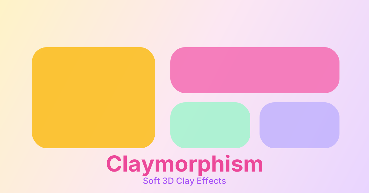
柔软的粘土质感设计,通过超大圆角、内外阴影组合和柔和渐变,创造出可爱的 3D 立体效果,适合儿童应用和趣味产品。

粘土拟态视觉预览
主色#f8b4d9
次色#fef3c7
强调色 1#a7f3d0
强调色 2#c4b5fd
强调色 3#fcd34d
强调色 4#b6e9ff

AI 实现规则

你是一个 Claymorphism 设计风格的前端开发专家。生成的所有代码必须严格遵守以下约束:

## 绝对禁止

- 使用直角 rounded-none 或小圆角 rounded-sm
- 使用硬边缘阴影 shadow-[Xpx_Xpx_0px]
- 使用高对比度深色配色
- 使用纯黑色文字 text-black
- 省略内阴影效果
- 使用单纯的平移代替形变物理(不能只有 translate-y)
- 使用线性缓动(必须用弹簧缓动)

## 必须遵守

- 超大圆角 rounded-3xl, rounded-[32px], rounded-full
- 组合阴影:外阴影 + 内高光 + 内阴影
- 柔和渐变背景 bg-gradient-to-b, bg-gradient-to-br
- 糖果色系配色(粉、黄、绿、紫、橙)

## Animation & Interaction Rules

- Squishy Physics: 点击时(:active)使用 Squash & Stretch 形变——active:scale-x-105 active:scale-y-90,模拟粘土被按压变形。
- Deep Impression: 按下时大幅增加内阴影(inset shadow 从 4px 升至 8px),同时减小外阴影,模拟手指将粘土按凹进去。
- Bouncy Easing: 必须使用弹簧缓动 ease-[cubic-bezier(0.34,1.56,0.64,1)] 配合 duration-300,让元素松开后有弹性回弹感。
- Floating Hover: 悬停时上浮 -translate-y-1,外阴影轻微扩大,表现元素被轻轻抬起。

## 配色

主色调:
- 粉色: from-pink-300 to-pink-400, text-pink-600
- 奶油: from-amber-100 to-amber-200, text-amber-700
- 薄荷: from-green-200 to-green-300, text-green-700
- 淡紫: from-purple-200 to-purple-300, text-purple-700
- 柠檬: from-yellow-200 to-yellow-300, text-yellow-700

## 阴影公式

外凸元素(按钮、卡片):
shadow-[8px_8px_16px_rgba(0,0,0,0.08),inset_4px_4px_8px_rgba(255,255,255,0.6),inset_-2px_-2px_4px_rgba(0,0,0,0.08)]

内凹元素(输入框):
shadow-[inset_4px_4px_8px_rgba(0,0,0,0.1),inset_-4px_-4px_8px_rgba(255,255,255,0.9)]

按压状态(active):
shadow-[2px_2px_4px_rgba(0,0,0,0.05),inset_8px_8px_16px_rgba(0,0,0,0.15),inset_-4px_-4px_8px_rgba(255,255,255,0.5)]

## 自检

每次生成代码后检查:
1. 圆角足够大(至少 rounded-2xl)
2. 有内外阴影组合
3. 使用柔和的渐变色
4. 按压时有 scale-x-105 scale-y-90 形变
5. 使用弹簧缓动而非线性缓动

组件预览与实现

font-semibold rounded-2xl border-none transition-all duration-200 bg-[#f8b4d9] text-gray-800 shadow-[0_8px_16px_rgba(0,0,0,0.1),inset_0_-4px_8px_rgba(0,0,0,0.1)] hover:shadow-[0_12px_20px_rgba(0,0,0,0.15),inset_0_-4px_8px_rgba(0,0,0,0.1)] hover:-translate-y-0.5 active:shadow-[0_4px_8px_rgba(0,0,0,0.1),inset_0_4px_8px_rgba(0,0,0,0.15)] active:translate-y-0.5
button

按钮

粘土风格按钮,Q弹按压形变 + 弹簧缓动

<button className="
  px-8 py-4
  bg-gradient-to-b from-pink-300 to-pink-400
  rounded-3xl
  text-white font-bold
  shadow-[8px_8px_16px_rgba(255,182,193,0.5),-8px_-8px_16px_rgba(255,255,255,0.8),inset_4px_4px_8px_rgba(255,255,255,0.4),inset_-4px_-4px_8px_rgba(219,112,147,0.2)]
  hover:shadow-[10px_10px_20px_rgba(255,182,193,0.6),-10px_-10px_20px_rgba(255,255,255,0.9),inset_6px_6px_10px_rgba(255,255,255,0.5),inset_-4px_-4px_8px_rgba(219,112,147,0.2)]
  hover:-translate-y-1
  active:scale-x-105 active:scale-y-90
  active:translate-y-2
  active:shadow-[2px_2px_4px_rgba(255,182,193,0.3),-2px_-2px_4px_rgba(255,255,255,0.5),inset_8px_8px_16px_rgba(219,112,147,0.4),inset_-4px_-4px_8px_rgba(255,255,255,0.2)]
  transition-all duration-300 ease-[cubic-bezier(0.34,1.56,0.64,1)]
">
  Clay Button
</button>
card

卡片

粘土质感卡片,悬停时发光上浮

<div className="
  p-8
  bg-gradient-to-br from-amber-100 to-amber-200
  rounded-[32px]
  shadow-[12px_12px_24px_rgba(0,0,0,0.08),inset_6px_6px_12px_rgba(255,255,255,0.6),inset_-4px_-4px_8px_rgba(0,0,0,0.05)]
  hover:shadow-[16px_16px_32px_rgba(0,0,0,0.1),inset_8px_8px_16px_rgba(255,255,255,0.7),inset_-4px_-4px_8px_rgba(0,0,0,0.05)]
  hover:-translate-y-1
  transition-all duration-300 ease-[cubic-bezier(0.34,1.56,0.64,1)]
">
  <h3 className="text-2xl font-bold text-amber-800 mb-3">
    Clay Card
  </h3>
  <p className="text-amber-700">
    柔软可爱的粘土质感卡片
  </p>
</div>
input

输入框

粘土风格输入框,内凹效果

<input
  type="text"
  placeholder="请输入..."
  className="
    w-full px-6 py-4
    bg-gradient-to-b from-gray-100 to-gray-200
    rounded-2xl
    text-gray-700 placeholder-gray-400
    shadow-[inset_4px_4px_8px_rgba(0,0,0,0.1),inset_-4px_-4px_8px_rgba(255,255,255,0.9)]
    focus:outline-none
    focus:shadow-[inset_6px_6px_12px_rgba(0,0,0,0.15),inset_-4px_-4px_8px_rgba(255,255,255,0.9),0_0_0_4px_rgba(248,180,217,0.3)]
    transition-all duration-300 ease-[cubic-bezier(0.34,1.56,0.64,1)]
  "
/>
nav

导航栏

粘土风格导航栏

<nav className="
  px-8 py-4
  bg-gradient-to-b from-pink-200 to-pink-300
  rounded-b-[32px]
  shadow-[0_8px_16px_rgba(0,0,0,0.1),inset_0_4px_8px_rgba(255,255,255,0.4)]
">
  <div className="max-w-6xl mx-auto flex items-center justify-between">
    <a href="/" className="text-pink-700 font-bold text-xl">
      Logo
    </a>
    <div className="flex gap-6">
      <a href="#" className="text-pink-600 hover:text-pink-800 font-medium transition-colors duration-300">
        Home
      </a>
      <a href="#" className="text-pink-600 hover:text-pink-800 font-medium transition-colors duration-300">
        About
      </a>
    </div>
  </div>
</nav>
hero

Hero 区块

粘土风格 Hero 展示区域

<section className="
  min-h-screen
  flex items-center justify-center
  bg-gradient-to-br from-amber-100 via-pink-100 to-purple-100
  px-6 py-20
">
  <div className="
    max-w-2xl mx-auto text-center
    p-12
    bg-gradient-to-br from-white to-pink-50
    rounded-[48px]
    shadow-[20px_20px_40px_rgba(0,0,0,0.08),inset_8px_8px_16px_rgba(255,255,255,0.8),inset_-4px_-4px_8px_rgba(0,0,0,0.05)]
  ">
    <h1 className="text-5xl font-bold text-pink-600 mb-6">
      Claymorphism
    </h1>
    <p className="text-xl text-pink-500 mb-8">
      柔软可爱的粘土质感设计风格
    </p>
    <button className="
      px-10 py-5
      bg-gradient-to-b from-pink-400 to-pink-500
      rounded-full
      text-white font-bold text-lg
      shadow-[8px_8px_16px_rgba(255,182,193,0.5),-8px_-8px_16px_rgba(255,255,255,0.8),inset_4px_4px_8px_rgba(255,255,255,0.3)]
      hover:-translate-y-1
      hover:shadow-[10px_10px_20px_rgba(255,182,193,0.6),-10px_-10px_20px_rgba(255,255,255,0.9),inset_4px_4px_8px_rgba(255,255,255,0.3)]
      active:scale-x-105 active:scale-y-90
      active:translate-y-2
      transition-all duration-300 ease-[cubic-bezier(0.34,1.56,0.64,1)]
    ">
      Get Started
    </button>
  </div>
</section>

交互展示

适用范围与设计理念

应用场景

marketingsaascreative

视觉关键词

粘土3D可爱柔软圆润儿童趣味moderncontemporarysleek

Claymorphism(粘土拟态)是一种模拟粘土或橡皮泥质感的 UI 设计风格,通过超大圆角、内外阴影组合和柔和的渐变色彩,创造出柔软、可爱的 3D 立体效果。

核心理念:

- 柔软感:超大圆角和柔和阴影营造软糯质感

- 立体感:内阴影 + 外阴影组合模拟 3D 效果

- 趣味性:糖果色系和圆润造型传递愉悦情绪

- 触感:设计元素看起来像可以触摸和捏揉

- Q弹物理:按压时发生挤压形变,松开后弹性回弹

设计原则:

- 视觉一致性:所有组件必须遵循统一的视觉语言,从色彩到字体到间距保持谐调

- 层次分明:通过颜色深浅、字号大小、留白空间建立清晰的信息层级

- 交互反馈:每个可交互元素都必须有明确的 hover、active、focus 状态反馈

- 响应式适配:设计必须在移动端、平板、桌面端上保持一致的体验

- 无障碍性:确保色彩对比度符合 WCAG 2.1 AA 标准,所有交互元素可键盘访问

应该这样做

  • 使用超大圆角 rounded-3xl 或 rounded-full
  • 组合内阴影和外阴影创造立体感
  • 使用柔和的糖果色系配色
  • 添加微妙的渐变背景模拟光照
  • 保持元素之间足够的间距
  • 使用圆润的图标和字体
  • 按下时使用 Squash & Stretch:active:scale-x-105 active:scale-y-90
  • 使用弹簧缓动 ease-[cubic-bezier(0.34,1.56,0.64,1)] duration-300
  • 按压时加深内阴影、减小外阴影,模拟凹陷

避免这样做

  • 禁止使用尖锐的直角 rounded-none
  • 禁止使用硬边缘阴影 shadow-[Xpx_Xpx_0px]
  • 禁止使用高对比度的深色配色
  • 禁止使用过于复杂的渐变
  • 禁止元素过于拥挤
  • 禁止使用单纯的 translate-y 代替真实的形变物理
  • 禁止使用线性 ease 或 ease-in-out(无弹性感)

全局 CSS

/* Claymorphism 全局样式 */

:root {
  --clay-pink: #f8b4d9;
  --clay-cream: #fef3c7;
  --clay-mint: #a7f3d0;
  --clay-lavender: #c4b5fd;
  --clay-lemon: #fcd34d;
  --clay-shadow-light: rgba(255, 255, 255, 0.7);
  --clay-shadow-dark: rgba(0, 0, 0, 0.08);
  --clay-spring: cubic-bezier(0.34, 1.56, 0.64, 1);
}

/* 基础粘土效果类 */
.clay {
  border-radius: 24px;
  box-shadow:
    8px 8px 16px var(--clay-shadow-dark),
    inset 4px 4px 8px var(--clay-shadow-light),
    inset -2px -2px 4px var(--clay-shadow-dark);
}

/* 粘土按钮效果 — Q弹物理 */
.clay-button {
  border-radius: 9999px;
  box-shadow:
    6px 6px 12px var(--clay-shadow-dark),
    inset 3px 3px 6px var(--clay-shadow-light),
    inset -2px -2px 4px var(--clay-shadow-dark);
  transition: all 0.3s var(--clay-spring);
}

.clay-button:hover {
  transform: translateY(-4px);
  box-shadow:
    10px 10px 20px var(--clay-shadow-dark),
    inset 3px 3px 6px var(--clay-shadow-light),
    inset -2px -2px 4px var(--clay-shadow-dark);
}

.clay-button:active {
  transform: scaleX(1.05) scaleY(0.9) translateY(2px);
  box-shadow:
    2px 2px 4px var(--clay-shadow-dark),
    inset 8px 8px 16px rgba(0, 0, 0, 0.15),
    inset -2px -2px 4px var(--clay-shadow-light);
}

/* 粘土输入框(内凹效果) */
.clay-input {
  border-radius: 16px;
  box-shadow:
    inset 4px 4px 8px var(--clay-shadow-dark),
    inset -4px -4px 8px var(--clay-shadow-light);
  transition: all 0.3s var(--clay-spring);
}
@keyframes claymorphism-fade-in {
  from { opacity: 0; transform: translateY(8px); }
  to { opacity: 1; transform: translateY(0); }
}

@keyframes claymorphism-pulse {
  0%, 100% { opacity: 1; }
  50% { opacity: 0.7; }
}

.claymorphism-card {
  position: relative;
  overflow: hidden;
}

.claymorphism-card::before {
  content: "";
  position: absolute;
  inset: 0;
  opacity: 0;
  transition: opacity 0.3s ease;
  background: linear-gradient(135deg, rgba(248, 180, 217, 0.05), transparent);
  pointer-events: none;
}

.claymorphism-card:hover::before {
  opacity: 1;
}

.claymorphism-gradient {
  background: linear-gradient(135deg, #f8b4d9, #a7f3d0);
}

.claymorphism-gradient-text {
  background: linear-gradient(135deg, #f8b4d9, #a7f3d0);
  -webkit-background-clip: text;
  -webkit-text-fill-color: transparent;
  background-clip: text;
}

.claymorphism-frosted {
  backdrop-filter: blur(12px) saturate(180%);
  -webkit-backdrop-filter: blur(12px) saturate(180%);
  background: rgba(248, 180, 217, 0.08);
}

.claymorphism-accent-corner {
  clip-path: polygon(0 0, 100% 0, 100% calc(100% - 2rem), calc(100% - 2rem) 100%, 0 100%);
}

.claymorphism-animate-in {
  animation: claymorphism-fade-in 0.5s ease-out both;
}

布局、色板与 Tokens

主色#f8b4d9
次色#fef3c7
强调色 1#a7f3d0
强调色 2#c4b5fd
强调色 3#fcd34d
强调色 4#b6e9ff
{
  "border": {
    "width": "border-0",
    "color": "border-transparent",
    "radius": "rounded-3xl",
    "style": "border-none"
  },
  "shadow": {
    "sm": "shadow-[4px_4px_8px_rgba(0,0,0,0.08),inset_2px_2px_4px_rgba(255,255,255,0.5),inset_-1px_-1px_2px_rgba(0,0,0,0.05)]",
    "md": "shadow-[8px_8px_16px_rgba(0,0,0,0.1),inset_4px_4px_8px_rgba(255,255,255,0.4),inset_-2px_-2px_4px_rgba(0,0,0,0.1)]",
    "lg": "shadow-[12px_12px_24px_rgba(0,0,0,0.12),inset_6px_6px_12px_rgba(255,255,255,0.5),inset_-3px_-3px_6px_rgba(0,0,0,0.1)]",
    "none": "shadow-none",
    "hover": "hover:shadow-[4px_4px_8px_rgba(0,0,0,0.1),inset_4px_4px_8px_rgba(255,255,255,0.4),inset_-2px_-2px_4px_rgba(0,0,0,0.1)]",
    "focus": "focus:shadow-[8px_8px_16px_rgba(0,0,0,0.1),inset_4px_4px_8px_rgba(255,255,255,0.4),inset_-2px_-2px_4px_rgba(0,0,0,0.1),0_0_0_4px_rgba(248,180,217,0.3)]",
    "colored": {}
  },
  "interaction": {
    "transition": "transition-all duration-200",
    "active": "active:translate-y-2",
    "hoverTranslate": "hover:translate-y-1"
  },
  "typography": {
    "heading": "font-bold text-pink-700",
    "body": "text-pink-600",
    "mono": "font-mono text-pink-500",
    "sizes": {
      "hero": "text-4xl md:text-6xl",
      "h1": "text-3xl md:text-5xl",
      "h2": "text-2xl md:text-3xl",
      "h3": "text-xl md:text-2xl",
      "body": "text-base",
      "small": "text-sm"
    }
  },
  "spacing": {
    "section": "py-16 md:py-24",
    "container": "px-6 md:px-8",
    "card": "p-6 md:p-8",
    "gap": {
      "sm": "gap-4",
      "md": "gap-6",
      "lg": "gap-8"
    }
  },
  "colors": {
    "background": {
      "primary": "bg-gradient-to-br from-amber-100 via-pink-100 to-purple-100",
      "secondary": "bg-gradient-to-br from-white to-pink-50",
      "accent": [
        "bg-gradient-to-b from-pink-300 to-pink-400",
        "bg-gradient-to-b from-green-200 to-green-300",
        "bg-gradient-to-b from-purple-200 to-purple-300",
        "bg-gradient-to-b from-yellow-200 to-yellow-300"
      ]
    },
    "text": {
      "primary": "text-pink-700",
      "secondary": "text-pink-600",
      "muted": "text-pink-400"
    },
    "button": {
      "primary": "bg-gradient-to-b from-pink-300 to-pink-400 text-white",
      "secondary": "bg-gradient-to-b from-amber-200 to-amber-300 text-amber-800"
    }
  },
  "forbidden": {
    "classes": [
      "rounded-none",
      "rounded-sm",
      "rounded",
      "shadow-none",
      "bg-black",
      "text-black",
      "border-black"
    ],
    "patterns": [
      "^rounded-(?:none|sm|md)$",
      "^shadow-\\[\\d+px_\\d+px_0px",
      "^bg-(?:black|gray-900|slate-900)"
    ],
    "reasons": {
      "rounded-none": "Claymorphism requires large rounded corners (rounded-3xl or larger)",
      "rounded-sm": "Claymorphism requires large rounded corners (rounded-3xl or larger)",
      "shadow-none": "Claymorphism requires combined inner and outer shadows for 3D effect",
      "bg-black": "Claymorphism uses soft, candy-colored backgrounds",
      "text-black": "Claymorphism uses soft colored text, not pure black"
    }
  },
  "required": {
    "button": [
      "bg-gradient-to-b from-pink-300 to-pink-400",
      "rounded-full",
      "text-white font-bold",
      "shadow-[8px_8px_16px_rgba(0,0,0,0.1),inset_4px_4px_8px_rgba(255,255,255,0.4),inset_-2px_-2px_4px_rgba(0,0,0,0.1)]",
      "hover:translate-y-1",
      "transition-all duration-200"
    ],
    "card": [
      "bg-gradient-to-br from-white to-pink-50",
      "rounded-[32px]",
      "shadow-[12px_12px_24px_rgba(0,0,0,0.1),inset_6px_6px_12px_rgba(255,255,255,0.6),inset_-4px_-4px_8px_rgba(0,0,0,0.05)]"
    ],
    "input": [
      "bg-gradient-to-b from-gray-100 to-gray-200",
      "rounded-2xl",
      "shadow-[inset_4px_4px_8px_rgba(0,0,0,0.1),inset_-4px_-4px_8px_rgba(255,255,255,0.9)]",
      "focus:outline-none",
      "transition-all"
    ]
  }
}

示例提示词

儿童教育应用

可爱的学习界面

用 Claymorphism 风格创建一个儿童教育应用界面,要求:
1. 背景:柔和的渐变(粉色到紫色或黄色到橙色)
2. 主卡片:超大圆角,粘土质感阴影,hover 时上浮
3. 按钮:圆润的胶囊形状,按下时 scale-x-105 scale-y-90 形变,弹簧缓动回弹
4. 图标:使用圆润的图标风格
5. 配色:糖果色系,明亮但不刺眼

游戏 UI

趣味游戏界面

用 Claymorphism 风格设计一个休闲游戏界面,要求:
1. 背景:多彩渐变,营造欢乐氛围
2. 游戏卡片:立体粘土效果,hover 时上浮,点击时形变
3. 分数显示:大号圆润数字
4. 按钮:Play、Pause、Settings 等,都是粘土风格,active 时 Squash & Stretch
5. 所有过渡使用 ease-[cubic-bezier(0.34,1.56,0.64,1)]

作品集展示

生成 粘土拟态风格的作品集页面

Create a portfolio showcase page using Claymorphism style with project grid, about section, contact form, and consistent visual language.