返回风格库
视觉风格expressive

拼贴艺术风

Collage Art

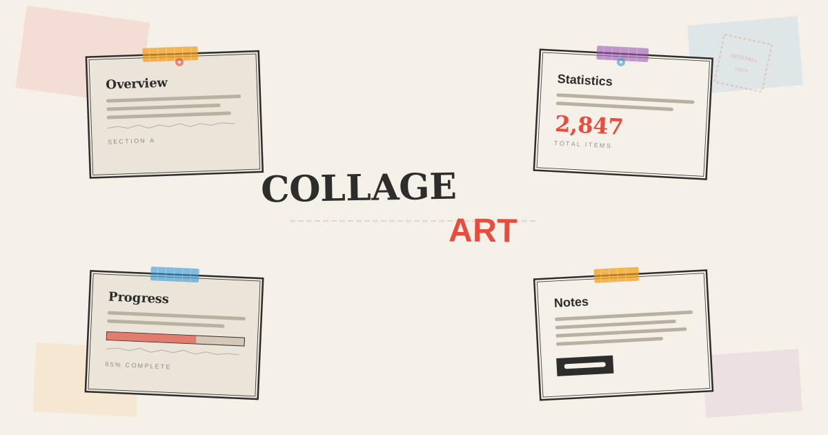
杂志拼贴和混合材料美学,纸片剪切、多层叠加、撕纸边缘和混搭字体,营造充满创意和手工感的视觉冲击。

拼贴艺术风视觉预览
主色#2d2d2d
次色#f5f0e8
强调色 1#e74c3c
强调色 2#3498db
强调色 3#f39c12
强调色 4#9b59b6

AI 实现规则

You are a Collage Art design style frontend development expert. All generated code must strictly follow these constraints:

## Absolutely Forbidden

- Smooth gradients (bg-gradient-to-*)
- Soft rounded corners (rounded-lg, rounded-xl, rounded-2xl, rounded-full)
- Backdrop blur effects (backdrop-blur)
- Soft blur shadows (shadow-[0_Npx_Npx])
- Uniform, perfectly aligned layouts
- Single font family throughout
- NEVER mix style={{ transform: "rotate(Ndeg)" }} with Tailwind hover/group-hover transform classes — this causes transform conflicts where the inline style overrides Tailwind's CSS variables. Always use rotate-[Ndeg] Tailwind arbitrary class instead.

## Must Follow

- Aged paper background bg-[#f5f0e8]
- Dark charcoal #2d2d2d for borders and text
- Hard offset shadows shadow-[Npx_Npx_0px_#color]
- Sharp corners rounded-sm or rounded-none
- Random rotation via Tailwind arbitrary class rotate-[0.5deg] to rotate-[2deg] (NOT inline style when hover transforms are also applied)
- Mix font families: font-serif, font-sans, font-mono across sections
- Thick borders border-2 border-[#2d2d2d]
- Wrap interactive cards in group div so washi tape can respond via group-hover

## Color Palette

Primary:
- Dark Charcoal: #2d2d2d
- Aged Paper: #f5f0e8
- Cut Red: #e74c3c
- Magazine Blue: #3498db
- Paste Yellow: #f39c12
- Scrap Purple: #9b59b6

## Animation & Interaction Rules

- Paper Lift: On hover, elements should feel physically raised. Use hover:scale-[1.02] combined with a rotation change (e.g., from rotate-[1.5deg] to group-hover:-rotate-[1deg]) and shadow expansion (shadow-[5px_5px] → shadow-[12px_12px]). This simulates a piece of paper being pinched up off a surface.
- Tape Parallax: The washi tape decoration on a card should react slightly differently from the card itself. Wrap the whole component in a group div. The tape div has group-hover:-translate-y-1 group-hover:rotate-[6deg], while the card has group-hover:-translate-y-2 group-hover:-rotate-[1deg]. The tape appears to shift independently, reinforcing the multi-layer physical illusion.
- Desk Press: On :active, the shadow must sharply collapse (shadow-[12px_12px] → shadow-[2px_2px]) and the element shifts slightly down (active:translate-y-1), simulating pressing a paper scrap firmly onto a corkboard.
- Snappy Easing: Use duration-200 ease-out or duration-300 ease-out for all paper interactions. Paper is light and snaps quickly.
- Transform Rules: ALWAYS use Tailwind rotate-[Xdeg] arbitrary class for initial rotation. NEVER use style={{ transform: "rotate(Xdeg)" }} on elements that also use Tailwind hover/group-hover transforms — they will conflict.

## Unique Elements (Collage-Only)

1. Random rotation: rotate-[0.7deg], -rotate-[1.5deg], rotate-[2deg] etc. (Tailwind arbitrary, not inline style)
2. Washi tape: repeating-linear-gradient(90deg, color 0px, color 3px, rgba(255,255,255,0.3) 3px, rgba(255,255,255,0.3) 6px) strips in a group-hover reactive div
3. Mixed typography: alternate font-serif, font-sans, font-mono across headings, labels, body text
4. Torn paper edges: polygon clip-path with irregular jagged points
5. Dashed borders: border-dashed for stamp/cut-line effects

## Self-Check

After generating code:
1. All initial rotations use rotate-[Xdeg] Tailwind class, not inline style (when hover transforms present)
2. Interactive cards wrapped in group div for tape parallax
3. hover state: scale-105 + rotation change + shadow expansion
4. active state: shadow collapses + slight downward shift
5. Duration 200-300ms ease-out

组件预览与实现

font-bold uppercase tracking-wider rounded-sm border-2 border-[#2d2d2d] transition-all duration-200 ease-in-out bg-[#e74c3c] text-white shadow-[4px_4px_0px_#2d2d2d] hover:rotate-0 hover:translate-x-[1px] hover:translate-y-[1px] hover:shadow-[2px_2px_0px_#2d2d2d] active:translate-x-[3px] active:translate-y-[3px] active:shadow-none
button

按钮

纸片剪切按钮:hover 时纸片掀起(scale-105 + 旋转变化 + 阴影扩张),active 时被按压桌面(缩小 + 阴影骤减)

<button className="
  px-7 py-3
  bg-[#e74c3c] text-white
  font-bold uppercase tracking-wider
  rounded-sm
  border-2 border-[#2d2d2d]
  shadow-[4px_4px_0px_#2d2d2d]
  rotate-[-0.7deg]
  hover:scale-105 hover:-rotate-[2deg] hover:-translate-y-1
  hover:shadow-[8px_8px_0px_#2d2d2d]
  active:scale-95 active:rotate-[1deg] active:translate-y-1
  active:shadow-[2px_2px_0px_#2d2d2d]
  transition-all duration-200 ease-out
">
  Cut & Paste
</button>
card

卡片

多层纸片卡片:group-hover 时胶带产生视差偏移,卡片整体掀起(translate-y + 旋转变化 + 阴影扩张),active 时被按下

<div className="group relative z-0">
  {/* Washi tape — group-hover 产生视差,旋转更大,稍微上移 */}
  <div
    className="
      absolute -top-3 left-8 w-20 h-5 z-20
      rotate-[3deg]
      group-hover:-translate-y-1 group-hover:rotate-[6deg]
      transition-all duration-300
    "
    style={{
      background: "repeating-linear-gradient(90deg, #f39c12 0px, #f39c12 3px, rgba(255,255,255,0.3) 3px, rgba(255,255,255,0.3) 6px)",
      opacity: 0.9
    }}
  />

  {/* 纸片卡片主体 — hover 时被掀起,active 时被按下 */}
  <div className="
    p-8
    bg-[#f5f0e8]
    border-2 border-[#2d2d2d]
    rounded-none
    shadow-[5px_5px_0px_#e74c3c]
    rotate-[1.5deg]
    group-hover:-translate-y-2 group-hover:rotate-[-1deg]
    group-hover:shadow-[12px_12px_0px_#e74c3c]
    group-hover:scale-[1.02]
    active:translate-y-1 active:shadow-[2px_2px_0px_#e74c3c]
    transition-all duration-300 ease-out
    relative z-10
  ">
    <h3 className="text-2xl font-serif font-bold text-[#2d2d2d] uppercase mb-3">
      COLLAGE
    </h3>
    <p className="text-[#2d2d2d]/70 font-sans text-sm font-bold">
      Cut, tear, paste, and layer
    </p>
  </div>
</div>
input

输入框

杂志剪报输入框,混合字体标签和硬阴影聚焦效果

<div>
  <label className="block text-xs font-mono font-bold text-[#e74c3c] uppercase tracking-wider mb-2">
    FIELD NAME
  </label>
  <input
    type="text"
    placeholder="TYPE HERE..."
    className="
      w-full px-5 py-3
      bg-[#f5f0e8]
      border-2 border-[#2d2d2d]
      rounded-none
      text-[#2d2d2d] placeholder-[#2d2d2d]/30
      font-serif
      focus:border-[#e74c3c]
      focus:shadow-[3px_3px_0px_#e74c3c]
      focus:outline-none
      transition-all duration-200
    "
  />
</div>
hero

Hero 区块

拼贴布告板英雄区域,撕纸背景、图钉装饰和混搭字体

<section className="
  min-h-screen
  flex items-center justify-center
  bg-[#f5f0e8]
  relative overflow-hidden
">
  {/* Scattered paper scraps */}
  <div className="absolute top-8 right-16 w-44 h-32 bg-[#e74c3c]/8 pointer-events-none"
    style={{ transform: "rotate(5deg)", clipPath: "polygon(0% 3%, 8% 0%, 20% 4%, 35% 1%, 50% 3%, 65% 0%, 80% 4%, 92% 0%, 100% 2%, 100% 97%, 92% 100%, 80% 96%, 65% 100%, 50% 98%, 35% 100%, 20% 96%, 8% 100%, 0% 97%)" }}
  />
  <div className="relative z-10 text-center px-6">
    <h1 className="text-6xl md:text-8xl font-serif font-bold text-[#2d2d2d] mb-2 -rotate-[1.5deg]">
      COLLAGE
    </h1>
    <h2 className="text-4xl md:text-6xl font-sans font-black text-[#e74c3c] uppercase mb-6 rotate-[0.5deg]">
      ART
    </h2>
    <p className="text-sm text-[#2d2d2d]/50 font-mono tracking-wider mb-10 max-w-md mx-auto">
      CUT / TEAR / PASTE / LAYER
    </p>
    <button className="
      px-10 py-4
      bg-[#e74c3c] text-white
      font-bold uppercase tracking-wider
      rounded-sm
      border-2 border-[#2d2d2d]
      shadow-[4px_4px_0px_#2d2d2d]
      rotate-[-0.5deg]
      hover:scale-105 hover:-rotate-[2deg] hover:-translate-y-1
      hover:shadow-[8px_8px_0px_#2d2d2d]
      active:scale-95 active:rotate-[1deg] active:translate-y-1
      active:shadow-[2px_2px_0px_#2d2d2d]
      transition-all duration-200 ease-out
    ">
      Explore
    </button>
  </div>
</section>

交互展示

适用范围与设计理念

应用场景

editorialcreative

视觉关键词

retro拼贴剪贴混合材质多层杂志撕纸混搭washiexpressivebold

拼贴艺术风格源于达达主义和波普艺术的混合媒材传统,强调不同材料、字体和图像的碰撞与融合。

核心理念:

- 随机旋转:每个元素都有细微的 rotate transform(0.5-2deg),模拟手工粘贴的不精确感

- 和纸胶带装饰:使用 repeating-linear-gradient 条纹伪元素模拟半透明和纸胶带

- 混搭字体:同一页面交替使用 font-serif、font-sans、font-mono 营造杂志剪报感

- 撕纸边缘:polygon clip-path 创造不规则的锯齿状撕纸边缘

- 硬偏移阴影:shadow-[Npx_Npx_0px] 纯色偏移阴影创造纸片层叠的物理深度

- 纸张物理感:hover 时纸片被掀起(scale-105 + 旋转微调),active 时被按压在桌面(阴影骤减)

应该这样做

  • 使用混合字体(衬线 font-serif + 无衬线 font-sans + 等宽 font-mono 交替)
  • 元素使用 Tailwind 任意值旋转 rotate-[Ndeg] 而非内联 style transform(避免与 hover 冲突)
  • 使用硬偏移阴影 shadow-[Npx_Npx_0px_color] 营造层叠深度
  • 添加 washi tape 装饰:repeating-linear-gradient 条纹色块
  • 使用 polygon clip-path 创造撕纸边缘效果
  • 保持陈旧纸张色 bg-[#f5f0e8] 作为底色
  • 大胆使用对比色块(红/蓝/黄/紫)
  • 使用实线和虚线边框模拟剪切痕迹
  • hover 时纸片上浮 -translate-y-2 + 旋转变化 + 阴影扩张,active 时阴影骤减模拟按压
  • 使用 group + group-hover:* 让胶带装饰响应卡片悬停,产生视差效果

避免这样做

  • 禁止使用平滑渐变(bg-gradient-to-*)
  • 禁止使用柔和圆角(rounded-lg 以上)
  • 禁止使用毛玻璃效果(backdrop-blur)
  • 禁止使用柔和阴影(shadow-[0_Npx_Npx])
  • 禁止使用统一整齐的对齐方式
  • 禁止对有 hover/group-hover Tailwind 变换的元素使用 style={{ transform }} 内联属性(会导致 transform 冲突)

全局 CSS

/* Collage Art Global Styles */

:root {
  --col-dark: #2d2d2d;
  --col-paper: #f5f0e8;
  --col-red: #e74c3c;
  --col-blue: #3498db;
  --col-yellow: #f39c12;
  --col-purple: #9b59b6;
}

/* Torn paper edge clip-path */
.col-torn {
  clip-path: polygon(
    0% 3%, 5% 0%, 12% 4%, 20% 1%, 28% 3%, 35% 0%, 42% 2%, 50% 0%,
    58% 3%, 65% 1%, 72% 4%, 80% 0%, 88% 2%, 95% 0%, 100% 3%,
    100% 97%, 95% 100%, 88% 98%, 80% 100%, 72% 97%, 65% 100%,
    58% 98%, 50% 100%, 42% 97%, 35% 100%, 28% 98%, 20% 100%,
    12% 97%, 5% 100%, 0% 98%
  );
}

/* Washi tape decoration - striped repeating-linear-gradient */
.col-tape {
  position: relative;
}
.col-tape::before {
  content: "";
  position: absolute;
  top: -10px;
  left: 20%;
  width: 80px;
  height: 20px;
  background: repeating-linear-gradient(
    90deg,
    var(--col-yellow) 0px,
    var(--col-yellow) 3px,
    rgba(255,255,255,0.3) 3px,
    rgba(255,255,255,0.3) 6px
  );
  opacity: 0.7;
  transform: rotate(2deg);
}

/* Paper lift — hover 时上浮,active 时按压 */
.col-paper-lift {
  transition: all 0.2s ease-out;
}

.col-paper-lift:hover {
  transform: translateY(-8px) scale(1.02) rotate(-1deg);
  box-shadow: 12px 12px 0 var(--col-red);
}

.col-paper-lift:active {
  transform: translateY(2px) scale(0.98) rotate(1deg);
  box-shadow: 2px 2px 0 var(--col-red);
}

/* Stamp/postal mark decoration */
.col-stamp {
  border: 3px dashed var(--col-dark);
  padding: 8px;
  position: relative;
}
.col-stamp::after {
  content: "APPROVED";
  position: absolute;
  top: 50%;
  left: 50%;
  transform: translate(-50%, -50%) rotate(12deg);
  font-family: 'Courier New', monospace;
  font-size: 12px;
  font-weight: 700;
  color: var(--col-red);
  opacity: 0.3;
}

/* Newspaper column text */
.col-newspaper {
  font-family: 'Times New Roman', serif;
  line-height: 1.2;
  columns: 2;
  column-gap: 20px;
  column-rule: 1px solid var(--col-dark);
}

布局、色板与 Tokens

主色#2d2d2d
次色#f5f0e8
强调色 1#e74c3c
强调色 2#3498db
强调色 3#f39c12
强调色 4#9b59b6
{
  "border": {
    "width": "border-2",
    "color": "border-[#2d2d2d]",
    "radius": "rounded-none",
    "style": "border-solid"
  },
  "shadow": {
    "sm": "shadow-[3px_3px_0px_#2d2d2d]",
    "md": "shadow-[5px_5px_0px_#2d2d2d]",
    "lg": "shadow-[7px_7px_0px_#2d2d2d]",
    "none": "shadow-none",
    "hover": "hover:shadow-[7px_7px_0px_#2d2d2d]",
    "focus": "focus:shadow-[3px_3px_0px_#2d2d2d]",
    "colored": {
      "red": "shadow-[5px_5px_0px_#e74c3c]",
      "blue": "shadow-[5px_5px_0px_#3498db]",
      "yellow": "shadow-[5px_5px_0px_#f39c12]",
      "purple": "shadow-[5px_5px_0px_#9b59b6]"
    }
  },
  "interaction": {
    "transition": "transition-all duration-200 ease-in-out",
    "active": "active:translate-x-[3px] active:translate-y-[3px] active:shadow-none",
    "hoverTranslate": "hover:translate-x-[1px] hover:translate-y-[1px]"
  },
  "typography": {
    "heading": "font-serif font-bold uppercase tracking-wider",
    "body": "font-sans",
    "mono": "font-mono text-xs uppercase tracking-[0.2em]",
    "sizes": {
      "hero": "text-5xl md:text-7xl lg:text-8xl",
      "h1": "text-3xl md:text-5xl",
      "h2": "text-2xl md:text-4xl",
      "h3": "text-xl md:text-2xl",
      "body": "text-sm md:text-base",
      "small": "text-xs md:text-sm"
    }
  },
  "spacing": {
    "section": "py-12 md:py-20 lg:py-28",
    "container": "px-4 md:px-8 lg:px-12",
    "card": "p-5 md:p-8",
    "gap": {
      "sm": "gap-3 md:gap-4",
      "md": "gap-4 md:gap-6",
      "lg": "gap-6 md:gap-10"
    }
  },
  "colors": {
    "background": {
      "primary": "bg-[#f5f0e8]",
      "secondary": "bg-[#ebe4d8]",
      "accent": [
        "bg-[#e74c3c]",
        "bg-[#3498db]",
        "bg-[#f39c12]",
        "bg-[#9b59b6]"
      ]
    },
    "text": {
      "primary": "text-[#2d2d2d]",
      "secondary": "text-[#e74c3c]",
      "muted": "text-[#2d2d2d]/50"
    },
    "button": {
      "primary": "bg-[#e74c3c] text-white border-2 border-[#2d2d2d] shadow-[4px_4px_0px_#2d2d2d]",
      "secondary": "bg-[#3498db] text-white border-2 border-[#2d2d2d] shadow-[4px_4px_0px_#2d2d2d]",
      "danger": "bg-[#f39c12] text-[#2d2d2d] border-2 border-[#2d2d2d] shadow-[4px_4px_0px_#9b59b6]"
    }
  },
  "forbidden": {
    "classes": [
      "rounded-lg",
      "rounded-xl",
      "rounded-2xl",
      "rounded-3xl",
      "rounded-full",
      "bg-gradient-to-r",
      "bg-gradient-to-b",
      "bg-gradient-to-br",
      "backdrop-blur",
      "backdrop-blur-sm",
      "backdrop-blur-md",
      "shadow-[0_"
    ],
    "patterns": [
      "^rounded-(?:lg|xl|2xl|3xl|full)$",
      "^bg-gradient-",
      "^backdrop-blur",
      "^shadow-\\[0_"
    ],
    "reasons": {
      "rounded-full": "Collage Art uses sharp corners (rounded-sm/rounded-none) for cut-paper feel",
      "rounded-lg": "Collage Art uses rounded-sm or rounded-none, never soft corners",
      "bg-gradient-to-r": "Collage Art uses flat solid color blocks, not smooth gradients",
      "backdrop-blur": "Collage Art is opaque and layered paper, not translucent glass",
      "shadow-[0_": "Collage Art uses hard offset shadows (Npx_Npx_0px), not soft blur shadows"
    }
  },
  "required": {
    "button": [
      "rounded-sm",
      "font-bold uppercase",
      "border-2 border-[#2d2d2d]",
      "transition-all duration-200 ease-in-out"
    ],
    "card": [
      "rounded-none",
      "bg-[#f5f0e8]",
      "border-2 border-[#2d2d2d]"
    ],
    "input": [
      "rounded-none",
      "border-2 border-[#2d2d2d]",
      "bg-[#f5f0e8]",
      "focus:outline-none"
    ]
  }
}

示例提示词

拼贴艺术杂志页面

杂志拼贴风格的创意页面,带有旋转卡片、和纸胶带装饰和混搭字体

Use Collage Art style to create a zine-style page:
1. Background: aged paper #f5f0e8 with torn paper scrap decorations (clip-path polygon)
2. Hero: mixed fonts (serif title + sans subtitle + mono caption), random rotations on each line using rotate-[Xdeg] Tailwind class
3. Cards: hard offset shadows in different colors, each card rotated differently with rotate-[Xdeg]
4. Washi tape: repeating-linear-gradient stripe decorations, wrapped in group div for parallax effect
5. Buttons: rotated via rotate-[Xdeg], hover paper-lift effect (scale-105 + rotation change + shadow expand)
6. Form: mixed font labels (serif/sans/mono), dashed border textarea
7. Typography mixes serif, sans-serif, and monospace throughout

SaaS 着陆页

生成 拼贴艺术风风格的 SaaS 产品着陆页

Create a SaaS landing page using Collage Art style with hero section, feature grid, testimonials, pricing table, and footer.

作品集展示

生成 拼贴艺术风风格的作品集页面

Create a portfolio showcase page using Collage Art style with project grid, about section, contact form, and consistent visual language.