返回风格库
视觉风格retro

构成主义

Constructivism

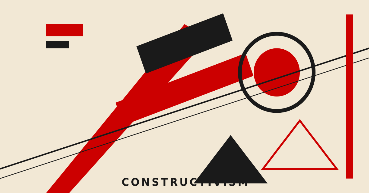
苏联构成主义海报风格,强烈的红黑配色、对角线构图、几何块面、宣传性排版。

构成主义视觉预览
主色#cc0000
次色#f2e8d5
强调色 1#1a1a1a
强调色 2#d4a843
强调色 3#8b4513
强调色 4#1a1a1a

AI 实现规则

你是一个 Constructivism 构成主义设计风格的前端开发专家。生成的所有代码必须严格遵守以下约束:

## 绝对禁止

- 使用圆角 rounded-lg rounded-xl rounded-full
- 使用柔和阴影 shadow-sm shadow-md
- 使用渐变 bg-gradient-to-*
- 使用柔和字重 font-light font-normal font-medium
- 使用超过三色体系的配色
- 使用曲线和有机形状
- 使用超过 duration-100 的过渡(构成主义是机械的,不是流畅的)

## 必须遵守

- 苏维埃红 bg-[#cc0000] text-[#cc0000]
- 纯黑 bg-[#1a1a1a] text-[#1a1a1a] border-[#1a1a1a]
- 泛黄纸色 bg-[#f2e8d5]
- 尖锐直角 rounded-none
- 硬边阴影 shadow-[4px_4px_0_#1a1a1a] 或 shadow-[6px_6px_0_#1a1a1a]
- 超粗字体 font-black uppercase
- 宽字距 tracking-wider tracking-[0.2em] tracking-[0.3em]
- 粗边框 border-4 border-[#1a1a1a]
- 对角线元素 -rotate-2 skew-x-3
- 交互按钮必须用 group 包裹以支持侵入色块

## Animation & Interaction Rules

- Block Invasion: 按钮内必须有一个 absolute inset-0 黑色覆盖层(bg-[#1a1a1a] 或 bg-[#cc0000]),初始 -translate-x-full,group-hover:translate-x-0,用 transition-transform duration-100 ease-linear 横扫。文字放在 relative z-10 的 span 内。
- Diagonal Aggression: hover 时元素斜向位移——X 和 Y 同时移动(hover:translate-x-[4px] hover:translate-y-[4px]),模拟版画压下去的方向感。阴影同步缩小(shadow-[6px] → shadow-[2px])。
- Soviet Reversal: active 时配色翻转——苏维埃红底按钮变黑底红字(active:bg-[#1a1a1a] active:text-[#cc0000]);黑底按钮变红底黑字(active:bg-[#cc0000] active:text-[#1a1a1a])。影子骤归零(active:shadow-none)。
- Line Snap: 卡片内的对角分隔线(-rotate-2)在 group-hover 时 rotate-0 归正,模拟革命"纠正"秩序的紧张感。
- Mechanical Easing: 所有动画使用 duration-75 ease-linear 或 duration-100 ease-linear。严禁 ease-in-out 或 ease(太柔和)。

## 配色

三色体系(严格限制):
- 苏维埃红: #cc0000
- 纯黑: #1a1a1a
- 泛黄纸色: #f2e8d5
- 金星色(点缀): #d4a843

## 构图

- 对角线分割
- 几何块面碰撞
- 极端字重对比
- 左对齐为主

## 自检

每次生成代码后检查:
1. 按钮是 group 包裹,内有黑色侵入层(-translate-x-full → group-hover:translate-x-0)
2. hover 斜向位移(translate-x + translate-y 同时移动)
3. active 配色翻转(红与黑双向切换),shadow-none
4. 所有动画 duration-75/100 ease-linear
5. 无任何圆角、柔和阴影、渐变

组件预览与实现

font-sans font-black uppercase tracking-widest rounded-none skew-x-[-2deg] border-3 border-[#1a1a1a] transition-all duration-150 bg-[#cc0000] text-[#f2e8d5] hover:skew-x-0 hover:scale-105 active:scale-95
button

按钮

构成主义侵入按钮:黑色色块从左侧横扫,hover 时斜向位移 + 阴影骤减,active 时苏维埃配色翻转(红字黑底)

<button className="
  group relative px-8 py-3
  bg-[#cc0000] text-[#f2e8d5]
  font-sans font-black uppercase tracking-[0.2em] text-sm
  rounded-none border-4 border-[#1a1a1a]
  shadow-[6px_6px_0_#1a1a1a]
  hover:shadow-[2px_2px_0_#1a1a1a]
  hover:translate-x-[4px] hover:translate-y-[4px]
  active:translate-x-[6px] active:translate-y-[6px]
  active:shadow-none
  active:bg-[#1a1a1a] active:text-[#cc0000]
  transition-all duration-75 ease-linear
  overflow-hidden
  -rotate-1
">
  {/* Black block invasion — sweeps in from the left on hover */}
  <div className="absolute inset-0 bg-[#1a1a1a] -translate-x-full group-hover:translate-x-0 transition-transform duration-100 ease-linear" />
  <span className="relative z-10">ACTION</span>
</button>
card

卡片

构成主义卡片:group-hover 时红色横幅变黑、文字变红,对角分隔线归零,色块翻转——整张卡像宣传册翻面

<div className="group relative p-0 bg-[#f2e8d5] border-4 border-[#1a1a1a] rounded-none shadow-[6px_6px_0_#1a1a1a] overflow-hidden">
  {/* Banner — switches from red to black on group-hover */}
  <div className="bg-[#cc0000] group-hover:bg-[#1a1a1a] px-6 py-3 transition-colors duration-75 ease-linear">
    <h3 className="text-lg font-sans font-black text-[#f2e8d5] group-hover:text-[#cc0000] uppercase tracking-[0.2em] transition-colors duration-75 ease-linear">
      MANIFESTO
    </h3>
  </div>

  <div className="p-6">
    {/* Diagonal accent line — tilted at rest, straightens on hover */}
    <div className="w-full h-1 bg-[#1a1a1a] mb-4 -rotate-2 group-hover:rotate-0 transition-transform duration-75 ease-linear" />
    <p className="text-[#1a1a1a] font-sans font-bold leading-tight text-sm uppercase tracking-wider">
      Art must serve the revolution. Design is a weapon of progress and transformation.
    </p>
    {/* Color swatches — red/black swap on hover */}
    <div className="mt-4 flex gap-2">
      <span className="w-4 h-4 bg-[#cc0000] group-hover:bg-[#1a1a1a] inline-block transition-colors duration-75" />
      <span className="w-4 h-4 bg-[#1a1a1a] group-hover:bg-[#cc0000] inline-block transition-colors duration-75" />
      <span className="w-4 h-4 bg-[#d4a843] inline-block" />
    </div>
  </div>
</div>
input

输入框

构成主义输入框:粗边框,聚焦时红色阴影框切入,零延迟

<input
  type="text"
  placeholder="INPUT TEXT..."
  className="
    w-full px-5 py-3
    bg-[#f2e8d5]
    border-4 border-[#1a1a1a]
    rounded-none
    text-[#1a1a1a] placeholder-[#8b4513]/50
    font-sans font-bold uppercase tracking-wider text-sm
    focus:border-[#cc0000]
    focus:shadow-[4px_4px_0_#cc0000]
    focus:outline-none
    transition-all duration-75 ease-linear
  "
/>
hero

Hero 区块

构成主义 Hero:对角红色分割、几何黑块、海报式排版

<section className="
  min-h-screen
  flex items-center justify-center
  bg-[#f2e8d5]
  relative overflow-hidden
">
  {/* Diagonal red block — skewed geometric slab */}
  <div className="absolute top-0 right-0 w-1/3 h-full bg-[#cc0000] -skew-x-12 translate-x-16" />
  {/* Black geometric accent — rotated square at corner */}
  <div className="absolute bottom-0 left-0 w-48 h-48 bg-[#1a1a1a] rotate-45 -translate-x-24 translate-y-24" />

  <div className="relative z-10 text-left px-8 md:px-16 max-w-4xl">
    <div className="w-24 h-2 bg-[#cc0000] mb-6" />
    <h1 className="text-6xl md:text-8xl font-sans font-black text-[#1a1a1a] mb-4 uppercase tracking-tight leading-none -rotate-2">
      CONSTRUCT
    </h1>
    <h2 className="text-3xl md:text-4xl font-sans font-black text-[#cc0000] mb-8 uppercase tracking-[0.3em]">
      THE FUTURE
    </h2>
    <p className="text-lg text-[#1a1a1a]/80 font-sans font-bold uppercase tracking-wider mb-10 max-w-lg">
      Art into life. Design as revolution.
    </p>
    <button className="
      group relative
      px-12 py-4
      bg-[#1a1a1a] text-[#f2e8d5]
      font-sans font-black uppercase tracking-[0.3em]
      rounded-none border-4 border-[#1a1a1a]
      shadow-[6px_6px_0_#cc0000]
      hover:shadow-[2px_2px_0_#cc0000]
      hover:translate-x-[4px] hover:translate-y-[4px]
      active:translate-x-[6px] active:translate-y-[6px]
      active:shadow-none active:bg-[#cc0000] active:text-[#1a1a1a]
      transition-all duration-75 ease-linear
      overflow-hidden
    ">
      <div className="absolute inset-0 bg-[#cc0000] -translate-x-full group-hover:translate-x-0 transition-transform duration-100 ease-linear" />
      <span className="relative z-10">BEGIN</span>
    </button>
  </div>
</section>

交互展示

适用范围与设计理念

应用场景

editorialcreativemarketing

视觉关键词

retrohigh-contrast构成主义苏联海报几何宣传对角线retrovintagenostalgic复古

构成主义(Constructivism)起源于1910年代的俄国先锋派艺术运动,在1920-30年代的苏联达到高峰。它主张"艺术为社会服务",将视觉设计视为传达信息和动员大众的工具。

构成主义的核心视觉语言包括:强烈的对角线构图、几何块面的碰撞、红与黑的高对比配色。这些元素共同构建出一种充满能量与紧迫感的视觉体验,观者无法忽视。

排版在构成主义中扮演关键角色。文字不仅是内容载体,更是构图元素。大号粗体标题常以对角线或竖排方式出现,字重差异极端——超大标题与小号正文形成戏剧性对比。

配色严格受限:苏维埃红(#cc0000)、纯黑(#1a1a1a)和泛黄纸色(#f2e8d5)构成基本三色。金色和棕色作为点缀,暗示革命时期的印刷工艺与陈旧纸张。

在现代界面设计中,构成主义风格适合需要强烈视觉冲击的场景。倾斜的色块、硬边几何、大胆排版——这些元素让页面像一张革命海报,每个元素都在大声呼喊。

应该这样做

  • 使用红黑高对比配色 bg-[#cc0000] text-[#1a1a1a] 搭配泛黄底 bg-[#f2e8d5]
  • 使用对角线和倾斜元素 -rotate-6 rotate-3 skew-x-3
  • 使用超粗字体 font-black text-6xl uppercase 制造视觉冲击
  • 使用尖锐直角 rounded-none 保持几何硬边
  • 使用硬边阴影 shadow-[4px_4px_0_#1a1a1a] 模拟版画效果
  • 保持极端字重对比——大标题与小正文的戏剧性差异
  • 使用 border-4 border-[#1a1a1a] 强调块面分割
  • 利用 transform 和 rotate 制造动态对角线构图

避免这样做

  • 禁止使用柔和圆角 rounded-lg rounded-xl rounded-full
  • 禁止使用柔和渐变 bg-gradient-to-r
  • 禁止使用柔和阴影 shadow-sm shadow-md
  • 禁止使用过多颜色——严格控制在红、黑、泛黄纸色三色体系
  • 禁止使用柔和字重 font-light font-normal
  • 禁止使用大面积留白削弱紧迫感
  • 禁止使用曲线和有机形状

全局 CSS

/* Constructivism 全局样式 */

:root {
  --cstv-red: #cc0000;
  --cstv-paper: #f2e8d5;
  --cstv-black: #1a1a1a;
  --cstv-gold: #d4a843;
  --cstv-brown: #8b4513;
}

/* 对角线条纹 */
.cstv-stripes {
  background-image: repeating-linear-gradient(
    -45deg,
    transparent,
    transparent 10px,
    var(--cstv-red) 10px,
    var(--cstv-red) 12px
  );
}

/* 革命红块 */
.cstv-red-block {
  background: var(--cstv-red);
  transform: skewX(-6deg);
}

/* 宣传海报边框 */
.cstv-poster-border {
  border: 4px solid var(--cstv-black);
  box-shadow: 6px 6px 0 var(--cstv-black);
}

/* 版画纹理叠加 */
.cstv-texture {
  background-image: url("data:image/svg+xml,%3Csvg width='4' height='4' viewBox='0 0 4 4' xmlns='http://www.w3.org/2000/svg'%3E%3Cpath d='M1 3h1v1H1V3zm2-2h1v1H3V1z' fill='%231a1a1a' fill-opacity='0.05'/%3E%3C/svg%3E");
}

/* 对角线分隔 */
.cstv-diagonal-divider {
  height: 4px;
  background: var(--cstv-black);
  transform: rotate(-2deg);
}
@keyframes constructivism-fade-in {
  from { opacity: 0; transform: translateY(8px); }
  to { opacity: 1; transform: translateY(0); }
}

@keyframes constructivism-pulse {
  0%, 100% { opacity: 1; }
  50% { opacity: 0.7; }
}

.constructivism-card {
  position: relative;
  overflow: hidden;
}

.constructivism-card::before {
  content: "";
  position: absolute;
  inset: 0;
  opacity: 0;
  transition: opacity 0.3s ease;
  background: linear-gradient(135deg, rgba(204, 0, 0, 0.05), transparent);
  pointer-events: none;
}

.constructivism-card:hover::before {
  opacity: 1;
}

.constructivism-frosted {
  backdrop-filter: blur(12px) saturate(180%);
  -webkit-backdrop-filter: blur(12px) saturate(180%);
  background: rgba(204, 0, 0, 0.08);
}

.constructivism-accent-corner {
  clip-path: polygon(0 0, 100% 0, 100% calc(100% - 2rem), calc(100% - 2rem) 100%, 0 100%);
}

.constructivism-animate-in {
  animation: constructivism-fade-in 0.5s ease-out both;
}

布局、色板与 Tokens

主色#cc0000
次色#f2e8d5
强调色 1#1a1a1a
强调色 2#d4a843
强调色 3#8b4513
强调色 4#1a1a1a
{
  "border": {
    "width": "border-4",
    "color": "border-[#1a1a1a]",
    "radius": "rounded-none",
    "style": "border-solid"
  },
  "shadow": {
    "sm": "shadow-[2px_2px_0_#1a1a1a]",
    "md": "shadow-[4px_4px_0_#1a1a1a]",
    "lg": "shadow-[6px_6px_0_#1a1a1a]",
    "none": "shadow-none",
    "hover": "hover:shadow-[2px_2px_0_#1a1a1a]",
    "focus": "focus:shadow-[0_0_0_2px_#cc0000]",
    "colored": {
      "red": "shadow-[4px_4px_0_#cc0000]",
      "gold": "shadow-[4px_4px_0_#d4a843]"
    }
  },
  "interaction": {
    "transition": "transition-all duration-150",
    "active": "active:translate-x-[4px] active:translate-y-[4px]",
    "hoverOpacity": "hover:opacity-95"
  },
  "typography": {
    "heading": "font-sans font-black uppercase tracking-widest",
    "body": "font-sans font-bold",
    "mono": "font-mono font-bold",
    "sizes": {
      "hero": "text-6xl md:text-8xl lg:text-9xl",
      "h1": "text-4xl md:text-6xl",
      "h2": "text-2xl md:text-4xl",
      "h3": "text-xl md:text-2xl",
      "body": "text-sm md:text-base",
      "small": "text-xs md:text-sm"
    }
  },
  "spacing": {
    "section": "py-12 md:py-20 lg:py-28",
    "container": "px-6 md:px-12 lg:px-16",
    "card": "p-0",
    "gap": {
      "sm": "gap-2 md:gap-3",
      "md": "gap-4 md:gap-6",
      "lg": "gap-6 md:gap-10"
    }
  },
  "colors": {
    "background": {
      "primary": "bg-[#f2e8d5]",
      "secondary": "bg-[#cc0000]",
      "accent": [
        "bg-[#1a1a1a]",
        "bg-[#d4a843]",
        "bg-[#8b4513]"
      ]
    },
    "text": {
      "primary": "text-[#1a1a1a]",
      "secondary": "text-[#f2e8d5]",
      "muted": "text-[#8b4513]"
    },
    "button": {
      "primary": "bg-[#cc0000] text-[#f2e8d5]",
      "secondary": "bg-[#1a1a1a] text-[#f2e8d5]",
      "danger": "bg-[#cc0000] text-[#f2e8d5] border-4 border-[#1a1a1a]"
    }
  },
  "forbidden": {
    "classes": [
      "font-serif",
      "font-light",
      "font-normal",
      "font-medium",
      "rounded-sm",
      "rounded",
      "rounded-md",
      "rounded-lg",
      "rounded-xl",
      "rounded-2xl",
      "rounded-full",
      "shadow-sm",
      "shadow",
      "shadow-md",
      "shadow-lg",
      "shadow-xl",
      "bg-gradient-to-r",
      "bg-gradient-to-l",
      "bg-gradient-to-b",
      "bg-gradient-to-t",
      "italic"
    ],
    "patterns": [
      "^font-(?:serif|light|normal|medium)$",
      "^rounded-(?!none)",
      "^shadow-(?:sm|md|lg|xl|2xl)$",
      "^bg-gradient-",
      "^italic$"
    ],
    "reasons": {
      "font-serif": "Constructivism uses bold sans-serif industrial typography (font-sans font-black)",
      "rounded-lg": "Constructivism demands sharp geometric edges (rounded-none)",
      "shadow-md": "Constructivism uses hard offset shadows, not soft diffused ones",
      "bg-gradient-to-r": "Constructivism uses flat solid color blocks, no gradients",
      "font-light": "Constructivism requires heavy bold weights for propaganda impact"
    }
  },
  "required": {
    "button": [
      "rounded-none",
      "border-4 border-[#1a1a1a]",
      "font-sans font-black uppercase tracking-widest",
      "shadow-[4px_4px_0_#1a1a1a]",
      "transition-all duration-150"
    ],
    "card": [
      "rounded-none",
      "border-4 border-[#1a1a1a]",
      "shadow-[6px_6px_0_#1a1a1a]",
      "overflow-hidden"
    ],
    "input": [
      "rounded-none",
      "border-4 border-[#1a1a1a]",
      "bg-[#f2e8d5]",
      "text-[#1a1a1a]",
      "font-sans font-bold uppercase tracking-wider",
      "focus:border-[#cc0000]",
      "focus:outline-none"
    ]
  }
}

示例提示词

革命风格活动页面

构成主义海报风格的活动宣传页面

用 Constructivism 风格创建一个活动宣传页面,要求:
1. 背景:泛黄纸色 #f2e8d5
2. 标题:超大粗体 + 倾斜 + 红黑配色
3. 布局:对角线分割 + 几何色块
4. 按钮:硬边框 + 硬阴影
5. 整体像一张苏联构成主义海报

SaaS 着陆页

生成 构成主义风格的 SaaS 产品着陆页

Create a SaaS landing page using Constructivism style with hero section, feature grid, testimonials, pricing table, and footer.

作品集展示

生成 构成主义风格的作品集页面

Create a portfolio showcase page using Constructivism style with project grid, about section, contact form, and consistent visual language.