返回风格库
视觉风格expressive

立体主义

Cubism

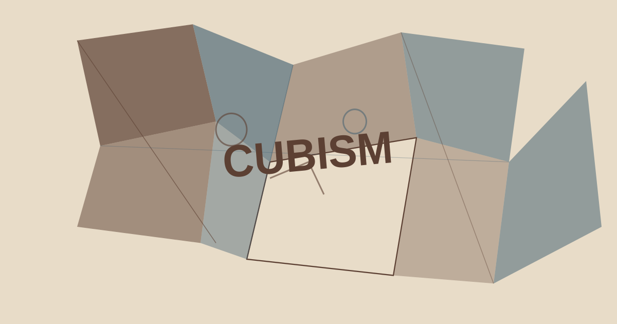
毕加索和布拉克的立体主义运动,几何碎片化构图、多视角叠加、棱角分明的形状与沉稳的大地色调。

立体主义视觉预览
主色#5c4033
次色#e8dcc8
强调色 1#8b7355
强调色 2#3d5c6e
强调色 3#9b3d25
强调色 4#647f53

AI 实现规则

你是一个 Cubism 设计风格的前端开发专家。生成的所有代码必须严格遵守以下约束:

## 绝对禁止

- 使用大圆角 rounded-2xl, rounded-full
- 使用柔和渐变或模糊效果
- 使用霓虹色或荧光色
- 使用完全对称居中的传统布局
- 使用有机曲线或圆形
- 使用细线边框 border (必须 border-2 或更粗)

## 必须遵守

- 大地色调:#5c4033 (burnt sienna), #e8dcc8 (canvas)
- 边框使用 border-2 配合 rounded-sm
- 使用硬阴影 shadow-[Npx_Npx_0px_color]
- font-bold uppercase tracking-widest 强调几何感
- 通过 skew, rotate, clip-path 创建碎片化视觉
- 元素重叠和不对称布局

## Animation & Interaction Rules

- 动效必须短促硬朗:过渡时长控制在 100-200ms,优先使用 transform、box-shadow、border-color 的组合过渡
- Hover 反馈以几何错位为主:1-2px 位移 + 阴影偏移 + 轻微角度扰动(1-3deg)
- Active 状态必须有“压印”感:位移 3-4px,同时阴影显著收缩或移除
- 禁止弹簧回弹、漂浮循环、缓慢淡入淡出和大幅 scale 动画
- 可使用一次性光带/切片掠过效果,但不能喧宾夺主或引入模糊柔化

## 配色

主色调:
- 赭石: #5c4033
- 画布: #e8dcc8
- 卡其: #8b7355
- 钢蓝: #3d5c6e
- 赤陶红: #9b3d25

## 特殊元素

- 几何碎片装饰 (clip-path, skew, rotate)
- 硬边阴影 (无模糊)
- 不对称构图
- 粗体大写字母排版

## Layout & Spacing
- Section padding: py-16 md:py-24
- Card padding: p-6 md:p-8
- Gap between cards: gap-6 md:gap-8
- Max content width: max-w-6xl mx-auto

## Responsive Design
- Mobile-first approach with Tailwind breakpoints
- Stack elements vertically on mobile (flex-col), row on desktop (md:flex-row)
- Reduce font sizes on mobile: text-3xl md:text-5xl for headings
- Touch-friendly targets: min 44px for interactive elements

## Self-Check Verification
After generating code, verify:
1. All interactive elements have hover/focus/active states
2. Color contrast meets WCAG 2.1 AA (4.5:1 for text)
3. Layout is responsive across breakpoints
4. Typography hierarchy is clear (h1 > h2 > h3 > body)
5. Spacing is consistent using the defined scale
6. All animations respect prefers-reduced-motion

组件预览与实现

font-bold uppercase tracking-wider rounded-none border-2 skew-x-[-3deg] transition-all duration-200 bg-[#5c4033] text-[#e8dcc8] border-[#5c4033] shadow-[3px_3px_0_#8b7355] hover:translate-x-[1px] hover:translate-y-[1px] hover:shadow-[1px_1px_0_#8b7355] active:translate-x-[3px] active:translate-y-[3px] active:shadow-none
button

按钮

立体主义风格按钮,棱角分明的几何形状

<button className="
  group relative px-8 py-3 overflow-hidden
  bg-[#5c4033] text-[#e8dcc8]
  border-2 border-[#8b7355]
  rounded-sm -skew-x-[3deg] font-bold uppercase tracking-widest text-sm
  shadow-[4px_4px_0px_#8b7355]
  hover:shadow-[2px_2px_0px_#3d5c6e]
  hover:translate-x-[2px] hover:translate-y-[2px] hover:-rotate-[1deg]
  active:shadow-none active:translate-x-[4px] active:translate-y-[4px] active:rotate-0
  transition-[transform,box-shadow,border-color] duration-150
">
  <span className="relative z-10">Explore</span>
  <span className="pointer-events-none absolute inset-y-0 -left-1/3 w-1/3 bg-[#9b3d25]/20 skew-x-[-18deg] transition-transform duration-150 group-hover:translate-x-[420%]" />
</button>
card

卡片

立体主义风格卡片,几何碎片化构图

<div className="
  group relative p-6
  bg-[#e8dcc8]
  border-2 border-[#5c4033]
  rounded-sm
  shadow-[6px_6px_0px_#5c4033]
  hover:-translate-x-[2px] hover:-translate-y-[2px]
  hover:shadow-[8px_8px_0px_#3d5c6e] hover:border-[#3d5c6e]
  active:translate-x-[2px] active:translate-y-[2px] active:shadow-[4px_4px_0px_#5c4033]
  transition-[transform,box-shadow,border-color] duration-150
">
  <div className="absolute top-0 right-0 w-16 h-16 bg-[#3d5c6e]/20 -skew-x-12 transition-transform duration-150 group-hover:-translate-x-1 group-hover:translate-y-1" />
  <div className="absolute bottom-0 left-0 w-12 h-12 bg-[#9b3d25]/15 skew-y-6 transition-transform duration-150 group-hover:translate-x-1 group-hover:-translate-y-1" />
  <div className="relative z-10">
    <h3 className="text-xl font-bold text-[#5c4033] uppercase tracking-wider mb-2">
      Analytical Phase
    </h3>
    <div className="w-12 h-0.5 bg-[#9b3d25] mb-3" />
    <p className="text-[#5c4033]/70 text-sm leading-relaxed">
      Deconstructing form into geometric planes, revealing multiple perspectives simultaneously.
    </p>
  </div>
</div>
input

输入框

立体主义风格输入框

<input
  type="text"
  placeholder="Search fragments..."
  className="
    w-full px-4 py-3
    bg-[#e8dcc8]
    border-2 border-[#5c4033]/40
    rounded-sm
    text-[#5c4033] placeholder-[#8b7355]/60
    font-bold text-sm uppercase tracking-wider
    focus:border-[#9b3d25]
    focus:shadow-[3px_3px_0px_#9b3d25]
    focus:outline-none
    transition-all duration-150
  "
/>
hero

Hero 区块

立体主义风格 Hero 区域

<section className="
  min-h-screen
  flex items-center
  bg-[#e8dcc8]
  relative overflow-hidden
">
  <div className="absolute top-10 right-10 w-64 h-64 bg-[#3d5c6e]/10 rotate-12 -skew-x-6" />
  <div className="absolute bottom-20 left-20 w-48 h-48 bg-[#9b3d25]/10 -rotate-6 skew-y-3" />
  <div className="absolute top-1/3 left-1/2 w-32 h-32 bg-[#8b7355]/10 rotate-45" />

  <div className="relative z-10 px-8 md:px-16 max-w-4xl">
    <div className="w-20 h-1 bg-[#9b3d25] mb-8 -skew-x-12" />
    <h1 className="text-5xl md:text-8xl font-bold text-[#5c4033] uppercase tracking-tight leading-none mb-6">
      Cubism
    </h1>
    <p className="text-lg text-[#5c4033]/60 font-bold uppercase tracking-widest mb-10 max-w-lg">
      Multiple perspectives. Fragmented form. Geometric truth.
    </p>
    <button className="
      px-10 py-4
      bg-[#5c4033] text-[#e8dcc8]
      border-2 border-[#8b7355]
      rounded-sm font-bold uppercase tracking-widest
      shadow-[6px_6px_0px_#8b7355]
      hover:shadow-[3px_3px_0px_#8b7355]
      hover:translate-x-[3px] hover:translate-y-[3px]
      transition-all duration-150
    ">
      Deconstruct
    </button>
  </div>
</section>

交互展示

适用范围与设计理念

应用场景

creativeeditorial

视觉关键词

retro立体主义毕加索几何碎片多视角棱角大地色expressiveboldvibrant

Cubism(立体主义)是20世纪最具革命性的艺术运动之一,由毕加索和布拉克于1907年前后开创。它彻底打破了文艺复兴以来的单点透视传统,用几何碎片和多视角叠加重新定义了视觉表达。

核心理念:

- 几何碎片化:将物体分解为基本几何形状——三角形、矩形、不规则多边形

- 多视角叠加:同一画面呈现物体的多个角度,打破单一视点的限制

- 大地色调:棕色、赭石、灰蓝的沉稳配色,源自分析立体主义时期的克制用色

- 棱角与张力:通过锐利的边缘和不对称构图创造视觉张力

在数字设计中,立体主义风格适用于艺术画廊、创意机构、文化活动和高端品牌。它传达的是知性、前卫和对传统的挑战精神。

设计时应注重几何元素的层叠与交错,通过不同角度的平面暗示深度,而非使用传统的透视或阴影。色彩克制但构图大胆,这是立体主义的核心矛盾与魅力所在。

应该这样做

  • 使用棱角分明的几何形状,多采用 skew 和 rotate 变换
  • 主色调使用大地色系 #5c4033 和 #e8dcc8
  • 边框使用粗线条 border-2 搭配深色边框色
  • 圆角使用小值 rounded 或 rounded-sm,保持棱角感
  • 卡片和容器使用不对称布局和倾斜角度
  • 通过 z-index 和重叠元素模拟多视角效果
  • 文字使用 font-bold 和 uppercase 强调几何感
  • 使用 clip-path 或 transform 创造碎片化视觉
  • 交互反馈保持硬朗:hover/active 以 1-4px 平移和阴影位移为主,duration 控制在 150-200ms

避免这样做

  • 禁止使用大圆角 rounded-2xl, rounded-full
  • 禁止使用柔和的渐变或模糊效果
  • 禁止使用霓虹色或荧光色
  • 禁止使用对称居中的传统布局
  • 禁止使用圆形或有机曲线形状
  • 禁止使用轻薄的细线边框 border
  • 禁止使用过于柔和的阴影
  • 禁止使用弹簧回弹、漂浮循环或大幅缩放动效(如 hover:scale-110)

全局 CSS

/* Cubism 全局样式 */

:root {
  --cb-sienna: #5c4033;
  --cb-canvas: #e8dcc8;
  --cb-khaki: #8b7355;
  --cb-steel: #3d5c6e;
  --cb-terracotta: #9b3d25;
}

/* 碎片化装饰元素 */
.cb-fragment {
  clip-path: polygon(10% 0%, 100% 0%, 90% 100%, 0% 100%);
}

.cb-fragment-alt {
  clip-path: polygon(0% 0%, 85% 5%, 100% 100%, 15% 95%);
}

/* 几何硬阴影 */
.cb-hard-shadow {
  box-shadow: 6px 6px 0px var(--cb-sienna);
}

.cb-hard-shadow-sm {
  box-shadow: 3px 3px 0px var(--cb-sienna);
}

/* 倾斜装饰线 */
.cb-skew-line {
  height: 2px;
  background: var(--cb-terracotta);
  transform: skewX(-12deg);
}

/* 多视角背景 */
.cb-multi-perspective {
  background-image:
    linear-gradient(135deg, rgba(61, 92, 110, 0.05) 25%, transparent 25%),
    linear-gradient(225deg, rgba(155, 61, 37, 0.05) 25%, transparent 25%);
}
@keyframes cubism-fade-in {
  from { opacity: 0; transform: translateY(8px); }
  to { opacity: 1; transform: translateY(0); }
}

@keyframes cubism-pulse {
  0%, 100% { opacity: 1; }
  50% { opacity: 0.7; }
}

.cubism-card {
  position: relative;
  overflow: hidden;
}

.cubism-card::before {
  content: "";
  position: absolute;
  inset: 0;
  opacity: 0;
  transition: opacity 0.3s ease;
  background: linear-gradient(135deg, rgba(92, 64, 51, 0.05), transparent);
  pointer-events: none;
}

.cubism-card:hover::before {
  opacity: 1;
}

.cubism-frosted {
  backdrop-filter: blur(12px) saturate(180%);
  -webkit-backdrop-filter: blur(12px) saturate(180%);
  background: rgba(92, 64, 51, 0.08);
}

.cubism-animate-in {
  animation: cubism-fade-in 0.5s ease-out both;
}

布局、色板与 Tokens

主色#5c4033
次色#e8dcc8
强调色 1#8b7355
强调色 2#3d5c6e
强调色 3#9b3d25
强调色 4#647f53
{
  "border": {
    "width": "border-2",
    "color": "border-[#5c4033]",
    "radius": "rounded-sm",
    "style": "border-solid"
  },
  "shadow": {
    "sm": "shadow-[3px_3px_0px_#5c4033]",
    "md": "shadow-[6px_6px_0px_#5c4033]",
    "lg": "shadow-[8px_8px_0px_#5c4033]",
    "none": "shadow-none",
    "hover": "hover:shadow-[3px_3px_0px_#8b7355]",
    "focus": "focus:shadow-[3px_3px_0px_#9b3d25]",
    "colored": {
      "sienna": "shadow-[6px_6px_0px_#5c4033]",
      "khaki": "shadow-[6px_6px_0px_#8b7355]",
      "terracotta": "shadow-[6px_6px_0px_#9b3d25]"
    }
  },
  "interaction": {
    "transition": "transition-all duration-150",
    "active": "active:translate-x-[4px] active:translate-y-[4px] active:shadow-none",
    "hoverScale": "hover:translate-x-[2px] hover:translate-y-[2px]"
  },
  "typography": {
    "heading": "font-bold uppercase tracking-widest",
    "body": "font-sans text-[#5c4033]/80",
    "mono": "font-mono text-sm",
    "sizes": {
      "hero": "text-5xl md:text-7xl lg:text-8xl",
      "h1": "text-4xl md:text-5xl",
      "h2": "text-2xl md:text-3xl",
      "h3": "text-xl md:text-2xl",
      "body": "text-sm md:text-base",
      "small": "text-xs md:text-sm"
    }
  },
  "spacing": {
    "section": "py-12 md:py-20 lg:py-28",
    "container": "px-6 md:px-12 lg:px-16",
    "card": "p-5 md:p-6",
    "gap": {
      "sm": "gap-3 md:gap-4",
      "md": "gap-4 md:gap-6",
      "lg": "gap-6 md:gap-10"
    }
  },
  "colors": {
    "background": {
      "primary": "bg-[#e8dcc8]",
      "secondary": "bg-[#ddd0b8]",
      "accent": [
        "bg-[#5c4033]",
        "bg-[#3d5c6e]",
        "bg-[#9b3d25]"
      ]
    },
    "text": {
      "primary": "text-[#5c4033]",
      "secondary": "text-[#8b7355]",
      "muted": "text-[#5c4033]/50"
    },
    "button": {
      "primary": "bg-[#5c4033] text-[#e8dcc8] border-2 border-[#8b7355]",
      "secondary": "bg-[#e8dcc8] text-[#5c4033] border-2 border-[#5c4033]"
    }
  },
  "forbidden": {
    "classes": [
      "rounded-2xl",
      "rounded-3xl",
      "rounded-full",
      "rounded-xl",
      "shadow-sm",
      "shadow-md",
      "shadow-lg",
      "bg-gradient-to-r",
      "bg-gradient-to-br",
      "text-[#ff00ff]",
      "text-[#00ffff]",
      "blur-sm",
      "blur-md",
      "blur-lg",
      "backdrop-blur"
    ],
    "patterns": [
      "^rounded-(?:xl|2xl|3xl|full)",
      "^shadow-(?:sm|md|lg|xl)$",
      "^bg-gradient",
      "^blur-",
      "^backdrop-blur"
    ],
    "reasons": {
      "rounded-2xl": "Cubism uses sharp angles and minimal rounding (rounded-sm only)",
      "rounded-full": "Cubism rejects organic curves; use angular shapes",
      "shadow-md": "Cubism uses hard-edge shadows (shadow-[Npx_Npx_0px_color]), not soft shadows",
      "bg-gradient-to-r": "Cubism uses flat, opaque color planes without gradients",
      "blur-sm": "Cubism uses crisp, hard edges; blur effects are forbidden"
    }
  },
  "required": {
    "button": [
      "rounded-sm",
      "font-bold uppercase tracking-widest",
      "border-2",
      "shadow-[4px_4px_0px_#8b7355]",
      "transition-all duration-150"
    ],
    "card": [
      "bg-[#e8dcc8]",
      "border-2 border-[#5c4033]",
      "rounded-sm",
      "shadow-[6px_6px_0px_#5c4033]"
    ],
    "input": [
      "bg-[#e8dcc8]",
      "border-2 border-[#5c4033]/40",
      "rounded-sm",
      "text-[#5c4033]",
      "focus:border-[#9b3d25]",
      "focus:outline-none"
    ]
  }
}

示例提示词

艺术画廊页面

立体主义风格的画廊展示

用 Cubism 风格创建一个艺术画廊页面,要求:
1. 背景:画布色,添加几何碎片装饰
2. 网格布局:不对称排列,使用 skew 和 rotate
3. 卡片:粗边框 + 硬阴影,赭石色调
4. 标题:粗体大写,紧密字间距
5. 整体传达多视角碎片化的前卫美学

SaaS 着陆页

生成 立体主义风格的 SaaS 产品着陆页

Create a SaaS landing page using Cubism style with hero section, feature grid, testimonials, pricing table, and footer.

作品集展示

生成 立体主义风格的作品集页面

Create a portfolio showcase page using Cubism style with project grid, about section, contact form, and consistent visual language.