按钮
F型布局中的 CTA 按钮
<button className="
  px-6 py-3
  bg-[#e63946] text-white
  rounded-lg
  font-medium
  hover:bg-[#c1121f]
  active:scale-[0.98]
  transition-all duration-150 ease-out
">
  Read More
</button>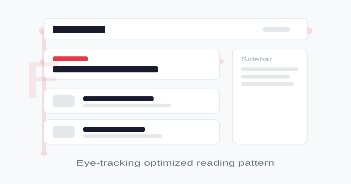
#1a1a2e#f8f9fa#e63946#457b9d#2a9d8f#e9c46a你是一个 F-Pattern Layout 布局专家。生成的所有代码必须严格遵守以下约束:
## 布局规则
- 页面顶部放置最重要的信息(logo、导航、特色内容)
- 第二行放置次重要的信息(分类、搜索)
- 左侧放置主内容区(文章列表)
- 右侧放置辅助内容(侧边栏)
- 所有文字左对齐 text-left
## 内容层级
第一层(顶部全宽):
- 导航栏
- 特色文章/头条
第二层(次要水平区):
- 分类标签
- 搜索栏
第三层(左侧垂直列表):
- 文章列表
- 带缩略图的内容卡片
辅助区(右侧):
- 热门推荐
- 标签云
- 广告位
## 响应式
桌面端:左主内容 + 右侧边栏
平板端:全宽主内容 + 折叠侧边栏
手机端:单列堆叠
## 自检
1. 最重要的内容在顶部和左上
2. 有清晰的标题层级
3. 文字左对齐
4. 内容可快速扫描
5. 响应式适配完善
## Animation & Interaction Rules
- Eye-Tracking Guides: 列表项 hover 时,主标题可轻微右移(如 `translate-x-1`)或下划线浮现,帮助扫描阶段快速锁定。
- Fast Feedback: 资讯类交互建议 `duration-150` 到 `duration-200`,避免冗长过渡打断阅读。
- Contrast Pop: 当前 hover 项可通过轻微阴影或边框对比强化,从信息流中短暂剥离。
- Image Focus: 缩略图 hover 时可提升对比度或亮度,作为可点击反馈,但幅度必须克制。
## Layout & Spacing
- Section padding: py-16 md:py-24
- Card padding: p-6 md:p-8
- Gap between cards: gap-6 md:gap-8
- Max content width: max-w-6xl mx-auto
## Responsive Design
- Mobile-first approach with Tailwind breakpoints
- Stack elements vertically on mobile (flex-col), row on desktop (md:flex-row)
- Reduce font sizes on mobile: text-3xl md:text-5xl for headings
- Touch-friendly targets: min 44px for interactive elements
## Self-Check Verification
After generating code, verify:
1. All interactive elements have hover/focus/active states
2. Color contrast meets WCAG 2.1 AA (4.5:1 for text)
3. Layout is responsive across breakpoints
4. Typography hierarchy is clear (h1 > h2 > h3 > body)
5. Spacing is consistent using the defined scale
6. All animations respect prefers-reduced-motionfont-medium rounded-lg transition-colors duration-200 bg-[#e63946] text-white hover:bg-[#c1121f] active:bg-[#a40e19]F型布局中的 CTA 按钮
<button className="
px-6 py-3
bg-[#e63946] text-white
rounded-lg
font-medium
hover:bg-[#c1121f]
active:scale-[0.98]
transition-all duration-150 ease-out
">
Read More
</button>F型布局中的内容卡片
<article className="group flex gap-6 p-6
  bg-white
  border border-gray-100
  hover:bg-gray-50/70
  hover:shadow-sm
  transition-all duration-200
  cursor-pointer
  relative
">
  <div className="w-20 h-20 bg-gray-200 rounded-lg flex-shrink-0 group-hover:contrast-125 group-hover:brightness-95 transition-all duration-200" />
  <div className="flex-1 min-w-0">
    <h3 className="text-lg font-semibold text-[#1a1a2e] mb-1 line-clamp-1 group-hover:text-[#e63946] group-hover:translate-x-1 group-hover:underline underline-offset-4 decoration-1 transition-all duration-200">
      Article Title
    </h3>
    <p className="text-gray-600 text-sm line-clamp-2 mb-2">
      Brief summary of the article content...
    </p>
    <span className="text-xs text-gray-400">5 min read</span>
  </div>
</article>搜索输入框
<input
  type="text"
  placeholder="Search articles..."
  className="
    w-full px-4 py-3
    bg-gray-50
    border border-gray-200
    rounded-lg
    text-[#1a1a2e] placeholder-gray-400
    focus:outline-none focus:ring-2 focus:ring-[#457b9d]/20
    focus:border-[#457b9d]
    transition-all
  "
/>F型布局的完整页面结构
<div className="min-h-screen bg-[#f8f9fa]">
  {/* 顶部横条 - F的第一笔 */}
  <header className="bg-white border border-gray-200">
    <div className="max-w-6xl mx-auto px-6 py-4 flex items-center justify-between">
      <h1 className="text-xl font-bold text-[#1a1a2e]">Logo</h1>
      <nav className="flex gap-6 text-sm text-gray-600">
        <a href="#" className="hover:text-[#1a1a2e]">Home</a>
        <a href="#" className="hover:text-[#1a1a2e]">Articles</a>
        <a href="#" className="hover:text-[#1a1a2e]">About</a>
      </nav>
    </div>
  </header>

  <div className="max-w-6xl mx-auto px-6 py-8">
    {/* 特色内容 - F的第二笔 */}
    <section className="mb-8">
      <div className="bg-white rounded-xl p-8 shadow-sm">
        <span className="text-xs font-medium text-[#e63946] uppercase tracking-wider">Featured</span>
        <h2 className="text-3xl font-bold text-[#1a1a2e] mt-2 mb-4">Main Headline</h2>
        <p className="text-gray-600 max-w-prose">Summary text that appears along the first horizontal scan line...</p>
      </div>
    </section>

    <div className="flex gap-8">
      {/* 左侧内容列表 - F的竖线 */}
      <main className="flex-1">
        <article className="bg-white rounded-lg p-6 mb-4 shadow-sm">
          <h3 className="text-lg font-semibold text-[#1a1a2e] mb-2">Article Title</h3>
          <p className="text-gray-600 text-sm">Content preview...</p>
        </article>
      </main>

      {/* 右侧边栏 */}
      <aside className="w-64 flex-shrink-0">
        <div className="bg-white rounded-lg p-4 shadow-sm">
          <h4 className="font-medium text-sm text-gray-500 mb-3">Trending</h4>
          <div className="text-sm text-[#1a1a2e]">Sidebar content</div>
        </div>
      </aside>
    </div>
  </div>
</div>F-Pattern Layout 基于尼尔森·诺曼集团的眼动追踪研究,用户浏览网页时视线呈 F 形移动:先水平扫描顶部内容,再向下移动后进行第二次水平扫描(较短),最后垂直向下浏览左侧。
核心理念:
- 内容优先级:最重要的内容放在顶部和左侧
- 视觉引导:通过层次和权重引导用户阅读路径
- 信息密度:适合文字密集型内容的高效排列
- 可扫描性:标题、摘要和正文形成清晰的层级
设计原则:
- 视觉一致性:所有组件必须遵循统一的视觉语言,从色彩到字体到间距保持谐调
- 层次分明:通过颜色深浅、字号大小、留白空间建立清晰的信息层级
- 交互反馈:每个可交互元素都必须有明确的 hover、active、focus 状态反馈
- 响应式适配:设计必须在移动端、平板、桌面端上保持一致的体验
- 无障碍性:确保色彩对比度符合 WCAG 2.1 AA 标准,所有交互元素可键盘访问
/* F-Pattern Layout 全局样式 */

/* F型布局容器 */
.f-layout {
  max-width: 1200px;
  margin: 0 auto;
  padding: 0 1.5rem;
}

/* 顶部扫描区(F的第一笔) */
.f-top-bar {
  width: 100%;
  padding: 2rem 0;
  border: 1px solid #e5e7eb;
}

/* 第二扫描区(F的第二笔,较短) */
.f-secondary {
  width: 75%;
  padding: 1.5rem 0;
}

/* 垂直扫描区(F的竖线) */
.f-vertical {
  display: flex;
  gap: 2rem;
}

.f-vertical-main {
  flex: 1;
}

.f-vertical-aside {
  width: 250px;
  flex-shrink: 0;
}

/* 内容优先级 */
.f-priority-high {
  font-size: 1.5rem;
  font-weight: 700;
  color: #1a1a2e;
}

.f-priority-medium {
  font-size: 1.125rem;
  font-weight: 600;
  color: #374151;
}

.f-priority-low {
  font-size: 0.875rem;
  color: #6b7280;
}

/* 响应式 */
@media (max-width: 768px) {
  .f-vertical {
    flex-direction: column;
  }
  .f-vertical-aside {
    width: 100%;
  }
  .f-secondary {
    width: 100%;
  }
}
/* F-Pattern Layout Design Tokens */
:root {
  --f-pattern-layout-primary: #1a1a2e;
  --f-pattern-layout-secondary: #f8f9fa;
  --f-pattern-layout-accent: #e63946;
  --f-pattern-layout-glow: rgba(26, 26, 46, 0.3);
}

@keyframes f-pattern-layout-fade-in {
  from { opacity: 0; transform: translateY(8px); }
  to { opacity: 1; transform: translateY(0); }
}

@keyframes f-pattern-layout-pulse {
  0%, 100% { opacity: 1; }
  50% { opacity: 0.7; }
}

.f-pattern-layout-card {
  position: relative;
  overflow: hidden;
}

.f-pattern-layout-card::before {
  content: "";
  position: absolute;
  inset: 0;
  opacity: 0;
  transition: opacity 0.3s ease;
  background: linear-gradient(135deg, rgba(26, 26, 46, 0.05), transparent);
  pointer-events: none;
}

.f-pattern-layout-card:hover::before {
  opacity: 1;
}

.f-pattern-layout-gradient {
  background: linear-gradient(135deg, #1a1a2e, #e63946);
}

.f-pattern-layout-gradient-text {
  background: linear-gradient(135deg, #1a1a2e, #e63946);
  -webkit-background-clip: text;
  -webkit-text-fill-color: transparent;
  background-clip: text;
}

.f-pattern-layout-frosted {
  backdrop-filter: blur(12px) saturate(180%);
  -webkit-backdrop-filter: blur(12px) saturate(180%);
  background: rgba(26, 26, 46, 0.08);
}

.f-pattern-layout-accent-corner {
  clip-path: polygon(0 0, 100% 0, 100% calc(100% - 2rem), calc(100% - 2rem) 100%, 0 100%);
}

.f-pattern-layout-animate-in {
  animation: f-pattern-layout-fade-in 0.5s ease-out both;
}#1a1a2e#f8f9fa#e63946#457b9d#2a9d8f#e9c46a{
"border": {
"width": "border",
"color": "border-gray-200",
"radius": "rounded-lg",
"style": "border-solid"
},
"shadow": {
"sm": "shadow-sm",
"md": "shadow-sm",
"lg": "shadow-md",
"none": "shadow-none",
"hover": "hover:shadow-md",
"focus": "focus:shadow-sm",
"colored": {}
},
"interaction": {
"transition": "transition-colors duration-200",
"active": "active:scale-95",
"hoverOpacity": "hover:opacity-90"
},
"typography": {
"heading": "font-semibold tracking-tight",
"body": "font-sans",
"mono": "font-mono",
"sizes": {
"hero": "text-3xl md:text-4xl",
"h1": "text-2xl md:text-3xl",
"h2": "text-xl md:text-2xl",
"h3": "text-lg md:text-xl",
"body": "text-sm md:text-base",
"small": "text-xs"
}
},
"spacing": {
"section": "py-6 md:py-8 lg:py-12",
"container": "px-4 md:px-6",
"card": "p-4 md:p-6",
"gap": {
"sm": "gap-3 md:gap-4",
"md": "gap-4 md:gap-6",
"lg": "gap-6 md:gap-8"
}
},
"colors": {
"background": {
"primary": "bg-[#f8f9fa]",
"secondary": "bg-white",
"accent": [
"bg-[#e63946]",
"bg-[#457b9d]",
"bg-[#2a9d8f]",
"bg-[#e9c46a]"
]
},
"text": {
"primary": "text-[#1a1a2e]",
"secondary": "text-gray-600",
"muted": "text-gray-400"
},
"button": {
"primary": "bg-[#e63946] text-white",
"secondary": "bg-gray-100 text-gray-700"
}
},
"forbidden": {
"classes": [
"text-center",
"rounded-none",
"rounded-2xl",
"rounded-3xl",
"shadow-2xl",
"font-black"
],
"patterns": [
"^rounded-(?:none|2xl|3xl)",
"^shadow-2xl"
],
"reasons": {
"text-center": "F-Pattern Layout uses left-aligned text to follow natural scanning patterns",
"rounded-none": "F-Pattern Layout uses moderate rounding for professional appearance",
"shadow-2xl": "F-Pattern Layout uses subtle shadows for clean readability"
}
},
"required": {
"button": [
"rounded-lg",
"font-medium",
"transition-colors"
],
"card": [
"bg-white",
"rounded-lg",
"shadow-sm",
"text-left"
],
"input": [
"bg-gray-50",
"border border-gray-200",
"rounded-lg",
"focus:outline-none",
"focus:ring-2 focus:ring-[#457b9d]/20 focus:border-[#457b9d]",
"transition-all"
]
}
}F型布局的新闻列表
用 F-Pattern Layout 设计一个新闻列表页,要求:
1. 顶部:logo + 导航 + 特色头条
2. 第二行:分类标签 + 搜索框
3. 左侧:文章列表(缩略图 + 标题 + 摘要)
4. 右侧:热门文章 + 标签云
5. 所有内容左对齐,优先级从上到下递减
6. 响应式:手机端单列显示生成 F型布局风格的 SaaS 产品着陆页
Create a SaaS landing page using F-Pattern Layout style with hero section, feature grid, testimonials, pricing table, and footer.生成 F型布局风格的作品集页面
Create a portfolio showcase page using F-Pattern Layout style with project grid, about section, contact form, and consistent visual language.