返回风格库
布局风格expressive

全屏滚动布局

Full Page Scroll

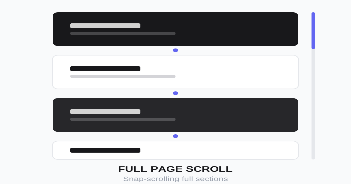
每一屏占满整个视口的沉浸式滚动体验,通过滚动切换完整场景,适合品牌故事、产品介绍、作品集展示。

全屏滚动布局视觉预览
主色#000000
次色#ffffff
强调色 1#6366f1
强调色 2#ec4899
强调色 3#14b8a6
强调色 4#f59e0b

AI 实现规则

You are a frontend expert specializing in Full Page Scroll layout. All generated code must strictly follow these constraints:

## Absolute Prohibitions

- Do NOT let content overflow beyond viewport height
- Do NOT omit scroll indicators
- Do NOT use heavy animations that hurt performance
- Do NOT lock scroll for too long
- Do NOT ignore mobile experience
- Do NOT use the same transition delay for all content elements (staggering is mandatory for parallax depth)

## Must Follow

- Container: h-screen overflow-y-auto scroll-snap-type: y mandatory
- Sections: min-h-screen snap-start group (MUST use group class for hover parallax)
- Content: centered with flex items-center justify-center
- Navigation: fixed capsule dots on right side (hover:h-6 to expand)
- Scroll indicator: at bottom of first section
- Smooth scrolling: scroll-behavior: smooth

## Section Structure

Each section:
- min-h-screen (full viewport height)
- snap-start (snap to section start)
- group (required for group-hover parallax)
- overflow-hidden (required for breathing background)
- Content centered both ways
- Distinct background color/gradient
- Number indicator (01, 02, etc.)

## Animation & Interaction Rules

- Staggered Parallax: Content layers inside a group section must use DIFFERENT transition delays to create depth. Use delay-0 for the eyebrow/label (fastest, frontmost), delay-75 for the heading (middle layer), delay-150 for body text (slowest, deepest). All use group-hover:-translate-y-N with transition-transform duration-700 ease-out. This creates the illusion that elements are on different Z-planes flying toward the viewer as the section is hovered/focused.
- Breathing Background: Every section includes an absolute background div (radial-gradient or other atmospheric effect) with group-hover:scale-110 transition-transform duration-1000 ease-out. The scale is slow (1000ms) and subtle — creates a "room breathing" or "portal opening" sensation without being jarring.
- Capsule Nav Dots: Side navigation dots are circles (w-3 h-3 rounded-full) by default. On hover: hover:h-6 (the dot extends vertically into a capsule/pill shape). The active section's dot is permanently tall (h-10 rounded-full). These indicate section hierarchy and interactivity without needing labels.
- Heading Scale: The main heading uses group-hover:scale-105 in addition to translation — creates a subtle zoom-in that reinforces the "content approaching" cinematic parallax.
- Scroll Indicator: animate-bounce, positioned absolute bottom-8 left-1/2 -translate-x-1/2. Always present on the first section.
- Easing: Content parallax uses duration-700 ease-out. Background breathing uses duration-1000 ease-out. Nav dots use duration-300.

## Navigation

Side dots:
- Fixed position on right side, vertical center
- Active: w-3 h-10 rounded-full bg-white (tall capsule)
- Inactive: w-3 h-3 rounded-full bg-white/30 hover:bg-white/80 hover:h-6 (expands to capsule on hover)
- transition-all duration-300 for smooth shape morph

## Self-Check

After generating code, verify:
1. All sections have group class
2. Content elements inside sections have DIFFERENT delay values (delay-0, delay-75, delay-150)
3. Each section has a breathing background div (group-hover:scale-110)
4. Navigation dots use hover:h-6 to morph into capsules
5. Active nav dot is permanently h-10 (tall capsule)
6. All sections are exactly viewport height (min-h-screen)
7. Scroll snapping enabled (scroll-snap-type y mandatory on container)

组件预览与实现

font-semibold transition-colors duration-200 bg-white text-black hover:bg-white/90 active:scale-[0.98]
button

滚动提示按钮

引导用户滚动的按钮

<button className="
  absolute bottom-8 left-1/2 -translate-x-1/2
  flex flex-col items-center gap-2
  text-white/70 hover:text-white
  transition-colors
  animate-bounce
">
  <span className="text-sm uppercase tracking-widest">Scroll</span>
  <svg className="w-6 h-6" fill="none" stroke="currentColor" viewBox="0 0 24 24">
    <path strokeLinecap="round" strokeLinejoin="round" strokeWidth={2} d="M19 14l-7 7m0 0l-7-7m7 7V3" />
  </svg>
</button>
card

全屏内容卡片

单屏展示内容容器:group-hover 时背景呼吸(radial gradient scale-110),内容层错落视差(delay-0 / delay-75 / delay-150)

<section className="
  relative min-h-screen
  snap-start flex items-center justify-center
  p-8
  bg-gradient-to-br from-indigo-900 via-purple-900 to-black
  overflow-hidden
  group
">
  {/* Breathing background glow — expands on group-hover */}
  <div className="
    absolute inset-0
    bg-[radial-gradient(ellipse_60%_50%_at_50%_50%,rgba(99,102,241,0.3),transparent)]
    group-hover:scale-110
    transition-transform duration-1000 ease-out
    pointer-events-none
  " />

  <div className="relative z-10 max-w-5xl text-center text-white cursor-default">
    {/* Eyebrow — fastest parallax layer */}
    <span className="
      inline-block
      text-sm uppercase tracking-widest opacity-60 mb-4
      group-hover:-translate-y-2
      transition-transform duration-700 ease-out
      delay-0
    ">
      Chapter 01
    </span>
    {/* Heading — medium parallax */}
    <h2 className="
      text-5xl lg:text-7xl font-bold mb-6
      group-hover:scale-105 group-hover:-translate-y-2
      transition-all duration-700 ease-out
      delay-75
    ">
      Immersive Narrative
    </h2>
    {/* Body — slowest parallax layer */}
    <p className="
      text-xl lg:text-2xl opacity-80 max-w-2xl mx-auto
      group-hover:-translate-y-1
      transition-transform duration-700 ease-out
      delay-150
    ">
      This full-screen section captures the entire viewport, creating a cinematic, story-like experience.
    </p>
  </div>
</section>
input

联系表单

全屏联系页面的表单

<form className="w-full max-w-md space-y-6">
  <div>
    <input
      type="text"
      placeholder="Your Name"
      className="
        w-full px-0 py-4
        bg-transparent
        border border-white/30
        text-white text-lg
        placeholder-white/50
        focus:outline-none focus:border-white
        transition-colors
      "
    />
  </div>
  <div>
    <input
      type="email"
      placeholder="Your Email"
      className="
        w-full px-0 py-4
        bg-transparent
        border border-white/30
        text-white text-lg
        placeholder-white/50
        focus:outline-none focus:border-white
        transition-colors
      "
    />
  </div>
  <button className="
    w-full py-4 mt-8
    bg-white text-black
    font-semibold
    hover:bg-white/90
    transition-colors
  ">
    Send Message
  </button>
</form>
nav

页面导航点

固定在侧边的页面指示器:hover 时从圆形扩展为胶囊(hover:h-6),active 为高亮胶囊,暗示可交互层级

<nav className="
  fixed right-8 top-1/2 -translate-y-1/2 z-50
  flex flex-col gap-3
">
  {/* Active section — tall capsule */}
  <a
    href="#section-1"
    className="w-3 h-10 rounded-full bg-white transition-all duration-300"
    aria-label="Section 1"
    aria-current="true"
  />
  {/* Inactive sections — expand to capsule on hover */}
  <a
    href="#section-2"
    className="w-3 h-3 rounded-full bg-white/30 hover:bg-white/80 hover:h-6 transition-all duration-300"
    aria-label="Section 2"
  />
  <a
    href="#section-3"
    className="w-3 h-3 rounded-full bg-white/30 hover:bg-white/80 hover:h-6 transition-all duration-300"
    aria-label="Section 3"
  />
  <a
    href="#section-4"
    className="w-3 h-3 rounded-full bg-white/30 hover:bg-white/80 hover:h-6 transition-all duration-300"
    aria-label="Section 4"
  />
</nav>
hero

全屏滚动页面

完整的全屏滚动布局

<main className="
  h-screen overflow-y-auto
  snap-y snap-mandatory
  scroll-smooth
">
  {/* Section 1 - Hero */}
  <section id="section-1" className="
    min-h-screen snap-start
    flex items-center justify-center
    bg-black text-white
    relative
  ">
    <div className="text-center">
      <h1 className="text-6xl lg:text-8xl font-bold mb-4">Welcome</h1>
      <p className="text-xl opacity-70">Scroll to explore</p>
    </div>
    <button className="absolute bottom-8 left-1/2 -translate-x-1/2 animate-bounce">
      <svg className="w-8 h-8" fill="none" stroke="currentColor" viewBox="0 0 24 24">
        <path strokeLinecap="round" strokeLinejoin="round" strokeWidth={2} d="M19 14l-7 7m0 0l-7-7m7 7V3" />
      </svg>
    </button>
  </section>

  {/* Section 2 - Feature */}
  <section id="section-2" className="
    min-h-screen snap-start
    flex items-center justify-center
    bg-gradient-to-br from-purple-600 to-pink-600 text-white
  ">
    <div className="max-w-4xl text-center px-8">
      <span className="text-sm uppercase tracking-widest opacity-70 mb-4 block">01</span>
      <h2 className="text-5xl lg:text-7xl font-bold mb-6">First Feature</h2>
      <p className="text-xl opacity-80">A compelling description of your first key feature.</p>
    </div>
  </section>

  {/* Section 3 - Feature */}
  <section id="section-3" className="
    min-h-screen snap-start
    flex items-center justify-center
    bg-gradient-to-br from-cyan-600 to-blue-600 text-white
  ">
    <div className="max-w-4xl text-center px-8">
      <span className="text-sm uppercase tracking-widest opacity-70 mb-4 block">02</span>
      <h2 className="text-5xl lg:text-7xl font-bold mb-6">Second Feature</h2>
      <p className="text-xl opacity-80">Another impressive feature description here.</p>
    </div>
  </section>

  {/* Section 4 - CTA */}
  <section id="section-4" className="
    min-h-screen snap-start
    flex items-center justify-center
    bg-zinc-900 text-white
  ">
    <div className="text-center px-8">
      <h2 className="text-5xl lg:text-6xl font-bold mb-8">Ready to Start?</h2>
      <button className="px-12 py-5 bg-white text-black font-semibold text-lg hover:bg-zinc-200 transition-colors">
        Get Started
      </button>
    </div>
  </section>

  {/* Navigation dots */}
  <nav className="fixed right-8 top-1/2 -translate-y-1/2 z-50 flex flex-col gap-3">
    <a href="#section-1" className="w-3 h-3 rounded-full bg-white/50 hover:bg-white transition-colors" />
    <a href="#section-2" className="w-3 h-3 rounded-full bg-white/50 hover:bg-white transition-colors" />
    <a href="#section-3" className="w-3 h-3 rounded-full bg-white/50 hover:bg-white transition-colors" />
    <a href="#section-4" className="w-3 h-3 rounded-full bg-white/50 hover:bg-white transition-colors" />
  </nav>
</main>

交互展示

适用范围与设计理念

应用场景

marketingportfoliocreative

视觉关键词

全屏滚动沉浸式场景品牌故事expressiveboldvibrant表现力

Full Page Scroll(全屏滚动布局)是一种将每个内容区块扩展到整个视口的布局方式,创造电影般的叙事体验。

核心理念:

- 沉浸体验:每一屏都是完整的视觉场景

- 叙事节奏:滚动即翻页,控制信息节奏

- 焦点集中:一次只展示一个核心信息

- 记忆深刻:场景化展示更易被记住

设计原则:

- 视觉一致性:所有组件必须遵循统一的视觉语言,从色彩到字体到间距保持谐调

- 层次分明:通过颜色深浅、字号大小、留白空间建立清晰的信息层级

- 交互反馈:每个可交互元素都必须有明确的 hover、active、focus 状态反馈

- 响应式适配:设计必须在移动端、平板、桌面端上保持一致的体验

- 无障碍性:确保色彩对比度符合 WCAG 2.1 AA 标准,所有交互元素可键盘访问

应该这样做

  • 每个 section 设置 min-h-screen 或 h-screen
  • 使用 scroll-snap 实现平滑吸附 scroll-snap-type: y mandatory
  • 每屏内容垂直水平居中 flex items-center justify-center
  • 添加滚动指示器和页面导航点
  • 使用 CSS scroll-behavior: smooth
  • 考虑添加进入/离开动画
  • 提供跳过或快速导航选项
  • section 使用 group 类,内容元素用 group-hover 实现视差效果
  • 导航点 hover 时从圆形扩展为胶囊形(hover:h-6)暗示可交互层级
  • 背景径向渐变在 group-hover 时 scale-110(呼吸感背景)
  • 内容层使用不同 delay(delay-0 / delay-75 / delay-150)制造错落视差

避免这样做

  • 禁止内容超出单屏视口(需要滚动才能看完)
  • 禁止没有滚动提示(用户可能不知道往下滚)
  • 禁止动画过于复杂导致性能问题
  • 禁止锁定滚动时间过长
  • 禁止忽略移动端体验
  • 禁止所有内容元素使用相同的 transition delay(必须错落才能产生景深感)

全局 CSS

/* Full Page Scroll Global Styles */

/* Main container with snap scroll */
.fullpage-container {
  height: 100vh;
  overflow-y: auto;
  scroll-snap-type: y mandatory;
  scroll-behavior: smooth;
}

/* Each section */
.fullpage-section {
  min-height: 100vh;
  scroll-snap-align: start;
  display: flex;
  align-items: center;
  justify-content: center;
}

/* Scroll indicator animation */
@keyframes bounce {
  0%, 100% {
    transform: translateY(0) translateX(-50%);
  }
  50% {
    transform: translateY(10px) translateX(-50%);
  }
}

.scroll-indicator {
  position: absolute;
  bottom: 2rem;
  left: 50%;
  transform: translateX(-50%);
  animation: bounce 2s infinite;
}

/* Navigation dots */
.fullpage-nav {
  position: fixed;
  right: 2rem;
  top: 50%;
  transform: translateY(-50%);
  z-index: 50;
  display: flex;
  flex-direction: column;
  gap: 0.75rem;
}

.fullpage-nav-dot {
  width: 0.75rem;
  height: 0.75rem;
  border-radius: 50%;
  background: rgba(255, 255, 255, 0.3);
  transition: background 0.3s, transform 0.3s;
}

.fullpage-nav-dot:hover,
.fullpage-nav-dot.active {
  background: rgba(255, 255, 255, 1);
  transform: scale(1.2);
}

/* Section entrance animations */
.fullpage-section [data-animate] {
  opacity: 0;
  transform: translateY(30px);
  transition: opacity 0.6s ease, transform 0.6s ease;
}

.fullpage-section.in-view [data-animate] {
  opacity: 1;
  transform: translateY(0);
}

/* Stagger children animations */
.fullpage-section.in-view [data-animate]:nth-child(1) { transition-delay: 0.1s; }
.fullpage-section.in-view [data-animate]:nth-child(2) { transition-delay: 0.2s; }
.fullpage-section.in-view [data-animate]:nth-child(3) { transition-delay: 0.3s; }
.fullpage-section.in-view [data-animate]:nth-child(4) { transition-delay: 0.4s; }
/* Full Page Scroll Design Tokens */
:root {
  --full-page-scroll-primary: #000000;
  --full-page-scroll-secondary: #ffffff;
  --full-page-scroll-accent: #6366f1;
  --full-page-scroll-glow: rgba(0, 0, 0, 0.3);
}

.full-page-scroll-card {
  position: relative;
  overflow: hidden;
}

.full-page-scroll-card::before {
  content: "";
  position: absolute;
  inset: 0;
  opacity: 0;
  transition: opacity 0.3s ease;
  background: linear-gradient(135deg, rgba(0, 0, 0, 0.05), transparent);
  pointer-events: none;
}

.full-page-scroll-card:hover::before {
  opacity: 1;
}

.full-page-scroll-gradient {
  background: linear-gradient(135deg, #000000, #6366f1);
}

.full-page-scroll-gradient-text {
  background: linear-gradient(135deg, #000000, #6366f1);
  -webkit-background-clip: text;
  -webkit-text-fill-color: transparent;
  background-clip: text;
}

.full-page-scroll-frosted {
  backdrop-filter: blur(12px) saturate(180%);
  -webkit-backdrop-filter: blur(12px) saturate(180%);
  background: rgba(0, 0, 0, 0.08);
}

.full-page-scroll-accent-corner {
  clip-path: polygon(0 0, 100% 0, 100% calc(100% - 2rem), calc(100% - 2rem) 100%, 0 100%);
}

.full-page-scroll-animate-in {
  animation: full-page-scroll-fade-in 0.5s ease-out both;
}

布局、色板与 Tokens

主色#000000
次色#ffffff
强调色 1#6366f1
强调色 2#ec4899
强调色 3#14b8a6
强调色 4#f59e0b
{
  "border": {
    "width": "border-0",
    "color": "border-white/20",
    "radius": "rounded-full",
    "style": "border-solid"
  },
  "shadow": {
    "sm": "shadow-none",
    "md": "shadow-none",
    "lg": "shadow-none",
    "none": "shadow-none",
    "hover": "shadow-none",
    "focus": "shadow-none",
    "colored": {}
  },
  "interaction": {
    "transition": "transition-all duration-300",
    "active": "active:scale-95",
    "hoverOpacity": "hover:opacity-90"
  },
  "typography": {
    "heading": "font-bold tracking-tight",
    "body": "font-sans",
    "mono": "font-mono",
    "sizes": {
      "hero": "text-5xl md:text-7xl lg:text-8xl",
      "h1": "text-4xl md:text-6xl",
      "h2": "text-3xl md:text-5xl lg:text-7xl",
      "h3": "text-2xl md:text-3xl",
      "body": "text-lg md:text-xl lg:text-2xl",
      "small": "text-sm md:text-base"
    }
  },
  "spacing": {
    "section": "py-0",
    "container": "px-6 md:px-8 lg:px-12",
    "card": "p-8 md:p-12",
    "gap": {
      "sm": "gap-2 md:gap-4",
      "md": "gap-4 md:gap-6",
      "lg": "gap-6 md:gap-8"
    }
  },
  "colors": {
    "background": {
      "primary": "bg-black",
      "secondary": "bg-zinc-900",
      "accent": [
        "bg-gradient-to-br from-indigo-600 to-purple-700",
        "bg-gradient-to-br from-cyan-600 to-blue-600",
        "bg-gradient-to-br from-purple-600 to-pink-600",
        "bg-gradient-to-br from-emerald-600 to-teal-600"
      ]
    },
    "text": {
      "primary": "text-white",
      "secondary": "text-white/80",
      "muted": "text-white/50"
    },
    "button": {
      "primary": "bg-white text-black",
      "secondary": "bg-transparent text-white border-2 border-white"
    }
  },
  "forbidden": {
    "classes": [
      "shadow-sm",
      "shadow-md",
      "shadow-lg",
      "shadow-xl",
      "border-gray-200",
      "border-gray-300",
      "text-zinc-900",
      "text-black"
    ],
    "patterns": [
      "^shadow-(?!none)",
      "^border-gray-"
    ],
    "reasons": {
      "shadow-lg": "Full Page Scroll uses bold color backgrounds instead of shadows for depth",
      "border-gray-200": "Full Page Scroll uses white/transparent borders for dark backgrounds",
      "text-black": "Full Page Scroll uses white text on dark/gradient backgrounds"
    }
  },
  "required": {
    "button": [
      "px-8 md:px-12 py-4 md:py-5",
      "font-semibold text-lg",
      "transition-colors"
    ],
    "card": [
      "min-h-screen",
      "snap-start",
      "flex items-center justify-center"
    ],
    "input": [
      "bg-transparent",
      "border border-white/30",
      "text-white text-lg",
      "placeholder-white/50",
      "focus:outline-none focus:border-white",
      "transition-colors"
    ]
  }
}

示例提示词

品牌故事页

讲述品牌历史的全屏滚动

Create a brand story page with full page scroll:
1. Container with scroll-snap-type: y mandatory
2. 5 sections, each min-h-screen with different gradient backgrounds
3. Section 1: Hero with brand name and tagline
4. Sections 2-4: Timeline moments with year, title, description
5. Section 5: CTA to explore more
6. Fixed navigation dots on right side
7. Scroll indicator on first section
Content centered, smooth transitions between sections

产品特性展示

一屏一特性的产品介绍

Create a product features page with full page scroll:
1. 4 full-screen sections with scroll snap
2. Each section: feature icon, headline, description, visual
3. Alternating dark/light backgrounds
4. Section entrance animations (fade up)
5. Progress indicator showing current section
6. Final section with pricing CTA
7. Skip button to jump to end
Use bold typography, centered content

作品集展示

每个项目一屏的作品集

Create a portfolio showcase with full page scroll:
1. Hero section with name and role
2. Each project in full-screen section
3. Project sections: large image, title, description, link
4. Different color schemes per project
5. Navigation dots with project names on hover
6. Final section with contact form
7. Smooth scroll between sections
Use dramatic visuals, minimal text