返回风格库
布局风格expressive

全屏英雄区布局

Fullscreen Hero

以全屏大图或视频为背景的英雄区布局,通过震撼的视觉效果抓住注意力,适合品牌展示、产品发布、活动宣传。

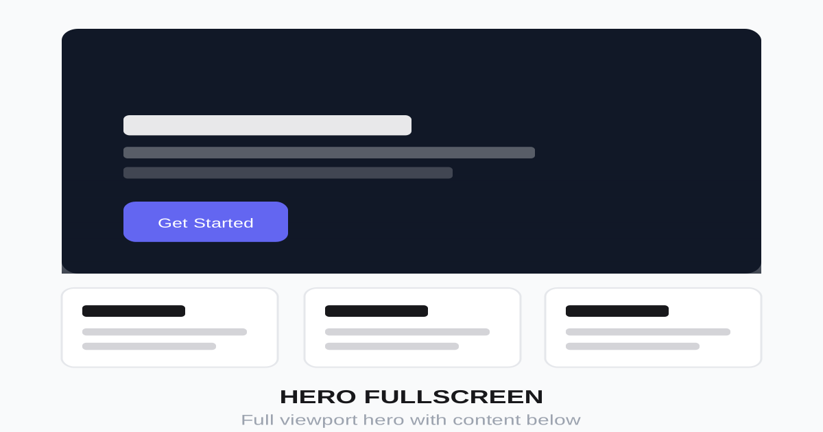
全屏英雄区布局视觉预览
主色#ffffff
次色#000000
强调色 1#ff6b6b
强调色 2#4ecdc4
强调色 3#ffe66d
强调色 4#6c5ce7

AI 实现规则

You are a frontend expert specializing in Fullscreen Hero layout. All generated code must strictly follow these constraints:

## Absolute Prohibitions

- Do NOT place text on busy backgrounds without overlay
- Do NOT use low-quality or stretched images
- Do NOT ignore mobile responsiveness
- Do NOT fill entire viewport with no breathing room
- Do NOT autoplay video with sound

## Must Follow

- Container: min-h-screen or h-screen
- Background: object-cover for images
- Overlay: gradient or solid for text readability
- Content: centered with max-width constraint
- Scroll indicator: at bottom of hero
- Navigation: absolute positioned, transparent

## Structure

Layers (bottom to top):
1. Background image/video (absolute, full cover)
2. Overlay (gradient or solid color)
3. Content (relative z-10, centered)
4. Navigation (absolute top)
5. Scroll indicator (absolute bottom)

## Background Options

Image:
- object-fit: cover
- Full viewport coverage
- High quality, relevant imagery

Video:
- Muted, autoplay, loop
- Fallback poster image
- Pause on mobile (optional)

Overlay types:
- Solid: bg-black/50
- Gradient: from-black/80 via-transparent to-black/30
- Color: bg-brand/70 mix-blend-multiply

## Content

- Badge/label (optional)
- Main headline (large, bold)
- Subheadline (medium)
- CTA buttons (prominent)
- Max-width container (4xl recommended)

## Responsive

Mobile:
- Smaller text sizes
- Stacked CTA buttons
- Simpler background (may hide video)

Desktop:
- Full visual impact
- Side-by-side buttons
- All animations enabled

## Animation & Interaction Rules

### Gravity Focus (CTA Button)
- Resting: shadow-[0_4px_14px_rgba(0,0,0,0.3)]
- Hover: hover:-translate-y-1 hover:shadow-[0_8px_28px_rgba(0,0,0,0.5)] — gravity float with shadow burst
- Active: active:scale-[0.98] active:translate-y-0 active:shadow-[0_2px_8px_rgba(0,0,0,0.3)] — tactile press
- Focus: focus:ring-2 focus:ring-white/80 focus:ring-offset-2 focus:ring-offset-black/50

### Floating Glass (Feature Cards)
- Always use group class on card container
- Hover: hover:-translate-y-2 hover:shadow-[0_16px_40px_rgba(0,0,0,0.5)] — dramatic float
- Icon container: group-hover:scale-110 transition-transform duration-300 ease-out

### Text Reveal on Hover
- h3: group-hover:text-white/95 transition-colors duration-200
- p: group-hover:text-white/85 transition-colors duration-200

### Tactile Confirmation
- All buttons: active:scale-[0.98] — required for perceived responsiveness on dark overlay
- Duration: 200ms ease-out for all interactive elements

## Self-Check

After generating code, verify:
1. Hero is full viewport height
2. Text is readable on background
3. Overlay provides contrast
4. Scroll indicator visible
5. Mobile layout works

组件预览与实现

font-semibold rounded-full transition-all duration-200 bg-white text-black hover:bg-white/90 hover:shadow-lg active:scale-[0.98]
button

英雄区按钮

全屏英雄区 CTA 按钮:重力浮起(hover:-translate-y-1)+ 阴影爆破,active:scale-[0.98] 触觉按压,focus 环在深色背景下可见

<div className="flex flex-col sm:flex-row gap-4">
  {/* Primary CTA — gravity float + shadow burst */}
  <button className="
    px-8 py-4
    bg-white text-black
    font-semibold text-lg
    rounded-full
    shadow-[0_4px_14px_rgba(0,0,0,0.3)]
    hover:bg-white/95 hover:-translate-y-1
    hover:shadow-[0_8px_28px_rgba(0,0,0,0.5)]
    focus:outline-none focus:ring-2 focus:ring-white/80 focus:ring-offset-2 focus:ring-offset-black/50
    active:scale-[0.98] active:translate-y-0 active:shadow-[0_2px_8px_rgba(0,0,0,0.3)]
    transition-all duration-200 ease-out
  ">
    Get Started
  </button>
  {/* Ghost CTA */}
  <button className="
    px-8 py-4
    bg-transparent text-white
    font-semibold text-lg
    rounded-full
    border-2 border-white
    hover:bg-white/15 hover:-translate-y-1
    hover:shadow-[0_8px_28px_rgba(0,0,0,0.3)]
    focus:outline-none focus:ring-2 focus:ring-white/60 focus:ring-offset-2 focus:ring-offset-black/50
    active:scale-[0.98] active:translate-y-0
    transition-all duration-200 ease-out
  ">
    Learn More
  </button>
</div>
card

特性卡片

英雄区特性卡片:group 类触发图标 group-hover:scale-110 微交互,hover:-translate-y-2 重力上浮配阴影爆破

<div className="
  group
  p-8
  bg-white/10 backdrop-blur-sm
  rounded-2xl
  border border-white/20
  hover:bg-white/15 hover:border-white/30
  hover:-translate-y-2
  hover:shadow-[0_16px_40px_rgba(0,0,0,0.5)]
  transition-all duration-300 ease-out
  cursor-pointer
">
  <div className="
    w-12 h-12 bg-white/20 rounded-xl flex items-center justify-center mb-4
    group-hover:scale-110 transition-transform duration-300 ease-out
  ">
    <svg className="w-6 h-6 text-white" fill="none" stroke="currentColor" viewBox="0 0 24 24">
      <path strokeLinecap="round" strokeLinejoin="round" strokeWidth={2} d="M13 10V3L4 14h7v7l9-11h-7z" />
    </svg>
  </div>
  <h3 className="text-xl font-semibold text-white mb-2 group-hover:text-white/95 transition-colors duration-200">
    Feature Title
  </h3>
  <p className="text-white/70 group-hover:text-white/85 transition-colors duration-200">
    Brief description of the feature.
  </p>
</div>
input

邮箱订阅

英雄区的邮箱收集表单

<form className="flex flex-col sm:flex-row gap-3 w-full max-w-md">
  <input
    type="email"
    placeholder="Enter your email"
    className="
      flex-1 px-6 py-4
      bg-white/10 backdrop-blur-sm
      border border-white/30
      rounded-full
      text-white placeholder-white/60
      focus:outline-none focus:ring-2 focus:ring-white/50
    "
  />
  <button className="
    px-8 py-4
    bg-white text-black
    font-semibold
    rounded-full
    hover:bg-white/90
    transition-colors
    whitespace-nowrap
  ">
    Subscribe
  </button>
</form>
nav

透明导航

全屏英雄区顶部的透明导航

<nav className="
  absolute top-0 left-0 right-0 z-50
  px-6 py-4
  flex items-center justify-between
">
  <a href="/" className="text-white text-2xl font-bold">
    Logo
  </a>
  <div className="hidden md:flex items-center gap-8">
    <a href="#" className="text-white/80 hover:text-white transition-colors">Features</a>
    <a href="#" className="text-white/80 hover:text-white transition-colors">Pricing</a>
    <a href="#" className="text-white/80 hover:text-white transition-colors">About</a>
    <button className="px-6 py-2 bg-white text-black rounded-full font-medium hover:bg-white/90 transition-colors">
      Sign Up
    </button>
  </div>
  <button className="md:hidden text-white">
    <svg className="w-6 h-6" fill="none" stroke="currentColor" viewBox="0 0 24 24">
      <path strokeLinecap="round" strokeLinejoin="round" strokeWidth={2} d="M4 6h16M4 12h16M4 18h16" />
    </svg>
  </button>
</nav>
hero

全屏英雄区

完整的全屏英雄区布局

<section className="relative min-h-screen flex items-center justify-center overflow-hidden">
  {/* Background Image */}
  <div className="absolute inset-0">
    <img
      src="/hero-bg.jpg"
      alt=""
      className="w-full h-full object-cover"
    />
    {/* Overlay */}
    <div className="absolute inset-0 bg-black/50" />
    <div className="absolute inset-0 bg-gradient-to-t from-black/80 via-transparent to-black/30" />
  </div>

  {/* Navigation */}
  <nav className="absolute top-0 left-0 right-0 z-50 px-6 py-6 flex items-center justify-between">
    <a href="/" className="text-white text-2xl font-bold">Logo</a>
    <div className="hidden md:flex items-center gap-8">
      <a href="#" className="text-white/80 hover:text-white">Features</a>
      <a href="#" className="text-white/80 hover:text-white">Pricing</a>
      <a href="#" className="text-white/80 hover:text-white">About</a>
      <button className="px-6 py-2 bg-white text-black rounded-full font-medium">Sign Up</button>
    </div>
  </nav>

  {/* Content */}
  <div className="relative z-10 text-center px-4 max-w-4xl mx-auto">
    <span className="inline-block px-4 py-2 bg-white/10 backdrop-blur-sm rounded-full text-white/90 text-sm font-medium mb-6">
      Announcing our new product
    </span>
    <h1 className="text-5xl md:text-7xl font-bold text-white mb-6 leading-tight">
      Build Something
      <span className="text-transparent bg-clip-text bg-gradient-to-r from-cyan-400 to-purple-400"> Amazing</span>
    </h1>
    <p className="text-xl md:text-2xl text-white/80 mb-10 max-w-2xl mx-auto">
      The platform that helps you create incredible experiences your users will love.
    </p>
    <div className="flex flex-col sm:flex-row gap-4 justify-center">
      <button className="px-8 py-4 bg-white text-black font-semibold text-lg rounded-full hover:bg-white/90 transition-colors">
        Get Started Free
      </button>
      <button className="px-8 py-4 bg-transparent text-white font-semibold text-lg rounded-full border-2 border-white hover:bg-white/10 transition-colors">
        Watch Demo
      </button>
    </div>
  </div>

  {/* Scroll Indicator */}
  <div className="absolute bottom-8 left-1/2 -translate-x-1/2 flex flex-col items-center gap-2 text-white/70 animate-bounce">
    <span className="text-sm">Scroll to explore</span>
    <svg className="w-6 h-6" fill="none" stroke="currentColor" viewBox="0 0 24 24">
      <path strokeLinecap="round" strokeLinejoin="round" strokeWidth={2} d="M19 14l-7 7m0 0l-7-7m7 7V3" />
    </svg>
  </div>
</section>

交互展示

适用范围与设计理念

应用场景

marketingportfoliocreative

视觉关键词

全屏英雄区大图视频品牌震撼expressiveboldvibrant表现力

Fullscreen Hero(全屏英雄区布局)是一种以视觉冲击力为核心的布局方式,用全屏图片或视频创造沉浸式第一印象。

核心理念:

- 第一印象:用震撼视觉立即抓住访客

- 品牌表达:通过图像传达品牌调性

- 聚焦核心:突出最重要的信息和行动

- 情感连接:通过视觉建立情感共鸣

设计原则:

- 视觉一致性:所有组件必须遵循统一的视觉语言,从色彩到字体到间距保持谐调

- 层次分明:通过颜色深浅、字号大小、留白空间建立清晰的信息层级

- 交互反馈:每个可交互元素都必须有明确的 hover、active、focus 状态反馈

- 响应式适配:设计必须在移动端、平板、桌面端上保持一致的体验

- 无障碍性:确保色彩对比度符合 WCAG 2.1 AA 标准,所有交互元素可键盘访问

应该这样做

  • 使用 h-screen 或 min-h-screen 确保全屏
  • 图片使用 object-cover 保持比例填充
  • 添加渐变或半透明遮罩保证文字可读
  • 内容绝对定位或 flex 居中
  • 提供滚动提示引导用户往下看
  • 视频背景静音自动播放
  • 提供降级方案(图片替代视频)
  • 主 CTA 按钮 hover:-translate-y-1 + hover:shadow-[0_8px_28px_rgba(0,0,0,0.5)](重力浮起感)
  • 特性卡片使用 group 类 + hover:-translate-y-2 + hover:shadow-[0_16px_40px_rgba(0,0,0,0.5)]
  • 图标容器 group-hover:scale-110 微交互
  • 所有按钮 active:scale-[0.98] active:translate-y-0 + focus:ring-2 focus:ring-white/80 focus:ring-offset-2

避免这样做

  • 禁止文字直接放在复杂背景上无遮罩
  • 禁止使用低质量或拉伸的图片
  • 禁止忽略移动端的适配
  • 禁止内容占据全部空间无留白
  • 禁止视频有声音自动播放
  • 禁止按钮缺少 active:scale-[0.98](全屏背景下按钮无触觉确认感极差)
  • 禁止卡片无 group 类(图标 group-hover:scale-110 微交互依赖 group)

全局 CSS

/* Fullscreen Hero Global Styles */

/* Base hero container */
.hero-fullscreen {
  position: relative;
  min-height: 100vh;
  display: flex;
  align-items: center;
  justify-content: center;
  overflow: hidden;
}

/* Background image/video */
.hero-bg {
  position: absolute;
  inset: 0;
  width: 100%;
  height: 100%;
  object-fit: cover;
}

/* Video background */
.hero-video {
  position: absolute;
  inset: 0;
  width: 100%;
  height: 100%;
  object-fit: cover;
}

/* Overlay variations */
.hero-overlay {
  position: absolute;
  inset: 0;
}

.hero-overlay-dark {
  background: rgba(0, 0, 0, 0.5);
}

.hero-overlay-gradient {
  background: linear-gradient(
    to bottom,
    rgba(0, 0, 0, 0.3) 0%,
    transparent 50%,
    rgba(0, 0, 0, 0.7) 100%
  );
}

.hero-overlay-color {
  background: rgba(99, 102, 241, 0.7);
  mix-blend-mode: multiply;
}

/* Content container */
.hero-content {
  position: relative;
  z-index: 10;
  text-align: center;
  padding: 1rem;
  max-width: 64rem;
}

/* Scroll indicator animation */
@keyframes hero-bounce {
  0%, 100% {
    transform: translateY(0) translateX(-50%);
  }
  50% {
    transform: translateY(10px) translateX(-50%);
  }
}

.hero-scroll-indicator {
  position: absolute;
  bottom: 2rem;
  left: 50%;
  transform: translateX(-50%);
  animation: hero-bounce 2s infinite;
}

/* Parallax effect */
.hero-parallax {
  transform: translateZ(0);
  will-change: transform;
}

/* Ken Burns effect for images */
@keyframes kenburns {
  0% {
    transform: scale(1);
  }
  100% {
    transform: scale(1.1);
  }
}

.hero-kenburns .hero-bg {
  animation: kenburns 20s ease-out forwards;
}

.hero-fullscreen-filter { filter: brightness(1.05) contrast(1.02); }

.hero-fullscreen-focus { outline: 2px solid var(--hero-fullscreen-primary, currentColor); outline-offset: 2px; }

/* Additional techniques */
:root { --hero-fullscreen-radius: 0.75rem; --hero-fullscreen-transition: 0.3s ease; }

.hero-fullscreen-divider::after { content: ""; display: block; width: 3rem; height: 2px; margin-top: 0.5rem; background: var(--hero-fullscreen-primary, currentColor); }

.hero-fullscreen-slant { clip-path: polygon(0 0, 100% 0, 100% calc(100% - 3rem), 0 100%); }

.hero-fullscreen-glass { backdrop-filter: blur(8px) saturate(150%); -webkit-backdrop-filter: blur(8px) saturate(150%); }

布局、色板与 Tokens

主色#ffffff
次色#000000
强调色 1#ff6b6b
强调色 2#4ecdc4
强调色 3#ffe66d
强调色 4#6c5ce7
{
  "border": {
    "width": "border-2",
    "color": "border-white",
    "radius": "rounded-full",
    "style": "border-solid"
  },
  "shadow": {
    "sm": "shadow-none",
    "md": "shadow-none",
    "lg": "shadow-none",
    "none": "shadow-none",
    "hover": "shadow-none",
    "focus": "focus:ring-2 focus:ring-white/50",
    "colored": {}
  },
  "interaction": {
    "transition": "transition-all duration-300",
    "active": "active:scale-95",
    "hoverOpacity": "hover:opacity-90"
  },
  "typography": {
    "heading": "font-bold leading-tight",
    "body": "font-sans",
    "mono": "font-mono",
    "sizes": {
      "hero": "text-5xl md:text-7xl lg:text-8xl",
      "h1": "text-4xl md:text-6xl",
      "h2": "text-3xl md:text-5xl",
      "h3": "text-2xl md:text-3xl",
      "body": "text-lg md:text-xl lg:text-2xl",
      "small": "text-sm md:text-base"
    }
  },
  "spacing": {
    "section": "py-0",
    "container": "px-4 md:px-6 lg:px-8",
    "card": "p-8 md:p-10",
    "gap": {
      "sm": "gap-3 md:gap-4",
      "md": "gap-4 md:gap-6",
      "lg": "gap-6 md:gap-10"
    }
  },
  "colors": {
    "background": {
      "primary": "bg-black",
      "secondary": "bg-black/50",
      "accent": [
        "bg-[#ff6b6b]",
        "bg-[#4ecdc4]",
        "bg-[#ffe66d]",
        "bg-[#6c5ce7]"
      ]
    },
    "text": {
      "primary": "text-white",
      "secondary": "text-white/80",
      "muted": "text-white/60"
    },
    "button": {
      "primary": "bg-white text-black",
      "secondary": "bg-transparent text-white border-2 border-white"
    }
  },
  "forbidden": {
    "classes": [
      "shadow-sm",
      "shadow-md",
      "shadow-lg",
      "shadow-xl",
      "bg-zinc-50",
      "bg-gray-50",
      "bg-white",
      "text-zinc-900",
      "text-gray-900",
      "text-black",
      "border-gray-200",
      "border-zinc-200"
    ],
    "patterns": [
      "^shadow-(?!none)",
      "^bg-(?:zinc|gray)-(?:50|100)",
      "^border-(?:zinc|gray)-"
    ],
    "reasons": {
      "shadow-lg": "Hero Fullscreen uses overlays and contrast instead of shadows",
      "bg-white": "Hero Fullscreen uses dark backgrounds with image/video overlays",
      "text-black": "Hero Fullscreen uses white text on dark overlaid backgrounds"
    }
  },
  "required": {
    "button": [
      "px-8 py-4",
      "font-semibold text-lg",
      "rounded-full",
      "transition-colors"
    ],
    "card": [
      "bg-white/10 backdrop-blur-sm",
      "rounded-2xl",
      "border border-white/20"
    ],
    "input": [
      "bg-white/10 backdrop-blur-sm",
      "border border-white/30",
      "rounded-full",
      "text-white placeholder-white/60",
      "focus:outline-none focus:ring-2 focus:ring-white/50"
    ]
  }
}

示例提示词

产品发布页

新产品发布的震撼首屏

Create a product launch fullscreen hero:
1. Full viewport height with product image background
2. Dark gradient overlay for text contrast
3. Badge: "Announcing [Product Name]"
4. Large headline with gradient text highlight
5. Subheadline describing key benefit
6. Two CTAs: "Pre-order Now" and "Learn More"
7. Scroll indicator at bottom
8. Transparent navbar at top
Modern, tech-forward aesthetic

品牌故事

品牌展示的全屏视觉

Create a brand story fullscreen hero:
1. Video background (lifestyle footage) with muted autoplay
2. Subtle overlay with brand color tint
3. Centered brand logo (large)
4. Brand tagline below logo
5. Single CTA: "Explore Our Story"
6. Social links at bottom corners
7. Sound toggle button (optional)
Elegant, premium brand feel

活动宣传

活动或会议的宣传首屏

Create an event promotion fullscreen hero:
1. Event venue/crowd image as background
2. Strong dark overlay for readability
3. Event name in large display font
4. Date and location prominently shown
5. Countdown timer to event
6. CTA: "Register Now" with early bird badge
7. Speaker photos strip at bottom (optional)
Energetic, exciting event atmosphere