返回风格库
视觉风格expressive

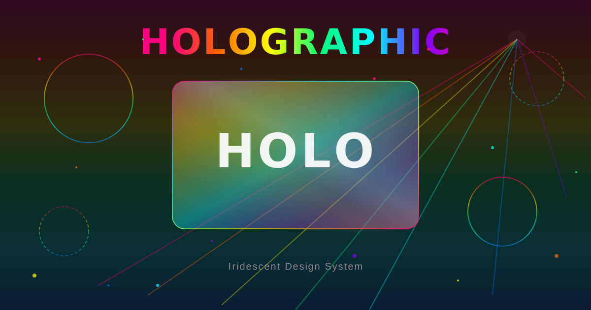
全息渐变

Holographic

彩虹光谱虹彩渐变美学,模拟全息投影的棱镜折射与动态光效,营造超凡脱俗的虹彩体验。

全息渐变视觉预览
主色#a855f7
次色#0a0a1f
强调色 1#ff0080
强调色 2#ffd700
强调色 3#00d4ff
强调色 4#00ff88
强调色 5#6366f1

AI 实现规则

## Holographic Style Rules
- Background: Deep dark (#0a0a1f or #1a0b2e) - cosmic/space feel
- Primary effect: Rainbow spectrum gradients using linear-gradient with 3+ stops
- Gradient colors: #ff0080 -> #ff6b00 -> #ffd700 -> #00ff88 -> #00d4ff -> #6366f1 -> #a855f7
- Cards: Semi-transparent (bg-white/5 to bg-white/10) with backdrop-blur
- Text highlights: Use bg-clip-text with gradient for headings
- Borders: Subtle white/10 to white/20 with purple/prismatic glow on hover
- Animate gradients: Use background-size: 200% and animate background-position
- Holographic badges: Small elements with full rainbow gradient + shimmer overlay
- All interactive elements should have prismatic box-shadow on hover
- Never use light/white backgrounds
- Never use flat solid colors without gradient treatment
- Never use muted or desaturated color palettes

## Animation & Interaction Rules

### Spectrum Shift (Gradient Slide)
- Apply bg-[length:200%_auto] to all gradient buttons and card headings
- On hover: hover:bg-right — gradient slides laterally, simulating angle-dependent holographic foil color shift
- Transition: transition-[background-position] duration-500 (smooth spectrum sweep)
- NEVER use hover:bg-right without bg-[length:200%_auto] (no movement without oversized gradient)

### Prismatic Glow (Multi-Color Shadow)
- Button hover: hover:shadow-[0_0_40px_rgba(0,212,255,0.6),0_0_20px_rgba(255,0,128,0.4)] — dual cyan+magenta glows
- Card hover: hover:shadow-[0_0_30px_rgba(147,51,234,0.3)] — purple prism glow
- Resting shadow always present: shadow-[0_0_20px_rgba(147,51,234,0.5)]

### Liquid Glass (Card Float)
- Always use group class on card containers
- Cards: hover:-translate-y-2 hover:bg-white/10 hover:border-purple-400/40
- Card headings use Spectrum Shift synchronized with card hover via group-hover:bg-right

### Jelly Press (Active State)
- All buttons: active:scale-95 active:translate-y-0 — jelly press confirms interaction
- Focus: focus:ring-2 focus:ring-purple-400 focus:ring-offset-2 focus:ring-offset-[#0a0a1f]
- ring-offset-[#0a0a1f] mandatory — ring invisible on dark cosmic background without it

### Duration
- Button transitions: duration-500 ease-out (slow = luxurious holographic feel)
- Card transitions: duration-300 ease-out

组件预览与实现

font-sans font-medium rounded-xl transition-all duration-200 bg-gradient-to-r from-purple-500 via-pink-500 to-cyan-500 text-white shadow-[0_0_20px_rgba(168,85,247,0.3)] hover:shadow-[0_0_30px_rgba(168,85,247,0.4)] active:scale-[0.98]
button

按钮

全息渐变按钮:bg-[length:200%_auto] + hover:bg-right 产生横向光谱位移(模拟全息箔随角度变色),棱镜双色光晕,active:scale-95 果冻按压,focus:ring-offset-[#0a0a1f]

<button className="
  px-8 py-3.5 rounded-xl font-bold tracking-wide
  text-white
  bg-gradient-to-r from-[#ff0080] via-[#ffd700] to-[#00d4ff]
  bg-[length:200%_auto]
  shadow-[0_0_20px_rgba(147,51,234,0.5)]
  hover:bg-right
  hover:shadow-[0_0_40px_rgba(0,212,255,0.6),0_0_20px_rgba(255,0,128,0.4)]
  hover:-translate-y-1
  focus:outline-none focus:ring-2 focus:ring-purple-400 focus:ring-offset-2 focus:ring-offset-[#0a0a1f]
  active:scale-95 active:translate-y-0
  active:shadow-[0_0_10px_rgba(147,51,234,0.5)]
  transition-all duration-500 ease-out
">
  Activate Portal
</button>
card

卡片

全息玻璃卡片:group 类触发标题 Spectrum Shift(bg-[length:200%_auto] group-hover:bg-right),hover:-translate-y-2 悬浮配棱镜双色光晕

<div className="
  group
  bg-white/5 backdrop-blur-xl rounded-2xl p-6
  border border-white/10 shadow-xl
  hover:bg-white/10 hover:border-purple-400/40
  hover:-translate-y-2
  hover:shadow-[0_0_30px_rgba(147,51,234,0.3)]
  transition-all duration-300 ease-out
  cursor-pointer
">
  <h3 className="
    text-lg font-bold mb-2
    text-transparent bg-clip-text
    bg-gradient-to-r from-[#ff0080] via-[#ffd700] to-[#00d4ff]
    bg-[length:200%_auto] group-hover:bg-right
    transition-[background-position] duration-500
  ">
    Holographic Card
  </h3>
  <p className="text-white/60 text-sm group-hover:text-white/75 transition-colors duration-300">
    Prismatic glass panel with rainbow border glow
  </p>
</div>
input

输入框

全息风格输入框,紫色聚焦光晕

<input
  type="text"
  placeholder="Enter text..."
  className="
    w-full px-4 py-3
    bg-white/5 backdrop-blur-md
    border border-white/15 rounded-xl
    text-white placeholder:text-white/30
    focus:outline-none
    focus:border-purple-400/50
    focus:shadow-[0_0_15px_rgba(147,51,234,0.3)]
    transition-all
  "
/>
nav

导航栏

全息风格导航,半透明深空背景

<nav className="
  bg-[#0a0a1f]/90 backdrop-blur-xl
  border border-white/10
  px-6 py-4
">
  <div className="flex items-center justify-between max-w-7xl mx-auto">
    <span className="font-bold text-transparent bg-clip-text bg-gradient-to-r from-[#ff0080] via-[#ffd700] to-[#00d4ff]">
      Holographic
    </span>
    <div className="flex gap-6 text-white/60">
      <a className="hover:text-white transition-colors">Features</a>
      <a className="hover:text-white transition-colors">About</a>
    </div>
  </div>
</nav>
hero

Hero 区块

全息风格 Hero,彩虹渐变标题配宇宙深空背景

<section className="relative bg-[#0a0a1f] overflow-hidden min-h-screen flex items-center justify-center">
  <div className="text-center px-6">
    <h1 className="text-6xl md:text-8xl font-bold text-transparent bg-clip-text bg-gradient-to-r from-[#ff0080] via-[#ffd700] to-[#00d4ff] mb-6">
      Holographic
    </h1>
    <p className="text-white/60 text-xl max-w-lg mx-auto mb-8">
      Prismatic rainbow gradients that shift and shimmer
    </p>
    <button className="px-8 py-4 bg-gradient-to-r from-[#ff0080] via-[#7928ca] to-[#00d4ff] text-white font-medium rounded-xl shadow-[0_0_30px_rgba(147,51,234,0.5)] hover:shadow-[0_0_50px_rgba(147,51,234,0.7)] hover:scale-105 transition-all">
      Explore
    </button>
  </div>
</section>
footer

页脚

全息风格页脚,深空背景

<footer className="bg-[#0a0a1f] border border-white/10 py-8 px-6">
  <div className="max-w-7xl mx-auto flex justify-between items-center">
    <span className="text-white/40 text-sm">Holographic Style</span>
    <span className="text-white/40 text-sm">UI Library</span>
  </div>
</footer>

交互展示

适用范围与设计理念

应用场景

creativemarketing

视觉关键词

high-contrastholographiciridescentrainbowprismaticgradientspectrumfoil全息虹彩棱镜

Holographic(全息渐变)模拟全息箔片的棱镜之美——彩虹光谱渐变随视角变化而流转,营造超凡脱俗的虹彩体验。

核心理念:

- 棱镜折射:多色光谱渐变,3个以上色停

- 宇宙深空:深色背景让全息元素跃然而出

- 动态光效:渐变位移动画模拟全息箔片的角度变化

- 半透明层叠:玻璃质感卡片配合背景模糊

设计原则:

- 视觉一致性:所有组件必须遵循统一的视觉语言,从色彩到字体到间距保持谐调

- 层次分明:通过颜色深浅、字号大小、留白空间建立清晰的信息层级

- 交互反馈:每个可交互元素都必须有明确的 hover、active、focus 状态反馈

- 响应式适配:设计必须在移动端、平板、桌面端上保持一致的体验

- 无障碍性:确保色彩对比度符合 WCAG 2.1 AA 标准,所有交互元素可键盘访问

应该这样做

  • Use multi-color gradient backgrounds (linear-gradient with 3+ color stops)
  • Apply background-size animation for moving gradient effects
  • Use semi-transparent cards over dark cosmic backgrounds
  • Add prismatic box-shadow with multiple colored glows
  • Include holographic sticker badges with full spectrum gradients
  • Use dark purple/navy backgrounds (#0a0a1f, #1a0b2e) to make holographic elements pop
  • Spectrum Shift: use bg-[length:200%_auto] on gradient buttons + hover:bg-right for lateral color flow (simulates angle-dependent holographic foil)
  • Prismatic Glow: buttons hover to multi-color shadow hover:shadow-[0_0_40px_rgba(0,212,255,0.6),0_0_20px_rgba(255,0,128,0.4)]
  • Buttons must have active:scale-95 + focus:ring-2 focus:ring-purple-400 focus:ring-offset-2 focus:ring-offset-[#0a0a1f]
  • Card gradient text uses bg-[length:200%_auto] + group-hover:bg-right for synchronized color shift

避免这样做

  • Don't use flat solid colors without gradient
  • Don't use light/white backgrounds (kills the holographic effect)
  • Don't use muted or desaturated colors
  • Don't use sharp corners without any glow
  • Don't use more than 2 non-gradient elements in a row
  • Don't use hover:scale-105 alone — always combine with gradient shift (hover:bg-right) and prismatic shadow
  • Don't omit active:scale-95 from buttons (no tactile confirmation)
  • Don't use focus:ring without focus:ring-offset-[#0a0a1f] (ring invisible on dark cosmic background)

全局 CSS

/* Holographic 全局样式 */

:root {
  --holo-pink: #ff0080;
  --holo-orange: #ff6b00;
  --holo-gold: #ffd700;
  --holo-green: #00ff88;
  --holo-cyan: #00d4ff;
  --holo-indigo: #6366f1;
  --holo-purple: #a855f7;
}

@keyframes holo-gradient-shift {
  0% { background-position: 0% 50%; }
  50% { background-position: 100% 50%; }
  100% { background-position: 0% 50%; }
}

@keyframes holo-shimmer {
  0% { transform: translateX(-100%) rotate(15deg); }
  100% { transform: translateX(200%) rotate(15deg); }
}

@keyframes holo-rotate {
  0% { filter: hue-rotate(0deg); }
  100% { filter: hue-rotate(360deg); }
}

/* 全息渐变背景 */
.holo-gradient {
  background: linear-gradient(
    135deg,
    var(--holo-pink),
    var(--holo-orange),
    var(--holo-gold),
    var(--holo-green),
    var(--holo-cyan),
    var(--holo-indigo),
    var(--holo-purple)
  );
  background-size: 200% 200%;
  animation: holo-gradient-shift 6s ease infinite;
}

/* 全息微光覆盖 */
.holo-shimmer::after {
  content: "";
  position: absolute;
  inset: 0;
  background: linear-gradient(
    105deg,
    transparent 40%,
    rgba(255, 255, 255, 0.15) 45%,
    rgba(255, 255, 255, 0.05) 55%,
    transparent 60%
  );
  animation: holo-shimmer 3s ease-in-out infinite;
}
.holographic-frosted {
  backdrop-filter: blur(12px) saturate(180%);
  -webkit-backdrop-filter: blur(12px) saturate(180%);
  background: rgba(168, 85, 247, 0.08);
}

.holographic-accent-corner {
  clip-path: polygon(0 0, 100% 0, 100% calc(100% - 2rem), calc(100% - 2rem) 100%, 0 100%);
}

.holographic-animate-in {
  animation: holographic-fade-in 0.5s ease-out both;
}

布局、色板与 Tokens

主色#a855f7
次色#0a0a1f
强调色 1#ff0080
强调色 2#ffd700
强调色 3#00d4ff
强调色 4#00ff88
强调色 5#6366f1
{
  "border": {
    "width": "border",
    "color": "border-white/10",
    "radius": "rounded-2xl",
    "style": "border-solid"
  },
  "shadow": {
    "sm": "shadow-[0_0_15px_rgba(147,51,234,0.2)]",
    "md": "shadow-[0_0_25px_rgba(147,51,234,0.4)]",
    "lg": "shadow-[0_0_50px_rgba(147,51,234,0.6)]",
    "none": "shadow-none",
    "hover": "shadow-[0_0_30px_rgba(147,51,234,0.4)]",
    "focus": "shadow-[0_0_20px_rgba(147,51,234,0.4)]",
    "colored": {
      "purple": "shadow-[0_0_20px_rgba(147,51,234,0.5)]",
      "pink": "shadow-[0_0_20px_rgba(255,0,128,0.5)]",
      "cyan": "shadow-[0_0_20px_rgba(0,212,255,0.5)]"
    }
  },
  "interaction": {
    "transition": "transition-all duration-500",
    "active": "active:scale-95",
    "hoverScale": "hover:shadow-[0_0_30px_rgba(147,51,234,0.4)] hover:border-purple-400/30 hover:scale-[1.02]"
  },
  "typography": {
    "heading": "font-sans font-bold",
    "body": "font-sans text-sm",
    "mono": "font-mono",
    "sizes": {
      "hero": "text-5xl md:text-7xl lg:text-8xl",
      "h1": "text-4xl md:text-6xl",
      "h2": "text-2xl md:text-4xl",
      "h3": "text-xl md:text-2xl",
      "body": "text-sm md:text-base",
      "small": "text-xs"
    }
  },
  "spacing": {
    "section": "py-16 px-6 md:px-8",
    "container": "px-4 md:px-8",
    "card": "p-6",
    "gap": {
      "sm": "gap-4",
      "md": "gap-6",
      "lg": "gap-8"
    }
  },
  "colors": {
    "background": {
      "primary": "bg-[#0a0a1f]",
      "secondary": "bg-[#1a0b2e]",
      "accent": [
        "bg-purple-500/10",
        "bg-pink-500/10",
        "bg-cyan-500/10"
      ]
    },
    "text": {
      "primary": "text-white",
      "secondary": "text-white/70",
      "muted": "text-white/40"
    },
    "button": {
      "primary": "bg-gradient-to-r from-[#ff0080] via-[#7928ca] to-[#00d4ff] text-white",
      "secondary": "bg-white/10 text-white border border-white/20",
      "danger": "bg-red-500/80 text-white"
    }
  },
  "forbidden": {
    "classes": [
      "bg-white",
      "bg-gray-50",
      "bg-gray-100",
      "shadow-sm",
      "shadow-md",
      "shadow-lg",
      "text-gray-900",
      "text-black",
      "rounded-none",
      "border-black",
      "border-gray-300"
    ],
    "patterns": [
      "^bg-white",
      "^bg-gray-[1-3]",
      "^bg-slate-[1-3]",
      "^shadow-(?!\\[)"
    ],
    "reasons": {
      "bg-white": "Holographic style requires dark backgrounds to make prismatic effects pop",
      "shadow-md": "Use prismatic glow shadows: shadow-[0_0_20px_rgba(147,51,234,0.5)]",
      "text-black": "Use text-white or gradient text on dark backgrounds"
    }
  },
  "required": {
    "button": [
      "rounded-",
      "bg-gradient-",
      "transition-all",
      "shadow-[0_0_"
    ],
    "card": [
      "backdrop-blur",
      "bg-white/",
      "rounded-",
      "border"
    ],
    "input": [
      "backdrop-blur",
      "bg-white/",
      "rounded-",
      "focus:border-purple",
      "focus:shadow-[0_0_"
    ]
  }
}

示例提示词

全息产品卡片

彩虹渐变边框 + 微光效果

用 Holographic 风格创建一个产品展示卡片,要求:
1. 深色宇宙背景 #0a0a1f
2. 半透明玻璃卡片 bg-white/5 backdrop-blur
3. 彩虹渐变边框,悬浮时棱镜光晕
4. 标题使用 bg-clip-text 彩虹渐变
5. 全息贴纸徽章装饰

全息定价页

虹彩全息等级徽章

用 Holographic 风格创建定价页面,要求:
1. 三个定价等级卡片
2. 每个等级使用不同的全息渐变
3. 推荐等级添加动态渐变动画
4. 全息箔片风格的徽章标记

作品集展示

生成 全息渐变风格的作品集页面

Create a portfolio showcase page using Holographic style with project grid, about section, contact form, and consistent visual language.