返回风格库
布局风格modern

圣杯布局

Holy Grail Layout

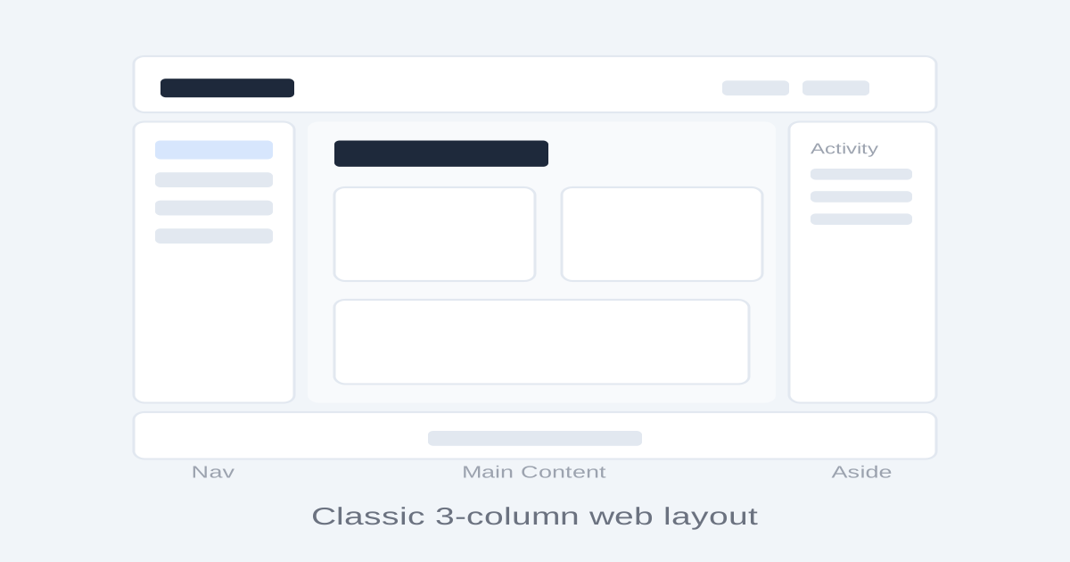
经典的三栏式网页布局,由固定页头、三列中间区域(左侧导航、主内容、右侧边栏)和固定页脚组成,是Web设计的基础布局范式。

圣杯布局视觉预览
主色#1e293b
次色#f1f5f9
强调色 1#3b82f6
强调色 2#10b981
强调色 3#f59e0b
强调色 4#ef4444

AI 实现规则

你是一个 Holy Grail Layout 布局专家。生成的所有代码必须严格遵守以下约束:

## 布局结构

五个区域:
1. Header:固定顶部,品牌 + 导航
2. Left Sidebar:固定宽度,导航菜单
3. Main Content:自适应宽度,主内容
4. Right Sidebar:固定宽度,辅助信息
5. Footer:固定底部,版权信息

## 实现规则

- 使用 Flexbox:外层 flex flex-col min-h-screen
- 三列区域:flex flex-1
- 侧边栏:固定宽度 w-60 / w-64 flex-shrink-0
- 主内容:flex-1 min-w-0
- 页头:sticky top-0 z-50
- 等高列:三列自动等高

## 响应式

大屏幕(>1024px):完整三列
中等屏幕(768-1024px):隐藏右侧边栏
小屏幕(<768px):所有列垂直堆叠

## Animation & Interaction Rules

### Content Supremacy (Card Float)
- Cards in main content: hover:-translate-y-0.5 hover:shadow-md — minimal, non-distracting float
- NEVER use hover:-translate-y-2 or larger (breaks reading focus)
- Transition: duration-150 ease-out (crisp productivity tool rhythm)

### Navigation Anchoring (Sidebar Links)
- Inactive nav items: hover:border-2 hover:border-[#3b82f6] hover:bg-gray-50 — complete-border highlight
- NEVER add vertical displacement to sidebar nav (anchoring feel requires stability)
- Active item: bg-[#3b82f6]/10 text-[#3b82f6] — always-visible active state

### Crisp Performance (Duration Standard)
- All transitions: duration-150 ease-out — productivity tools must feel instant
- NEVER exceed duration-200 for any interactive element

### Button Physics
- Hover: hover:-translate-y-0.5 hover:shadow-[0_4px_10px_rgba(59,130,246,0.4)]
- Active: active:scale-[0.98] active:translate-y-0 active:shadow-none — tactile micropress
- Focus: focus:ring-2 focus:ring-[#3b82f6] focus:ring-offset-2 (WCAG 2.1 AA)

## 自检

1. 页头固定在顶部
2. 三列等高
3. 主内容区自适应
4. 侧边栏固定宽度
5. 页脚始终在底部
6. 响应式折叠正确

组件预览与实现

font-medium rounded-lg transition-colors duration-200 bg-[#3b82f6] text-white hover:bg-[#2563eb] active:bg-[#1d4ed8]
button

按钮

圣杯布局三态按钮:hover:-translate-y-0.5 轻量浮起,active:scale-[0.98] 触觉按压,focus:ring-2 WCAG 焦点环,duration-150 crisp 响应

<button className="
  px-4 py-2
  bg-[#3b82f6] text-white
  rounded-lg
  font-medium text-sm
  hover:bg-[#2563eb] hover:-translate-y-0.5
  hover:shadow-[0_4px_10px_rgba(59,130,246,0.4)]
  focus:outline-none focus:ring-2 focus:ring-[#3b82f6] focus:ring-offset-2
  active:scale-[0.98] active:bg-[#1d4ed8] active:translate-y-0 active:shadow-none
  transition-all duration-150 ease-out
">
  Action
</button>
card

卡片

主内容区内容卡片:hover:-translate-y-0.5 轻量上浮 + hover:shadow-md(不干扰阅读的最小运动),duration-150 利落响应

<div className="
  p-6
  bg-white
  rounded-xl
  shadow-sm
  border border-gray-100
  hover:-translate-y-0.5 hover:shadow-md
  transition-all duration-150 ease-out
">
  <h3 className="text-lg font-semibold text-[#1e293b] mb-2">
    Content Card
  </h3>
  <p className="text-gray-600 text-sm leading-relaxed">
    Main content displayed in the center column of the holy grail layout.
  </p>
</div>
input

输入框

搜索输入框

<input
  type="text"
  placeholder="Search..."
  className="
    w-full px-3 py-2
    bg-gray-50
    border border-gray-200
    rounded-lg
    text-sm text-[#1e293b] placeholder-gray-400
    focus:outline-none focus:ring-2 focus:ring-[#3b82f6]/20
    focus:border-[#3b82f6]
    transition-all
  "
/>
hero

圣杯布局完整示例

圣杯布局的完整页面结构

<div className="min-h-screen flex flex-col bg-[#f1f5f9]">
  {/* 页头 */}
  <header className="sticky top-0 z-50 bg-white border border-gray-200 shadow-sm">
    <div className="px-6 py-3 flex items-center justify-between">
      <h1 className="text-lg font-bold text-[#1e293b]">Holy Grail</h1>
      <nav className="flex gap-4 text-sm text-gray-600">
        <a href="#" className="hover:text-[#1e293b]">Home</a>
        <a href="#" className="hover:text-[#1e293b]">Docs</a>
        <a href="#" className="hover:text-[#1e293b]">API</a>
      </nav>
    </div>
  </header>

  {/* 三列主体 */}
  <div className="flex-1 flex">
    {/* 左侧导航 */}
    <aside className="w-60 bg-white border border-gray-200 p-4 flex-shrink-0">
      <nav className="space-y-1">
        <a href="#" className="block px-3 py-2 text-sm bg-[#3b82f6]/10 text-[#3b82f6] rounded-lg font-medium">
          Dashboard
        </a>
        <a href="#" className="block px-3 py-2 text-sm text-gray-600 hover:border-2 hover:border-[#3b82f6] hover:bg-gray-50 rounded-lg transition-all duration-150">
          Projects
        </a>
        <a href="#" className="block px-3 py-2 text-sm text-gray-600 hover:border-2 hover:border-[#3b82f6] hover:bg-gray-50 rounded-lg transition-all duration-150">
          Settings
        </a>
      </nav>
    </aside>

    {/* 主内容区 */}
    <main className="flex-1 p-6">
      <h2 className="text-2xl font-bold text-[#1e293b] mb-4">Dashboard</h2>
      <div className="grid grid-cols-2 gap-4">
        <div className="bg-white rounded-xl p-6 shadow-sm border border-gray-100">
          <h3 className="font-medium text-gray-700 mb-1">Metric</h3>
          <p className="text-3xl font-bold text-[#1e293b]">1,234</p>
        </div>
        <div className="bg-white rounded-xl p-6 shadow-sm border border-gray-100">
          <h3 className="font-medium text-gray-700 mb-1">Revenue</h3>
          <p className="text-3xl font-bold text-[#10b981]">$5,678</p>
        </div>
      </div>
    </main>

    {/* 右侧边栏 */}
    <aside className="w-64 bg-white border border-gray-200 p-4 flex-shrink-0">
      <h4 className="text-sm font-medium text-gray-500 mb-3">Activity</h4>
      <div className="space-y-3 text-sm text-gray-600">
        <div className="pb-3 border border-gray-100">New user signed up</div>
        <div className="pb-3 border border-gray-100">Order completed</div>
        <div>Invoice sent</div>
      </div>
    </aside>
  </div>

  {/* 页脚 */}
  <footer className="bg-white border border-gray-200">
    <div className="px-6 py-4 text-center text-sm text-gray-500">
      Holy Grail Layout - Header, 3 columns, Footer
    </div>
  </footer>
</div>

交互展示

适用范围与设计理念

应用场景

docsblogadmin

视觉关键词

responsive三栏圣杯经典页头页脚侧边栏导航moderncontemporarysleek

Holy Grail Layout 是Web设计中追求已久的经典布局方案,包含固定的页头页脚和三列中间内容区。这个名字来源于CSS布局早期实现这种布局的困难程度。

核心理念:

- 结构清晰:页头、三列内容、页脚五个区域各司其职

- 主内容优先:HTML 源码中主内容先于侧边栏,利于 SEO

- 等高列:三列无论内容多少都保持等高

- 灵活适配:侧边栏固定宽度,主内容区自适应

设计原则:

- 视觉一致性:所有组件必须遵循统一的视觉语言,从色彩到字体到间距保持谐调

- 层次分明:通过颜色深浅、字号大小、留白空间建立清晰的信息层级

- 交互反馈:每个可交互元素都必须有明确的 hover、active、focus 状态反馈

- 响应式适配:设计必须在移动端、平板、桌面端上保持一致的体验

- 无障碍性:确保色彩对比度符合 WCAG 2.1 AA 标准,所有交互元素可键盘访问

应该这样做

  • 使用 CSS Grid 或 Flexbox 实现等高三列
  • 固定页头和页脚 sticky top-0 / sticky bottom-0
  • 主内容区 flex-1 自适应宽度
  • 左侧导航栏固定宽度 w-60 或 w-64
  • 右侧边栏固定宽度 w-64 或 w-72
  • 主内容在源码中先于侧边栏
  • 响应式折叠侧边栏
  • 所有按钮 active:scale-[0.98] active:translate-y-0 + focus:ring-2 focus:ring-[#3b82f6] focus:ring-offset-2
  • 内容卡片 hover:-translate-y-0.5 hover:shadow-md(轻量上浮,不干扰阅读)
  • 侧边导航 hover 时完整边框高亮 hover:border-2 hover:border-[#3b82f6](无垂直位移,保持锚定感)
  • 所有动画 duration-150 ease-out(生产力工具要求响应利落)

避免这样做

  • 禁止三列高度不一致
  • 禁止主内容区域过窄
  • 禁止忽略响应式折叠
  • 禁止侧边栏宽度随内容变化
  • 禁止页头页脚不固定
  • 禁止卡片大幅位移动画(阅读场景下大幅运动破坏专注)
  • 禁止动画 duration 超过 200ms(生产力工具应当响应利落)
  • 禁止按钮缺少 active:scale-[0.98](无触觉确认)
  • 禁止侧边导航 hover 时有垂直位移(锚定感要求无移动)

全局 CSS

/* Holy Grail Layout 全局样式 */

/* 圣杯布局容器 */
.holy-grail {
  display: flex;
  flex-direction: column;
  min-height: 100vh;
}

/* 页头 */
.holy-grail-header {
  position: sticky;
  top: 0;
  z-index: 50;
  background: white;
  border: 1px solid #e2e8f0;
}

/* 三列主体 */
.holy-grail-body {
  display: flex;
  flex: 1;
}

/* 左侧导航栏 */
.holy-grail-nav {
  width: 240px;
  flex-shrink: 0;
  background: white;
  border: 1px solid #e2e8f0;
  padding: 1rem;
}

/* 主内容区 */
.holy-grail-main {
  flex: 1;
  padding: 1.5rem;
  min-width: 0;
}

/* 右侧边栏 */
.holy-grail-aside {
  width: 256px;
  flex-shrink: 0;
  background: white;
  border: 1px solid #e2e8f0;
  padding: 1rem;
}

/* 页脚 */
.holy-grail-footer {
  background: white;
  border: 1px solid #e2e8f0;
  padding: 1rem 1.5rem;
  text-align: center;
}

/* 响应式 */
@media (max-width: 1024px) {
  .holy-grail-aside {
    display: none;
  }
}

@media (max-width: 768px) {
  .holy-grail-body {
    flex-direction: column;
  }
  .holy-grail-nav {
    width: 100%;
    border: none;
    border: 1px solid #e2e8f0;
  }
}
/* Holy Grail Layout Design Tokens */
:root {
  --holy-grail-layout-primary: #1e293b;
  --holy-grail-layout-secondary: #f1f5f9;
  --holy-grail-layout-accent: #3b82f6;
  --holy-grail-layout-glow: rgba(30, 41, 59, 0.3);
}

@keyframes holy-grail-layout-fade-in {
  from { opacity: 0; transform: translateY(8px); }
  to { opacity: 1; transform: translateY(0); }
}

@keyframes holy-grail-layout-pulse {
  0%, 100% { opacity: 1; }
  50% { opacity: 0.7; }
}

.holy-grail-layout-card {
  position: relative;
  overflow: hidden;
}

.holy-grail-layout-card::before {
  content: "";
  position: absolute;
  inset: 0;
  opacity: 0;
  transition: opacity 0.3s ease;
  background: linear-gradient(135deg, rgba(30, 41, 59, 0.05), transparent);
  pointer-events: none;
}

.holy-grail-layout-card:hover::before {
  opacity: 1;
}

.holy-grail-layout-gradient {
  background: linear-gradient(135deg, #1e293b, #3b82f6);
}

.holy-grail-layout-gradient-text {
  background: linear-gradient(135deg, #1e293b, #3b82f6);
  -webkit-background-clip: text;
  -webkit-text-fill-color: transparent;
  background-clip: text;
}

.holy-grail-layout-frosted {
  backdrop-filter: blur(12px) saturate(180%);
  -webkit-backdrop-filter: blur(12px) saturate(180%);
  background: rgba(30, 41, 59, 0.08);
}

.holy-grail-layout-accent-corner {
  clip-path: polygon(0 0, 100% 0, 100% calc(100% - 2rem), calc(100% - 2rem) 100%, 0 100%);
}

.holy-grail-layout-animate-in {
  animation: holy-grail-layout-fade-in 0.5s ease-out both;
}

布局、色板与 Tokens

主色#1e293b
次色#f1f5f9
强调色 1#3b82f6
强调色 2#10b981
强调色 3#f59e0b
强调色 4#ef4444
{
  "border": {
    "width": "border",
    "color": "border-gray-200",
    "radius": "rounded-xl",
    "style": "border-solid"
  },
  "shadow": {
    "sm": "shadow-sm",
    "md": "shadow-sm",
    "lg": "shadow-md",
    "none": "shadow-none",
    "hover": "hover:shadow-md",
    "focus": "focus:shadow-sm",
    "colored": {}
  },
  "interaction": {
    "transition": "transition-colors duration-200",
    "active": "active:scale-95",
    "hoverOpacity": "hover:opacity-90"
  },
  "typography": {
    "heading": "font-semibold tracking-tight",
    "body": "font-sans",
    "mono": "font-mono",
    "sizes": {
      "hero": "text-2xl md:text-3xl",
      "h1": "text-xl md:text-2xl",
      "h2": "text-lg md:text-xl",
      "h3": "text-base md:text-lg",
      "body": "text-sm md:text-base",
      "small": "text-xs"
    }
  },
  "spacing": {
    "section": "py-4 md:py-6",
    "container": "px-4 md:px-6",
    "card": "p-4 md:p-6",
    "gap": {
      "sm": "gap-2 md:gap-3",
      "md": "gap-3 md:gap-4",
      "lg": "gap-4 md:gap-6"
    }
  },
  "colors": {
    "background": {
      "primary": "bg-[#f1f5f9]",
      "secondary": "bg-white",
      "accent": [
        "bg-[#3b82f6]",
        "bg-[#10b981]",
        "bg-[#f59e0b]",
        "bg-[#ef4444]"
      ]
    },
    "text": {
      "primary": "text-[#1e293b]",
      "secondary": "text-gray-600",
      "muted": "text-gray-400"
    },
    "button": {
      "primary": "bg-[#3b82f6] text-white",
      "secondary": "bg-gray-100 text-gray-700",
      "danger": "bg-[#ef4444] text-white"
    }
  },
  "forbidden": {
    "classes": [
      "rounded-none",
      "shadow-2xl",
      "font-black",
      "font-extrabold",
      "text-5xl",
      "text-6xl",
      "text-7xl",
      "text-8xl"
    ],
    "patterns": [
      "^rounded-none$",
      "^shadow-2xl",
      "^text-[5-8]xl"
    ],
    "reasons": {
      "rounded-none": "Holy Grail Layout uses moderate rounding (rounded-xl) for a professional look",
      "shadow-2xl": "Holy Grail Layout uses subtle shadows befitting a standard web layout",
      "text-6xl": "Holy Grail Layout uses moderate type sizes for balanced three-column reading"
    }
  },
  "required": {
    "button": [
      "rounded-lg",
      "font-medium text-sm",
      "transition-colors"
    ],
    "card": [
      "bg-white",
      "rounded-xl",
      "shadow-sm",
      "border border-gray-100"
    ],
    "input": [
      "bg-gray-50",
      "border border-gray-200",
      "rounded-lg",
      "text-sm",
      "focus:outline-none",
      "focus:ring-2 focus:ring-[#3b82f6]/20 focus:border-[#3b82f6]",
      "transition-all"
    ]
  }
}

示例提示词

管理后台

圣杯布局的管理后台

用 Holy Grail Layout 设计一个管理后台,要求:
1. 页头:logo + 搜索框 + 用户头像
2. 左侧导航:图标 + 文字菜单项
3. 主内容:数据卡片 + 表格
4. 右侧边栏:通知列表 + 快捷操作
5. 页脚:版权信息
6. 页头 sticky 固定,三列等高
7. 响应式折叠侧边栏

SaaS 着陆页

生成 圣杯布局风格的 SaaS 产品着陆页

Create a SaaS landing page using Holy Grail Layout style with hero section, feature grid, testimonials, pricing table, and footer.

作品集展示

生成 圣杯布局风格的作品集页面

Create a portfolio showcase page using Holy Grail Layout style with project grid, about section, contact form, and consistent visual language.