返回风格库
视觉风格expressive

油画印象派风

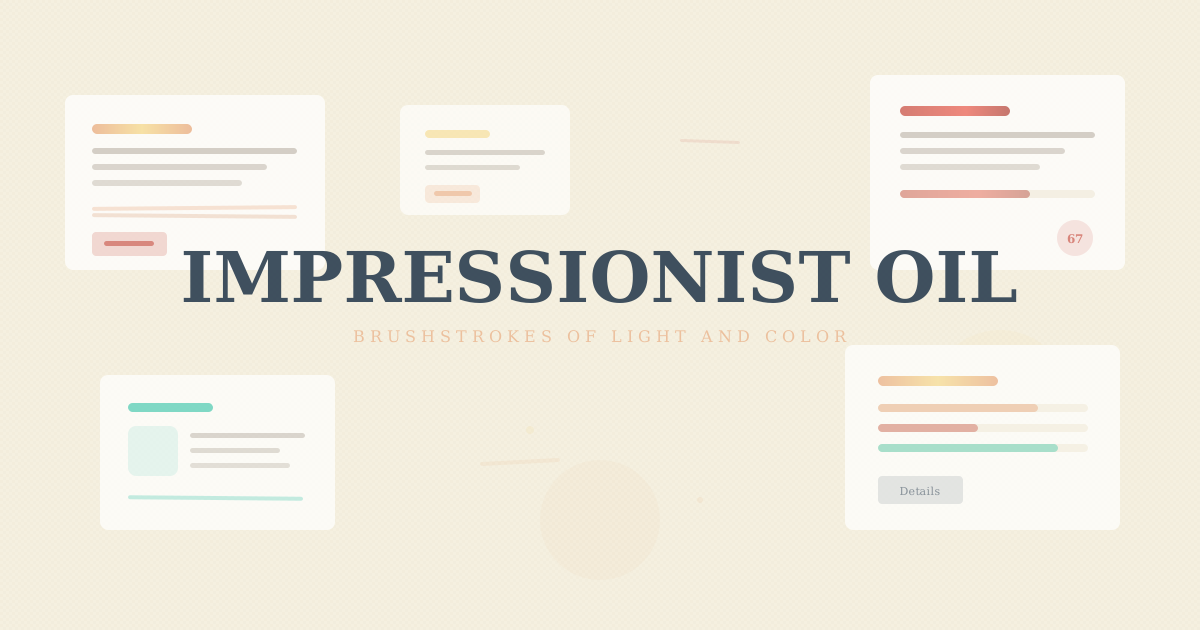
Impressionist Oil

受莫奈、雷诺阿等印象派大师启发,大胆的笔触纹理、斑驳光影、点彩色彩和温暖的画布质感,呈现如油画般的浓郁视觉体验。

油画印象派风视觉预览
主色#e8a87c
次色#f5f0e1
强调色 1#c0392b
强调色 2#2c3e50
强调色 3#1abc9c
强调色 4#f5d88a

AI 实现规则

You are an Impressionist Oil design style frontend development expert. All generated code must strictly follow these constraints:

## Absolutely Forbidden

- Flat solid fills without texture or gradient
- Sharp geometric edges (rounded-none, rounded-sm)
- Pixel-perfect offset shadows (shadow-[Npx_Npx_0px])
- Neon or fluorescent colors
- Monospace fonts (font-mono)
- Uppercase text (uppercase)
- Pure black backgrounds (bg-black)

## Must Follow

- Canvas cream background bg-[#f5f0e1]
- Warm orange #e8a87c as primary, use linear-gradient fills on buttons
- Serif fonts font-serif font-bold for all text
- Rounded corners rounded-lg
- Layered box-shadows: solid color base + blur shadow (e.g. 0 4px 0 #c0392b, 0 6px 16px rgba())
- Brushstroke texture via repeating-linear-gradient at angled degrees
- Dappled light via multiple radial-gradient overlays

## Color Palette

Primary:
- Warm Orange: #e8a87c
- Canvas Cream: #f5f0e1
- Vermillion Red: #c0392b
- Deep Blue: #2c3e50
- Turquoise Green: #1abc9c
- Golden Light: #f5d88a

## Unique Elements (Impressionist-Only)

1. Brushstroke texture: repeating-linear-gradient at 25-40deg angles with 0.02 opacity color stops
2. Dappled light: multiple radial-gradient(circle Npx at X% Y%, rgba(...,0.05-0.08)) scattered across surfaces
3. Impasto shadows: layered box-shadow with solid color base layer + blurred spread layer

## Animation & Interaction Rules

### Dancing Light (Button Hover)
- hover:brightness-110 hover:contrast-125 — simulates sunlight illuminating pigment
- Combined with hover:-translate-y-0.5 for subtle lift
- NEVER use flat color hover (defeats the impressionist light-play concept)

### Impasto Depression (Active Press)
- active:translate-y-[3px] — button sinks into the 4px solid vermillion shadow layer
- NEVER use active:scale-* alone (scaling doesn't simulate physical impasto depth)
- The translate must match or nearly match the solid shadow offset (currently 4px)

### Brushstroke Reveal (Card Underline)
- Card heading underline: w-16 h-[3px] bg-[#e8a87c] rounded-full
- On group-hover: group-hover:w-24 — brushstroke extends like paint spreading
- Transition: duration-500 ease-out (slow, painterly rhythm)
- Always use group class on card container

### Slow Easing Standard
- Minimum duration: 300ms (impressionist rhythm is slow and flowing)
- Button transitions: duration-300 ease-out
- Underline reveals: duration-500 ease-out
- NEVER use duration < 300ms

### Focus Ring
- focus:ring-2 focus:ring-[#e8a87c] focus:ring-offset-2 focus:ring-offset-[#f5f0e1]
- ring-offset-[#f5f0e1] mandatory — canvas cream background needs matching offset

组件预览与实现

font-serif font-bold tracking-wide rounded-lg transition-all duration-300 ease-in-out bg-[#e8a87c] text-[#2c3e50] shadow-[0_4px_0_#c0392b,0_6px_16px_rgba(232,168,124,0.30)] hover:brightness-110 active:translate-y-[2px]
button

按钮

油画印象派颜料管按钮:hover:brightness-110 hover:contrast-125 模拟颜料在阳光下闪耀,active:translate-y-[3px] 与 4px 实色阴影配合产生陷入感,focus:ring-offset-[#f5f0e1] 画布色底

<button className="
  px-8 py-3.5
  text-[#2c3e50]
  font-serif font-bold tracking-wide
  rounded-lg
  hover:brightness-110 hover:contrast-125 hover:-translate-y-0.5
  focus:outline-none focus:ring-2 focus:ring-[#e8a87c] focus:ring-offset-2 focus:ring-offset-[#f5f0e1]
  active:translate-y-[3px]
  transition-all duration-300 ease-out
"
  style={{
    background: "linear-gradient(135deg, #e8a87c 0%, #daa070 100%)",
    boxShadow: "0 4px 0 #c0392b, 0 6px 16px rgba(232,168,124,0.30)"
  }}
>
  Paint
</button>
card

卡片

画布质感卡片:group 类触发笔触底划线从 w-16 扩展至 group-hover:w-24(duration-500,Brushstroke Reveal),hover:-translate-y-0.5 + impasto 阴影加深

<div className="
  group
  relative p-8
  bg-[#f5f0e1]
  border border-[#e8a87c]/25
  rounded-lg
  hover:-translate-y-0.5
  transition-all duration-300
"
  style={{
    boxShadow: "0 3px 0 rgba(192,57,43,0.12), 0 8px 24px rgba(44,62,80,0.08)",
    backgroundImage: "repeating-linear-gradient(25deg, transparent, transparent 15px, rgba(232,168,124,0.02) 15px, transparent 16px)"
  }}
>
  <h3 className="text-2xl font-serif font-bold text-[#2c3e50] mb-3">
    Impression
  </h3>
  {/* Brushstroke Reveal underline */}
  <div className="w-16 h-[3px] bg-[#e8a87c] rounded-full mb-3 group-hover:w-24 transition-all duration-500 ease-out" />
  <p className="text-[#2c3e50]/50 font-serif leading-relaxed">
    Light dances across the canvas at golden hour
  </p>
</div>
input

输入框

画布表面输入框,温暖的内阴影和衬线字体

<input
  type="text"
  placeholder="Your brushstroke..."
  className="
    w-full px-5 py-3.5
    bg-[#f5f0e1]
    border-2 border-[#e8a87c]/25
    rounded-lg
    text-[#2c3e50] placeholder-[#2c3e50]/30
    font-serif
    focus:border-[#e8a87c]
    focus:outline-none
    transition-all duration-300
  "
  style={{ boxShadow: "inset 0 2px 4px rgba(44,62,80,0.04)" }}
/>
hero

Hero 区块

画廊墙面英雄区域,画框边框和斑驳光影叠加

<section className="
  min-h-screen
  flex items-center justify-center
  bg-[#f5f0e1]
  relative overflow-hidden
">
  {/* Dappled light overlay */}
  <div className="absolute inset-0 pointer-events-none" style={{
    background: "radial-gradient(circle 80px at 20% 15%, rgba(245,216,138,0.08) 0%, transparent 100%), radial-gradient(circle 100px at 75% 20%, rgba(232,168,124,0.06) 0%, transparent 100%)"
  }} />
  {/* Canvas texture */}
  <div className="absolute inset-0 pointer-events-none opacity-[0.04]" style={{
    backgroundImage: "repeating-linear-gradient(0deg, transparent, transparent 3px, rgba(44,62,80,0.03) 3px, transparent 4px), repeating-linear-gradient(90deg, transparent, transparent 3px, rgba(44,62,80,0.02) 3px, transparent 4px)"
  }} />
  <div className="relative z-10 text-center px-6">
    <h1 className="text-6xl md:text-8xl font-serif font-bold text-[#e8a87c] leading-none mb-3">
      Impression
    </h1>
    <h2 className="text-3xl md:text-5xl font-serif font-bold text-[#2c3e50] mb-6">
      Soleil Levant
    </h2>
    <p className="text-lg text-[#2c3e50]/45 font-serif mb-10 max-w-xl mx-auto leading-relaxed">
      Bold brushstrokes capture the fleeting dance of light
    </p>
    <button className="
      px-10 py-4
      text-[#2c3e50]
      font-serif font-bold tracking-wide
      rounded-lg
      hover:brightness-110
      active:translate-y-[2px]
      transition-all duration-300
    "
      style={{
        background: "linear-gradient(135deg, #e8a87c 0%, #daa070 100%)",
        boxShadow: "0 4px 0 #c0392b, 0 6px 16px rgba(232,168,124,0.30)"
      }}
    >
      Enter Gallery
    </button>
  </div>
</section>

交互展示

适用范围与设计理念

应用场景

creativeeditorial

视觉关键词

retro油画印象派笔触光影莫奈色彩画布impastoexpressivebold

油画印象派风格汲取19世纪法国印象派绘画的精髓,强调光影变化和色彩的即兴表达。

核心理念:

- 斑驳光影:使用 multiple radial-gradient 叠加模拟阳光穿过树叶的斑驳效果

- 笔触纹理:通过 repeating-linear-gradient 以不同角度叠加创造画布上可见的笔触

- 厚涂堆叠:layered box-shadow(0_3px_0 色块 + blur shadow)模拟颜料的厚实体积感

- 画布质感:温暖的米白底色 #f5f0e1 配以 feTurbulence 织纹滤镜

- 色彩调和:暖橙 #e8a87c、朱红 #c0392b、深蓝 #2c3e50、青绿 #1abc9c、金光 #f5d88a

应该这样做

  • 使用温暖的画布色 bg-[#f5f0e1] 作为背景
  • 按钮使用 linear-gradient 模拟颜料管挤出的渐变质感
  • 使用 layered box-shadow(实色底部 + 模糊扩散)模拟厚涂阴影
  • 卡片使用 repeating-linear-gradient 作为背景纹理模拟笔触方向
  • 添加 radial-gradient 光斑叠加模拟斑驳光影
  • 采用粗体衬线字体 font-serif font-bold 表达艺术感
  • 边角使用 rounded-lg 保持柔和的画布边缘
  • 按钮 hover:brightness-110 hover:contrast-125(颜料在阳光下闪耀)
  • 按钮 active:translate-y-[3px](与 4px 实色阴影配合产生按压陷入感)
  • 卡片使用 group 类,笔触底划线从 w-16 扩展至 group-hover:w-24(duration-500)
  • focus:ring-2 focus:ring-[#e8a87c] focus:ring-offset-2 focus:ring-offset-[#f5f0e1]

避免这样做

  • 禁止使用纯平色块(应有纹理感和渐变)
  • 禁止使用锐利几何边角(rounded-none/rounded-sm)
  • 禁止使用霓虹色或荧光色
  • 禁止使用等宽字体(font-mono)
  • 禁止使用大写文字(uppercase)
  • 禁止使用像素级精确的偏移阴影(shadow-[Npx_Npx_0px])
  • 禁止按钮缺少 active:translate-y-[3px](实色阴影不做陷入感 = 按钮失真)
  • 禁止 focus:ring 缺少 focus:ring-offset-[#f5f0e1](画布色背景下焦点环需与元素分离)
  • 禁止动画 duration 低于 300ms(印象派节奏是缓慢流动的)

全局 CSS

/* Impressionist Oil Global Styles */

:root {
  --imp-orange: #e8a87c;
  --imp-canvas: #f5f0e1;
  --imp-vermillion: #c0392b;
  --imp-blue: #2c3e50;
  --imp-turquoise: #1abc9c;
  --imp-gold: #f5d88a;
}

/* Canvas weave texture overlay */
.imp-canvas::after {
  content: "";
  position: absolute;
  inset: 0;
  background-image:
    repeating-linear-gradient(0deg, transparent, transparent 3px, rgba(44,62,80,0.03) 3px, transparent 4px),
    repeating-linear-gradient(90deg, transparent, transparent 3px, rgba(44,62,80,0.02) 3px, transparent 4px);
  opacity: 0.04;
  pointer-events: none;
}

/* Dappled light overlay - scattered radial gradient spots */
.imp-dapple::before {
  content: "";
  position: absolute;
  inset: 0;
  background:
    radial-gradient(circle 80px at 20% 15%, rgba(245,216,138,0.08) 0%, transparent 100%),
    radial-gradient(circle 100px at 45% 10%, rgba(232,168,124,0.06) 0%, transparent 100%),
    radial-gradient(circle 70px at 75% 20%, rgba(245,216,138,0.07) 0%, transparent 100%),
    radial-gradient(circle 90px at 90% 60%, rgba(232,168,124,0.05) 0%, transparent 100%);
  pointer-events: none;
}

/* Brushstroke texture as repeating-linear-gradient */
.imp-brushstroke {
  background-image: repeating-linear-gradient(
    25deg,
    transparent,
    transparent 15px,
    rgba(232,168,124,0.02) 15px,
    transparent 16px
  );
}

/* Brushstroke underline decoration */
.imp-stroke {
  position: relative;
  display: inline-block;
}
.imp-stroke::after {
  content: "";
  position: absolute;
  bottom: -4px;
  left: -5%;
  width: 110%;
  height: 6px;
  background: var(--imp-orange);
  opacity: 0.5;
  border-radius: 50%;
  transform: rotate(-1deg);
}

/* Pointillism dot background */
.imp-dots {
  background-image:
    radial-gradient(circle, var(--imp-orange) 0.8px, transparent 0.8px),
    radial-gradient(circle, var(--imp-vermillion) 0.6px, transparent 0.6px);
  background-size: 12px 12px, 8px 8px;
  background-position: 0 0, 4px 4px;
  opacity: 0.06;
}

布局、色板与 Tokens

主色#e8a87c
次色#f5f0e1
强调色 1#c0392b
强调色 2#2c3e50
强调色 3#1abc9c
强调色 4#f5d88a
{
  "border": {
    "width": "border",
    "color": "border-[#e8a87c]/25",
    "radius": "rounded-lg",
    "style": "border-solid"
  },
  "shadow": {
    "sm": "shadow-[0_2px_0_rgba(192,57,43,0.10),0_3px_8px_rgba(232,168,124,0.15)]",
    "md": "shadow-[0_3px_0_rgba(192,57,43,0.12),0_5px_16px_rgba(232,168,124,0.20)]",
    "lg": "shadow-[0_4px_0_rgba(192,57,43,0.15),0_8px_24px_rgba(44,62,80,0.12)]",
    "none": "shadow-none",
    "hover": "hover:shadow-[0_4px_0_rgba(192,57,43,0.15),0_10px_28px_rgba(44,62,80,0.12)]",
    "focus": "focus:shadow-[0_0_0_3px_rgba(232,168,124,0.12)]",
    "colored": {
      "orange": "shadow-[0_4px_0_#c0392b,0_6px_16px_rgba(232,168,124,0.30)]",
      "vermillion": "shadow-[0_4px_0_#2c3e50,0_6px_16px_rgba(192,57,43,0.30)]",
      "blue": "shadow-[0_4px_0_#1abc9c,0_6px_16px_rgba(44,62,80,0.30)]",
      "turquoise": "shadow-[0_3px_0_rgba(26,188,156,0.15),0_6px_16px_rgba(26,188,156,0.10)]"
    }
  },
  "interaction": {
    "transition": "transition-all duration-300 ease-in-out",
    "active": "active:translate-y-[2px]",
    "hoverScale": "hover:brightness-110"
  },
  "typography": {
    "heading": "font-serif font-bold tracking-wide",
    "body": "font-serif",
    "mono": "font-mono",
    "sizes": {
      "hero": "text-5xl md:text-7xl lg:text-8xl",
      "h1": "text-3xl md:text-5xl",
      "h2": "text-2xl md:text-3xl",
      "h3": "text-xl md:text-2xl",
      "body": "text-sm md:text-base",
      "small": "text-xs md:text-sm"
    }
  },
  "spacing": {
    "section": "py-14 md:py-20 lg:py-28",
    "container": "px-6 md:px-10 lg:px-14",
    "card": "p-6 md:p-8",
    "gap": {
      "sm": "gap-4 md:gap-5",
      "md": "gap-5 md:gap-6",
      "lg": "gap-6 md:gap-10"
    }
  },
  "colors": {
    "background": {
      "primary": "bg-[#f5f0e1]",
      "secondary": "bg-[#ede5d0]",
      "accent": [
        "bg-[#e8a87c]/15",
        "bg-[#c0392b]/10",
        "bg-[#1abc9c]/10",
        "bg-[#f5d88a]/10"
      ]
    },
    "text": {
      "primary": "text-[#2c3e50]",
      "secondary": "text-[#e8a87c]",
      "muted": "text-[#2c3e50]/45"
    },
    "button": {
      "primary": "text-[#2c3e50] shadow-[0_4px_0_#c0392b,0_6px_16px_rgba(232,168,124,0.30)]",
      "secondary": "text-[#f5f0e1] shadow-[0_4px_0_#1abc9c,0_6px_16px_rgba(44,62,80,0.30)]"
    }
  },
  "forbidden": {
    "classes": [
      "rounded-none",
      "rounded-sm",
      "shadow-[2px_2px_0px",
      "shadow-[3px_3px_0px",
      "shadow-[4px_4px_0px",
      "font-mono",
      "bg-black",
      "bg-[#0a0a1a]",
      "uppercase",
      "rounded-full"
    ],
    "patterns": [
      "^shadow-\\[\\d+px_\\d+px_0px",
      "^font-mono$",
      "^bg-black$",
      "^uppercase$",
      "^rounded-full$"
    ],
    "reasons": {
      "font-mono": "Impressionist Oil uses serif fonts for artistic painterly feel",
      "bg-black": "Impressionist Oil uses warm canvas backgrounds (#f5f0e1), never dark",
      "rounded-none": "Impressionist Oil uses rounded-lg for soft painterly edges",
      "uppercase": "Impressionist Oil uses elegant mixed-case serif, never aggressive uppercase",
      "rounded-full": "Impressionist Oil uses rounded-lg, not fully circular shapes"
    }
  },
  "required": {
    "button": [
      "rounded-lg",
      "font-serif font-bold",
      "transition-all duration-300 ease-in-out"
    ],
    "card": [
      "rounded-lg",
      "bg-[#f5f0e1]",
      "border border-[#e8a87c]/25"
    ],
    "input": [
      "rounded-lg",
      "border-2 border-[#e8a87c]/25",
      "bg-[#f5f0e1]",
      "font-serif",
      "focus:outline-none"
    ]
  }
}

示例提示词

印象派画廊页面

油画风格的艺术画廊展示,带有斑驳光影和笔触纹理

Use Impressionist Oil style to create a gallery page:
1. Background: canvas cream #f5f0e1 with repeating-linear-gradient crosshatch texture overlay
2. Hero: painting frame border with inset box-shadow, multiple radial-gradient dappled light spots
3. Cards: repeating-linear-gradient brushstroke texture at varied angles, layered box-shadows
4. Buttons: linear-gradient fills with 0 4px 0 solid + blur shadow
5. Warm palette: #e8a87c, #c0392b, #2c3e50, #1abc9c, #f5d88a
6. Font: serif bold throughout

SaaS 着陆页

生成 油画印象派风风格的 SaaS 产品着陆页

Create a SaaS landing page using Impressionist Oil style with hero section, feature grid, testimonials, pricing table, and footer.

作品集展示

生成 油画印象派风风格的作品集页面

Create a portfolio showcase page using Impressionist Oil style with project grid, about section, contact form, and consistent visual language.