返回风格库
布局风格modern

杂志网格布局

Magazine Grid

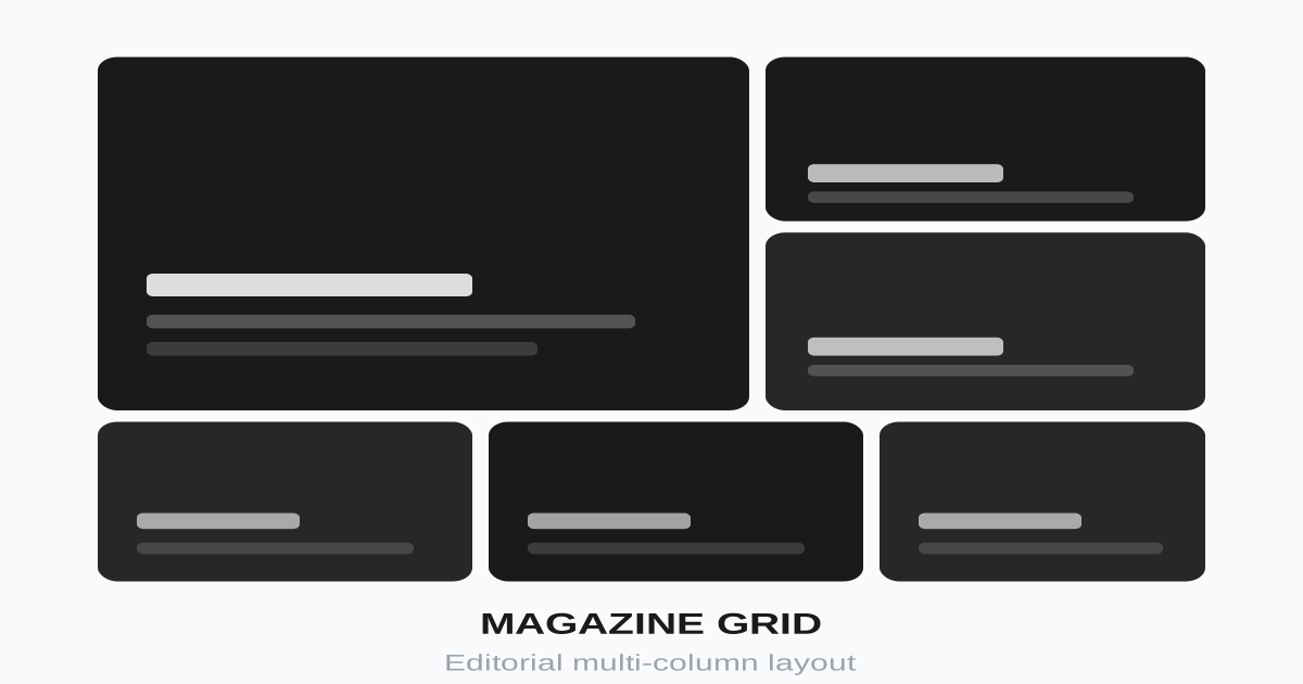
灵感来自印刷杂志的多栏网格布局,通过不同大小的内容块创造丰富的视觉层次,适合新闻、博客、内容聚合。

杂志网格布局视觉预览
主色#1a1a1a
次色#fafafa
强调色 1#e63946
强调色 2#2a9d8f
强调色 3#e9c46a
强调色 4#264653

AI 实现规则

You are a frontend expert specializing in Magazine Grid layout. All generated code must strictly follow these constraints:

## Absolute Prohibitions

- Do NOT make all content blocks same size
- Do NOT ignore mobile responsive layout
- Do NOT overcrowd content without whitespace
- Do NOT use inconsistent category styling
- Do NOT ignore image aspect ratios

## Must Follow

- Use CSS Grid: grid-cols-1 md:grid-cols-2 lg:grid-cols-4
- Featured content: col-span-2 row-span-2
- Consistent gaps: gap-6
- Category labels on all articles
- Image hover effects
- Line clamping for excerpts

## Grid Structure

Desktop (4 columns):
- Featured: 2x2 grid area
- Regular: 1x1 grid cells
- Mix large and small for variety

Tablet (2 columns):
- Featured: 2x1 or 1x2
- Regular: 1x1

Mobile (1 column):
- All items full width
- Stack vertically

## Article Card

Required elements:
1. Image with aspect ratio
2. Category label (colored)
3. Title (clamped)
4. Excerpt (optional, clamped)
5. Meta (author, date, read time)

## Category Colors

Use distinct colors per category:
- Tech: blue
- Business: green
- Culture: amber
- Opinion: purple
- Featured: red

## Animation & Interaction Rules

- Color Awakening: 默认图片可轻微灰度(例如 grayscale-[20%]),hover 时恢复全彩并 scale-105。
- Editorial Stretch: 分类标签旁装饰线可由 w-4 平滑延展到 w-12,强调排版骨架。
- Crisp Typographic Shift: 标题 hover 直接切主色(如 red-600),使用 duration-200 ease-out。
- Readability First: 段落正文禁止位移动画,保证阅读稳定与扫描效率。

## Self-Check

组件预览与实现

font-semibold uppercase tracking-wider text-xs transition-colors duration-200 bg-[#e63946] text-white rounded hover:bg-[#c1121f] active:bg-[#a40e19]
button

分类标签

文章分类的标签按钮,带有 Editorial Stretch 装饰线延伸效果

<div className="group flex items-center gap-2">
  <span className="
    inline-block
    px-3 py-1
    text-xs font-semibold uppercase tracking-wider
    text-red-600
    bg-red-50
    rounded
  ">
    Technology
  </span>
  <span className="block w-4 h-px bg-red-600 group-hover:w-12 transition-all duration-300 ease-out" />
</div>
card

杂志文章卡片

杂志风格的文章卡片

<article className="group flex flex-col gap-4 cursor-pointer">
  <a href="#" className="block">
    <div className="relative overflow-hidden rounded-lg">
      <div
        aria-label="Article thumbnail"
        className="w-full aspect-[16/10] bg-[linear-gradient(135deg,#264653_0%,#2a9d8f_60%,#1a1a1a_100%)] grayscale-[20%] group-hover:grayscale-0 group-hover:scale-105 transition-all duration-500 ease-out"
      />
      <span className="absolute top-4 left-4 px-3 py-1 text-xs font-semibold uppercase bg-red-600 text-white rounded">
        Featured
      </span>
    </div>
    <div className="flex flex-col mt-1">
      <div className="flex items-center gap-2 mb-2">
        <span className="text-xs font-semibold uppercase tracking-wider text-red-600">Technology</span>
        <span className="w-4 h-px bg-red-600 group-hover:w-12 transition-all duration-300 ease-out" />
      </div>
      <h3 className="text-xl font-bold text-zinc-900 mb-2 leading-snug group-hover:text-red-600 transition-colors duration-200 ease-out">
        Article Title Goes Here
      </h3>
      <p className="text-zinc-600 text-sm mb-3 line-clamp-2">
        Brief excerpt of the article content that gives readers a preview...
      </p>
      <div className="flex items-center gap-3 text-sm text-zinc-500">
        <span>John Doe</span>
        <span>5 min read</span>
      </div>
    </div>
  </a>
</article>
input

搜索框

杂志站点的搜索

<div className="relative">
  <input
    type="text"
    placeholder="Search articles..."
    className="
      w-full px-4 py-3 pr-12
      bg-zinc-100
      border-0
      rounded-lg
      text-zinc-900
      placeholder-zinc-500
      focus:outline-none focus:ring-2 focus:ring-red-500/30
    "
  />
  <button className="absolute right-2 top-1/2 -translate-y-1/2 p-2 text-zinc-500 hover:text-zinc-700">
    <svg className="w-5 h-5" fill="none" stroke="currentColor" viewBox="0 0 24 24">
      <path strokeLinecap="round" strokeLinejoin="round" strokeWidth={2} d="M21 21l-6-6m2-5a7 7 0 11-14 0 7 7 0 0114 0z" />
    </svg>
  </button>
</div>
nav

分类导航

杂志分类导航栏

<nav className="
  flex items-center gap-6
  border border-zinc-200
  overflow-x-auto
">
  <a href="#" className="
    py-4
    text-sm font-semibold uppercase tracking-wider
    text-red-600
    border-2 border-red-600
    whitespace-nowrap
  ">
    All
  </a>
  <a href="#" className="
    py-4
    text-sm font-semibold uppercase tracking-wider
    text-zinc-600
    hover:text-zinc-900
    border-2 border-transparent
    hover:border-zinc-300
    transition-colors
    whitespace-nowrap
  ">
    Technology
  </a>
  <a href="#" className="
    py-4
    text-sm font-semibold uppercase tracking-wider
    text-zinc-600
    hover:text-zinc-900
    border-2 border-transparent
    hover:border-zinc-300
    transition-colors
    whitespace-nowrap
  ">
    Business
  </a>
  <a href="#" className="
    py-4
    text-sm font-semibold uppercase tracking-wider
    text-zinc-600
    hover:text-zinc-900
    border-2 border-transparent
    hover:border-zinc-300
    transition-colors
    whitespace-nowrap
  ">
    Culture
  </a>
</nav>
hero

杂志网格布局

完整的杂志风格布局

<section className="py-8 px-4">
  <div className="max-w-7xl mx-auto">
    {/* Category Nav */}
    <nav className="flex items-center gap-6 border border-zinc-200 mb-8 overflow-x-auto">
      <a href="#" className="py-4 text-sm font-semibold uppercase tracking-wider text-red-600 border-2 border-red-600 whitespace-nowrap">All</a>
      <a href="#" className="py-4 text-sm font-semibold uppercase tracking-wider text-zinc-600 hover:text-zinc-900 whitespace-nowrap">Tech</a>
      <a href="#" className="py-4 text-sm font-semibold uppercase tracking-wider text-zinc-600 hover:text-zinc-900 whitespace-nowrap">Business</a>
      <a href="#" className="py-4 text-sm font-semibold uppercase tracking-wider text-zinc-600 hover:text-zinc-900 whitespace-nowrap">Culture</a>
    </nav>

    {/* Magazine Grid */}
    <div className="grid grid-cols-1 md:grid-cols-2 lg:grid-cols-4 gap-6">
      {/* Featured - Large */}
      <article className="md:col-span-2 lg:row-span-2 group">
        <a href="#" className="block h-full">
          <div className="relative h-full min-h-[300px] rounded-xl overflow-hidden">
            <div className="absolute inset-0 w-full h-full bg-[linear-gradient(135deg,#264653_0%,#2a9d8f_60%,#1a1a1a_100%)] group-hover:scale-105 transition-transform duration-500" />
            <div className="absolute inset-0 bg-gradient-to-t from-black/80 via-black/20 to-transparent" />
            <div className="absolute bottom-0 left-0 right-0 p-6 text-white">
              <span className="inline-block px-3 py-1 text-xs font-semibold uppercase bg-red-600 rounded mb-3">Featured</span>
              <h2 className="text-2xl lg:text-3xl font-bold mb-2">Main Featured Article Title</h2>
              <p className="text-white/80 mb-3 line-clamp-2">A compelling excerpt that draws readers in...</p>
              <div className="flex items-center gap-3 text-sm text-white/60">
                <span>By John Doe</span>
                <span>10 min read</span>
              </div>
            </div>
          </div>
        </a>
      </article>

      {/* Regular articles */}
      <article className="group">
        <a href="#" className="block">
          <div className="rounded-lg overflow-hidden mb-3">
            <div className="w-full aspect-video bg-[linear-gradient(135deg,#e63946_0%,#264653_100%)] group-hover:scale-105 transition-transform duration-300" />
          </div>
          <span className="text-xs font-semibold uppercase tracking-wider text-emerald-600">Business</span>
          <h3 className="font-bold text-zinc-900 mt-1 group-hover:text-red-600 transition-colors">Secondary Article Title</h3>
        </a>
      </article>

      <article className="group">
        <a href="#" className="block">
          <div className="rounded-lg overflow-hidden mb-3">
            <div className="w-full aspect-video bg-[linear-gradient(135deg,#e9c46a_0%,#e63946_100%)] group-hover:scale-105 transition-transform duration-300" />
          </div>
          <span className="text-xs font-semibold uppercase tracking-wider text-amber-600">Culture</span>
          <h3 className="font-bold text-zinc-900 mt-1 group-hover:text-red-600 transition-colors">Another Article Title Here</h3>
        </a>
      </article>

      <article className="group">
        <a href="#" className="block">
          <div className="rounded-lg overflow-hidden mb-3">
            <div className="w-full aspect-video bg-[linear-gradient(135deg,#1a1a1a_0%,#264653_100%)] group-hover:scale-105 transition-transform duration-300" />
          </div>
          <span className="text-xs font-semibold uppercase tracking-wider text-blue-600">Tech</span>
          <h3 className="font-bold text-zinc-900 mt-1 group-hover:text-red-600 transition-colors">Tech News Article</h3>
        </a>
      </article>

      <article className="group">
        <a href="#" className="block">
          <div className="rounded-lg overflow-hidden mb-3">
            <div className="w-full aspect-video bg-[linear-gradient(135deg,#2a9d8f_0%,#264653_100%)] group-hover:scale-105 transition-transform duration-300" />
          </div>
          <span className="text-xs font-semibold uppercase tracking-wider text-purple-600">Opinion</span>
          <h3 className="font-bold text-zinc-900 mt-1 group-hover:text-red-600 transition-colors">Opinion Piece Title</h3>
        </a>
      </article>
    </div>
  </div>
</section>

交互展示

适用范围与设计理念

应用场景

editorialportfolioblog

视觉关键词

responsive杂志多栏新闻博客内容网格moderncontemporarysleek现代

Magazine Grid(杂志网格布局)借鉴传统印刷杂志的排版智慧,通过多栏和混合尺寸内容块创造专业的编辑效果。

核心理念:

- 视觉层级:大图抓眼球,小块填充细节

- 扫描友好:读者可快速浏览找到感兴趣的内容

- 空间节奏:大小交替创造阅读节奏

- 专业感:传递权威性和可信度

设计原则:

- 视觉一致性:所有组件必须遵循统一的视觉语言,从色彩到字体到间距保持谐调

- 层次分明:通过颜色深浅、字号大小、留白空间建立清晰的信息层级

- 交互反馈:每个可交互元素都必须有明确的 hover、active、focus 状态反馈

- 响应式适配:设计必须在移动端、平板、桌面端上保持一致的体验

- 无障碍性:确保色彩对比度符合 WCAG 2.1 AA 标准,所有交互元素可键盘访问

应该这样做

  • 使用 CSS Grid 创建复杂网格 grid-template-areas
  • 特色内容使用更大的网格区域 col-span-2 row-span-2
  • 保持基线对齐和一致的间距
  • 使用不同大小的内容块创造层次
  • 移动端转为单列或简化网格
  • 添加清晰的分类标签和时间戳
  • 考虑广告位的预留空间
  • 所有文章卡片使用 group 类触发子元素联动
  • 图片默认 grayscale-[20%],group-hover:grayscale-0 group-hover:scale-105(Color Awakening,瞬间全彩抓眼球)
  • 分类标签后加装饰线:w-4 h-px group-hover:w-12 transition-all duration-300 ease-out(Editorial Stretch,排版骨架延伸)
  • 标题 group-hover:text-red-600 transition-colors duration-200 ease-out(Crisp Typographic Shift,干脆切色)

避免这样做

  • 禁止所有内容块大小相同
  • 禁止忽略移动端布局适配
  • 禁止内容过于拥挤无留白
  • 禁止分类标签不一致
  • 禁止忽略图片裁切比例
  • 禁止对正文段落施加任何位移动画(阅读稳定性优先)
  • 禁止标题 hover 使用发光或阴影效果(应直接切换颜色,干脆利落)

全局 CSS

/* Magazine Grid Global Styles */

/* Base magazine grid */
.magazine-grid {
  display: grid;
  grid-template-columns: 1fr;
  gap: 1.5rem;
}

@media (min-width: 768px) {
  .magazine-grid {
    grid-template-columns: repeat(2, 1fr);
  }
}

@media (min-width: 1024px) {
  .magazine-grid {
    grid-template-columns: repeat(4, 1fr);
  }
}

/* Featured item spans */
.magazine-featured {
  grid-column: span 2;
  grid-row: span 2;
}

@media (max-width: 767px) {
  .magazine-featured {
    grid-column: span 1;
    grid-row: span 1;
  }
}

/* Article card styles */
.magazine-article {
  position: relative;
}

.magazine-article img {
  transition: transform 0.3s ease;
}

.magazine-article:hover img {
  transform: scale(1.05);
}

/* Category tags */
.magazine-category {
  display: inline-block;
  padding: 0.25rem 0.75rem;
  font-size: 0.75rem;
  font-weight: 600;
  text-transform: uppercase;
  letter-spacing: 0.05em;
  border-radius: 0.25rem;
}

/* Category colors */
.magazine-category-tech { color: #3b82f6; background: #eff6ff; }
.magazine-category-business { color: #10b981; background: #ecfdf5; }
.magazine-category-culture { color: #f59e0b; background: #fffbeb; }
.magazine-category-opinion { color: #8b5cf6; background: #f5f3ff; }
.magazine-category-featured { color: white; background: #dc2626; }

/* Line clamp for excerpts */
.line-clamp-2 {
  display: -webkit-box;
  -webkit-line-clamp: 2;
  -webkit-box-orient: vertical;
  overflow: hidden;
}

.line-clamp-3 {
  display: -webkit-box;
  -webkit-line-clamp: 3;
  -webkit-box-orient: vertical;
  overflow: hidden;
}
/* Magazine Grid Design Tokens */
:root {
  --magazine-grid-primary: #1a1a1a;
  --magazine-grid-secondary: #fafafa;
  --magazine-grid-accent: #e63946;
  --magazine-grid-glow: rgba(26, 26, 26, 0.3);
}

@keyframes magazine-grid-fade-in {
  from { opacity: 0; transform: translateY(8px); }
  to { opacity: 1; transform: translateY(0); }
}

@keyframes magazine-grid-pulse {
  0%, 100% { opacity: 1; }
  50% { opacity: 0.7; }
}

.magazine-grid-card {
  position: relative;
  overflow: hidden;
}

.magazine-grid-card::before {
  content: "";
  position: absolute;
  inset: 0;
  opacity: 0;
  transition: opacity 0.3s ease;
  background: linear-gradient(135deg, rgba(26, 26, 26, 0.05), transparent);
  pointer-events: none;
}

.magazine-grid-card:hover::before {
  opacity: 1;
}

.magazine-grid-gradient {
  background: linear-gradient(135deg, #1a1a1a, #e63946);
}

.magazine-grid-gradient-text {
  background: linear-gradient(135deg, #1a1a1a, #e63946);
  -webkit-background-clip: text;
  -webkit-text-fill-color: transparent;
  background-clip: text;
}

.magazine-grid-frosted {
  backdrop-filter: blur(12px) saturate(180%);
  -webkit-backdrop-filter: blur(12px) saturate(180%);
  background: rgba(26, 26, 26, 0.08);
}

.magazine-grid-accent-corner {
  clip-path: polygon(0 0, 100% 0, 100% calc(100% - 2rem), calc(100% - 2rem) 100%, 0 100%);
}

.magazine-grid-animate-in {
  animation: magazine-grid-fade-in 0.5s ease-out both;
}

布局、色板与 Tokens

主色#1a1a1a
次色#fafafa
强调色 1#e63946
强调色 2#2a9d8f
强调色 3#e9c46a
强调色 4#264653
{
  "border": {
    "width": "border",
    "color": "border-zinc-200",
    "radius": "rounded-lg",
    "style": "border-solid"
  },
  "shadow": {
    "sm": "shadow-sm",
    "md": "shadow-sm",
    "lg": "shadow-md",
    "none": "shadow-none",
    "hover": "hover:shadow-md",
    "focus": "focus:shadow-sm",
    "colored": {}
  },
  "interaction": {
    "transition": "transition-all duration-300",
    "active": "active:scale-95",
    "hoverScale": "hover:scale-105"
  },
  "typography": {
    "heading": "font-bold tracking-tight",
    "body": "font-sans",
    "mono": "font-mono",
    "sizes": {
      "hero": "text-3xl md:text-4xl lg:text-5xl",
      "h1": "text-2xl md:text-3xl lg:text-4xl",
      "h2": "text-xl md:text-2xl",
      "h3": "text-lg md:text-xl",
      "body": "text-sm md:text-base",
      "small": "text-xs"
    }
  },
  "spacing": {
    "section": "py-8 md:py-12 lg:py-16",
    "container": "px-4 md:px-6 lg:px-8",
    "card": "p-4 md:p-6",
    "gap": {
      "sm": "gap-3 md:gap-4",
      "md": "gap-4 md:gap-6",
      "lg": "gap-6 md:gap-8"
    }
  },
  "colors": {
    "background": {
      "primary": "bg-white",
      "secondary": "bg-zinc-50",
      "accent": [
        "bg-[#e63946]",
        "bg-[#2a9d8f]",
        "bg-[#e9c46a]",
        "bg-[#264653]"
      ]
    },
    "text": {
      "primary": "text-zinc-900",
      "secondary": "text-zinc-600",
      "muted": "text-zinc-500"
    },
    "button": {
      "primary": "bg-[#e63946] text-white",
      "secondary": "bg-zinc-100 text-zinc-700"
    }
  },
  "forbidden": {
    "classes": [
      "rounded-none",
      "border-4",
      "border-8",
      "shadow-2xl",
      "font-black"
    ],
    "patterns": [
      "^border-[48]",
      "^shadow-2xl"
    ],
    "reasons": {
      "rounded-none": "Magazine Grid uses soft rounded corners for a polished editorial feel",
      "border-4": "Magazine Grid uses thin subtle borders for elegant separation",
      "shadow-2xl": "Magazine Grid uses subtle shadows, relying on layout for visual hierarchy"
    }
  },
  "required": {
    "button": [
      "text-xs font-semibold uppercase tracking-wider",
      "rounded"
    ],
    "card": [
      "rounded-lg",
      "overflow-hidden",
      "group"
    ],
    "input": [
      "bg-zinc-100",
      "border-0",
      "rounded-lg",
      "focus:outline-none",
      "focus:ring-2 focus:ring-red-500/30"
    ]
  }
}

示例提示词

新闻首页

新闻网站的杂志风格首页

Create a news homepage with magazine grid:
1. 4-column grid on desktop, 2 on tablet, 1 on mobile
2. Featured story spanning 2x2 with image overlay
3. Regular articles in grid with thumbnail, category, title
4. Category tabs: All, Politics, Tech, Business, Sports
5. Breaking news banner at top
6. Load more button at bottom
7. Sidebar with trending stories (optional)
Clean, professional news design with red accent

博客列表

博客文章的杂志布局

Create a blog listing with magazine grid:
1. Featured post with large image and gradient overlay
2. Regular posts in varied sizes (some 2-col wide)
3. Each post: image, category tag, title, excerpt, author
4. Mix of horizontal and vertical card layouts
5. Filter by category dropdown
6. Infinite scroll loading
7. Reading time indicator
Modern editorial style with serif headlines

内容聚合页

多类型内容的聚合展示

Create a content hub with magazine grid:
1. Mix of content types: articles, videos, podcasts
2. Video cards with play button overlay
3. Podcast cards with audio duration
4. Featured content section at top
5. "Editor's Picks" sidebar section
6. Newsletter signup card in grid
7. Trending topics tags
Multi-format content with clear type indicators