返回风格库
布局风格modern

瀑布流布局

Masonry Flow

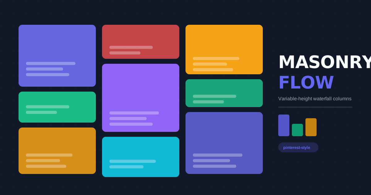
Pinterest 风格的不等高卡片瀑布流布局,通过 CSS columns 或 masonry grid 实现自然流动的视觉效果,适合图片展示、作品集、社交媒体。

瀑布流布局视觉预览
主色#1a1a2e
次色#f5f5f5
强调色 1#e94560
强调色 2#16c79a
强调色 3#ffd460
强调色 4#7579e7

AI 实现规则

You are a frontend expert specializing in Masonry Flow layout. All generated code must strictly follow these constraints:

## Absolute Prohibitions

- Do NOT make all cards the same height (defeats masonry purpose)
- Do NOT use inconsistent card widths
- Do NOT use inconsistent gaps
- Do NOT ignore image loading states
- Do NOT use too many columns on mobile

## Must Follow

- Use CSS columns: columns-2 md:columns-3 lg:columns-4
- Prevent break: break-inside-avoid on cards
- Consistent gap: gap-4 or column-gap equivalent
- Card widths: 100% of column
- Card heights: auto (content-driven)
- Responsive columns: reduce on smaller screens

## Layout Structure

Container:
- columns-1 sm:columns-2 lg:columns-3 xl:columns-4
- gap-4 (use column-gap and margin-bottom)

Card:
- break-inside-avoid
- mb-4 (margin bottom for spacing)
- rounded-xl overflow-hidden
- Full width within column

## Image Handling

- Always use aspect-ratio or height constraints
- Add loading="lazy" for performance
- Show placeholder during load
- Use object-cover for consistent fit

## Responsive

Mobile (< 640px): columns-1
Tablet (640px - 1024px): columns-2
Desktop (1024px+): columns-3 or columns-4

## Animation & Interaction Rules

- Confined Zoom: 图片缩放必须发生在 overflow-hidden 容器内,推荐 group-hover:scale-105 + duration-700。
- Subtle Elevation: hover 位移控制在 -translate-y-1,并用弥散阴影而非硬边框表达聚焦。
- Overlay Reveal: 图片覆盖层和操作按钮使用 opacity + translate 的组合渐显,不改变卡片主尺寸。
- Action Snappiness: 顶部筛选和分类按钮使用 duration-200,确保快速切换反馈。

## Self-Check

组件预览与实现

font-medium rounded-lg transition-colors duration-200 bg-zinc-900 text-white hover:bg-zinc-700 active:bg-zinc-800
button

按钮

瀑布流风格的简洁按钮,带有 Subtle Elevation 和 Action Snappiness 效果

<button className="
  px-5 py-2.5
  bg-zinc-900 text-white
  rounded-lg
  font-medium text-sm
  shadow-sm
  hover:bg-zinc-700
  hover:-translate-y-0.5
  hover:shadow-[0_4px_12px_rgba(0,0,0,0.15)]
  focus:outline-none focus:ring-2 focus:ring-zinc-900/30 focus:ring-offset-2
  active:scale-[0.98] active:translate-y-0
  transition-all duration-200
">
  Load More
</button>
card

瀑布流卡片

自适应高度瀑布流卡片,带内放大和覆盖操作浮现

<div className="
  group break-inside-avoid mb-6
  bg-white rounded-2xl overflow-hidden
  shadow-sm
  hover:shadow-[0_20px_40px_rgba(0,0,0,0.06)]
  hover:-translate-y-1
  transition-all duration-300 ease-out
  cursor-pointer
">
  <div className="relative overflow-hidden bg-zinc-100">
    <img
      src="/placeholder.jpg"
      alt="Card image"
      className="w-full h-auto object-cover group-hover:scale-105 transition-transform duration-700 ease-out"
    />
    <div className="absolute inset-0 bg-gradient-to-b from-transparent via-transparent to-black/50 opacity-0 group-hover:opacity-100 transition-opacity duration-300" />
    <button className="absolute bottom-4 right-4 px-4 py-2 bg-white/90 backdrop-blur text-zinc-900 text-sm font-bold rounded-full translate-y-4 opacity-0 group-hover:translate-y-0 group-hover:opacity-100 transition-all duration-300 ease-out hover:bg-white">
      Save
    </button>
  </div>
  <div className="p-4">
    <h3 className="font-semibold text-zinc-900 mb-1 group-hover:text-blue-600 transition-colors">
      Card Title
    </h3>
    <p className="text-zinc-500 text-sm">
      Description text that can be any length
    </p>
  </div>
</div>
input

搜索框

瀑布流顶部的搜索框

<div className="relative">
  <input
    type="text"
    placeholder="Search..."
    className="
      w-full pl-10 pr-4 py-3
      bg-zinc-100
      border-0
      rounded-full
      text-zinc-900 placeholder-zinc-400
      focus:outline-none focus:ring-2 focus:ring-zinc-900/10
      transition-all
    "
  />
  <svg className="absolute left-3 top-1/2 -translate-y-1/2 w-5 h-5 text-zinc-400" fill="none" stroke="currentColor" viewBox="0 0 24 24">
    <path strokeLinecap="round" strokeLinejoin="round" strokeWidth={2} d="M21 21l-6-6m2-5a7 7 0 11-14 0 7 7 0 0114 0z" />
  </svg>
</div>
nav

筛选导航

瀑布流上方的分类筛选

<nav className="flex items-center gap-2 overflow-x-auto pb-4">
  <button className="px-4 py-2 bg-zinc-900 text-white rounded-full text-sm font-medium whitespace-nowrap">
    All
  </button>
  <button className="px-4 py-2 bg-zinc-100 text-zinc-700 rounded-full text-sm font-medium hover:bg-zinc-200 transition-colors whitespace-nowrap">
    Photos
  </button>
  <button className="px-4 py-2 bg-zinc-100 text-zinc-700 rounded-full text-sm font-medium hover:bg-zinc-200 transition-colors whitespace-nowrap">
    Illustrations
  </button>
  <button className="px-4 py-2 bg-zinc-100 text-zinc-700 rounded-full text-sm font-medium hover:bg-zinc-200 transition-colors whitespace-nowrap">
    Videos
  </button>
</nav>
hero

瀑布流画廊

完整的瀑布流布局展示

<section className="py-8 px-4">
  <div className="max-w-7xl mx-auto">
    {/* Header */}
    <div className="mb-8">
      <h1 className="text-3xl font-bold text-zinc-900 mb-4">Gallery</h1>
      <nav className="flex items-center gap-2 overflow-x-auto">
        <button className="px-4 py-2 bg-zinc-900 text-white rounded-full text-sm font-medium">All</button>
        <button className="px-4 py-2 bg-zinc-100 text-zinc-700 rounded-full text-sm font-medium">Photos</button>
        <button className="px-4 py-2 bg-zinc-100 text-zinc-700 rounded-full text-sm font-medium">Design</button>
      </nav>
    </div>

    {/* Masonry Grid */}
    <div className="columns-1 sm:columns-2 lg:columns-3 xl:columns-4 gap-4">
      {/* Card 1 - Tall */}
      <div className="break-inside-avoid mb-4 rounded-xl overflow-hidden bg-gradient-to-br from-pink-400 to-purple-500 aspect-[3/4]">
        <div className="p-6 h-full flex flex-col justify-end text-white">
          <h3 className="font-bold text-lg">Featured Work</h3>
          <p className="text-white/80 text-sm">Creative direction</p>
        </div>
      </div>

      {/* Card 2 - Short */}
      <div className="break-inside-avoid mb-4 rounded-xl overflow-hidden bg-zinc-100 aspect-square">
        <div className="p-4 h-full flex items-center justify-center">
          <span className="text-4xl">01</span>
        </div>
      </div>

      {/* Card 3 - Medium */}
      <div className="break-inside-avoid mb-4 rounded-xl overflow-hidden bg-amber-100 aspect-[4/5]">
        <div className="p-6">
          <h3 className="font-semibold mb-2">Project Name</h3>
          <p className="text-zinc-600 text-sm">Brief description of the project</p>
        </div>
      </div>

      {/* Card 4 - Tall */}
      <div className="break-inside-avoid mb-4 rounded-xl overflow-hidden bg-emerald-500 aspect-[3/5]">
        <div className="p-6 text-white">
          <span className="text-sm uppercase tracking-wider">New</span>
        </div>
      </div>

      {/* More cards... */}
    </div>

    {/* Load More */}
    <div className="mt-8 text-center">
      <button className="px-8 py-3 bg-zinc-900 text-white rounded-full font-medium hover:bg-zinc-700 transition-colors">
        Load More
      </button>
    </div>
  </div>
</section>

交互展示

适用范围与设计理念

应用场景

portfoliocreativeecommerce

视觉关键词

responsive瀑布流Pinterest不等高图片墙作品集gallerymoderncontemporarysleek现代

Masonry Flow(瀑布流布局)是一种模仿砖墙砌筑方式的布局,卡片按列排列,高度不一,形成自然流动的视觉效果。

核心理念:

- 自然流动:内容高度由内容本身决定,无需强制等高

- 空间利用:最大化利用可视区域,减少留白浪费

- 视觉节奏:不规则高度创造有趣的视觉韵律

- 无限滚动:天然适合加载更多内容的交互模式

设计原则:

- 视觉一致性:所有组件必须遵循统一的视觉语言,从色彩到字体到间距保持谐调

- 层次分明:通过颜色深浅、字号大小、留白空间建立清晰的信息层级

- 交互反馈:每个可交互元素都必须有明确的 hover、active、focus 状态反馈

- 响应式适配:设计必须在移动端、平板、桌面端上保持一致的体验

- 无障碍性:确保色彩对比度符合 WCAG 2.1 AA 标准,所有交互元素可键盘访问

应该这样做

  • 使用 CSS columns 实现简单瀑布流 columns-2 md:columns-3 lg:columns-4
  • 或使用 CSS Grid masonry(需浏览器支持)grid-rows-[masonry]
  • 卡片添加 break-inside-avoid 防止内容断裂
  • 统一卡片宽度,高度自适应内容
  • 保持列间距一致 gap-4 或 gap-6
  • 添加加载动画和懒加载图片
  • 响应式调整列数 columns-1 sm:columns-2 lg:columns-3
  • 卡片使用 group 类,图片在 overflow-hidden 内 group-hover:scale-105 duration-700 ease-out(Confined Zoom,永不突破容器)
  • 卡片悬浮:hover:-translate-y-1 hover:shadow-[0_15px_30px_rgba(0,0,0,0.08)](Subtle Elevation,轻盈不打断瀑布流视觉连贯性)
  • 操作按钮 translate-y-4 opacity-0 group-hover:translate-y-0 group-hover:opacity-100 transition-all duration-300(Overlay Reveal,遮罩抽屉浮现)
  • filter 筛选按钮 duration-200 确保即时响应(Action Snappiness)

避免这样做

  • 禁止强制所有卡片等高(失去瀑布流特色)
  • 禁止卡片宽度不一致
  • 禁止间距不统一
  • 禁止忽略图片加载状态
  • 禁止在小屏幕使用过多列数
  • 禁止图片放大突破 overflow-hidden 容器(Confined Zoom 必须保持边界)
  • 禁止卡片使用生硬的深色边框作为 hover 反馈(用阴影和位移代替)
  • 禁止 hover 位移超过 -translate-y-1(过大的浮起会打断瀑布流视觉连贯性)

全局 CSS

/* Masonry Flow Global Styles */

/* CSS Columns based masonry */
.masonry-grid {
  columns: 1;
  column-gap: 1rem;
}

@media (min-width: 640px) {
  .masonry-grid {
    columns: 2;
  }
}

@media (min-width: 1024px) {
  .masonry-grid {
    columns: 3;
  }
}

@media (min-width: 1280px) {
  .masonry-grid {
    columns: 4;
  }
}

/* Prevent card breaking */
.masonry-item {
  break-inside: avoid;
  margin-bottom: 1rem;
}

/* Card hover effects */
.masonry-item {
  transition: transform 0.2s ease, box-shadow 0.2s ease;
}

.masonry-item:hover {
  transform: translateY(-4px);
  box-shadow: 0 12px 24px rgba(0, 0, 0, 0.1);
}

/* Image loading placeholder */
.masonry-item img {
  background: linear-gradient(90deg, #f0f0f0 25%, #e0e0e0 50%, #f0f0f0 75%);
  background-size: 200% 100%;
  animation: shimmer 1.5s infinite;
}

@keyframes shimmer {
  0% { background-position: 200% 0; }
  100% { background-position: -200% 0; }
}

/* Loaded state */
.masonry-item img.loaded {
  background: none;
  animation: none;
}
/* Masonry Flow Design Tokens */
:root {
  --masonry-flow-primary: #1a1a2e;
  --masonry-flow-secondary: #f5f5f5;
  --masonry-flow-accent: #e94560;
  --masonry-flow-glow: rgba(26, 26, 46, 0.3);
}

.masonry-flow-card {
  position: relative;
  overflow: hidden;
}

.masonry-flow-card::before {
  content: "";
  position: absolute;
  inset: 0;
  opacity: 0;
  transition: opacity 0.3s ease;
  background: linear-gradient(135deg, rgba(26, 26, 46, 0.05), transparent);
  pointer-events: none;
}

.masonry-flow-card:hover::before {
  opacity: 1;
}

.masonry-flow-frosted {
  backdrop-filter: blur(12px) saturate(180%);
  -webkit-backdrop-filter: blur(12px) saturate(180%);
  background: rgba(26, 26, 46, 0.08);
}

.masonry-flow-accent-corner {
  clip-path: polygon(0 0, 100% 0, 100% calc(100% - 2rem), calc(100% - 2rem) 100%, 0 100%);
}

.masonry-flow-animate-in {
  animation: masonry-flow-fade-in 0.5s ease-out both;
}

布局、色板与 Tokens

主色#1a1a2e
次色#f5f5f5
强调色 1#e94560
强调色 2#16c79a
强调色 3#ffd460
强调色 4#7579e7
{
  "border": {
    "width": "border-0",
    "color": "border-zinc-200",
    "radius": "rounded-xl",
    "style": "border-solid"
  },
  "shadow": {
    "sm": "shadow-sm",
    "md": "shadow-md",
    "lg": "shadow-lg",
    "none": "shadow-none",
    "hover": "hover:shadow-lg",
    "focus": "focus:shadow-md",
    "colored": {}
  },
  "interaction": {
    "transition": "transition-all duration-300",
    "active": "active:scale-95",
    "hoverScale": "hover:scale-[1.02]",
    "hoverTranslate": "hover:-translate-y-1"
  },
  "typography": {
    "heading": "font-semibold tracking-tight",
    "body": "font-sans",
    "mono": "font-mono",
    "sizes": {
      "hero": "text-3xl md:text-4xl lg:text-5xl",
      "h1": "text-2xl md:text-3xl",
      "h2": "text-xl md:text-2xl",
      "h3": "text-lg md:text-xl",
      "body": "text-sm md:text-base",
      "small": "text-xs md:text-sm"
    }
  },
  "spacing": {
    "section": "py-8 md:py-12 lg:py-16",
    "container": "px-4 md:px-6 lg:px-8",
    "card": "p-4 md:p-5",
    "gap": {
      "sm": "gap-3 md:gap-4",
      "md": "gap-4 md:gap-6",
      "lg": "gap-6 md:gap-8"
    }
  },
  "colors": {
    "background": {
      "primary": "bg-zinc-50",
      "secondary": "bg-white",
      "accent": [
        "bg-[#e94560]",
        "bg-[#16c79a]",
        "bg-[#ffd460]",
        "bg-[#7579e7]"
      ]
    },
    "text": {
      "primary": "text-zinc-900",
      "secondary": "text-zinc-600",
      "muted": "text-zinc-400"
    },
    "button": {
      "primary": "bg-zinc-900 text-white",
      "secondary": "bg-zinc-100 text-zinc-700"
    }
  },
  "forbidden": {
    "classes": [
      "rounded-none",
      "border-2",
      "border-4",
      "border-8",
      "shadow-[",
      "font-black"
    ],
    "patterns": [
      "^border-[248]",
      "^shadow-\\["
    ],
    "reasons": {
      "rounded-none": "Masonry Flow uses rounded corners (rounded-xl) for soft card aesthetics",
      "border-4": "Masonry Flow uses borderless or very subtle borders",
      "font-black": "Masonry Flow uses semibold weight, not black"
    }
  },
  "required": {
    "button": [
      "rounded-lg",
      "font-medium text-sm",
      "transition-colors"
    ],
    "card": [
      "break-inside-avoid",
      "rounded-xl",
      "overflow-hidden",
      "bg-white"
    ],
    "input": [
      "rounded-full",
      "bg-zinc-100",
      "border-0",
      "focus:outline-none",
      "focus:ring-2 focus:ring-zinc-900/10",
      "transition-all"
    ]
  }
}

示例提示词

图片画廊

Pinterest 风格的图片瀑布流

Create a Pinterest-style photo gallery with masonry layout:
1. Use CSS columns for masonry: columns-2 md:columns-3 lg:columns-4
2. Cards with varying heights (aspect-[3/4], aspect-square, aspect-[4/5])
3. Each card: rounded-xl, overflow-hidden, shadow on hover
4. Image with lazy loading and hover scale effect
5. Optional overlay with title on hover
6. Filter tabs at top (All, Photos, Videos, etc.)
7. Load more button at bottom
All cards use break-inside-avoid, consistent gap-4

作品集展示

设计师作品集的瀑布流布局

Create a designer portfolio with masonry flow:
1. Masonry grid with columns-1 md:columns-2 lg:columns-3
2. Project cards with different aspect ratios
3. Each card shows: project image, title, category tag
4. Hover effect: reveal project description
5. Mix of image cards and text-only cards
6. Category filter navigation
7. Smooth scroll to load more projects
Cards use break-inside-avoid, rounded-2xl, elegant shadows

社交动态墙

社交媒体风格的内容流

Create a social media feed with masonry layout:
1. Masonry columns: columns-1 sm:columns-2 lg:columns-3
2. Mixed content cards: text posts, images, quotes, links
3. Each card has: avatar, username, timestamp, content, reactions
4. Image posts have varying aspect ratios
5. Text posts auto-height based on content
6. Hover to show action buttons (like, comment, share)
7. Infinite scroll loading indicator
Use break-inside-avoid, rounded-xl cards, subtle shadows