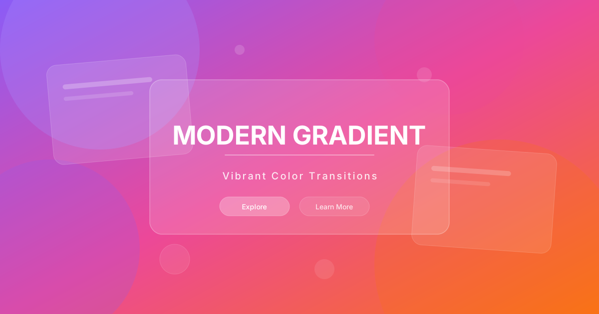
按钮
Modern Gradient 风格的渐变按钮
// Primary Gradient Button
<button className="px-8 py-4 bg-gradient-to-r from-violet-500 via-fuchsia-500 to-violet-500 bg-[length:200%_auto] text-white rounded-2xl font-bold tracking-wide shadow-[0_8px_20px_rgba(167,139,250,0.3)] hover:bg-right hover:shadow-[0_15px_30px_rgba(217,70,239,0.4)] hover:-translate-y-1 hover:scale-[1.02] active:scale-95 transition-all duration-500 ease-out">
  Get Started
</button>

// Outline Gradient Button
<button className="px-6 py-3 rounded-2xl font-medium relative group hover:-translate-y-1 hover:scale-[1.02] transition-all duration-500 ease-out">
  <span className="absolute inset-0 bg-gradient-to-r from-violet-500 to-fuchsia-500 rounded-2xl" />
  <span className="absolute inset-[2px] bg-slate-950 rounded-[14px] group-hover:bg-slate-900 transition-colors duration-500" />
  <span className="relative bg-gradient-to-r from-violet-400 to-fuchsia-400 bg-clip-text text-transparent">
    Learn More
  </span>
</button>

// Glass Button
<button className="px-6 py-3 backdrop-blur-xl bg-white/10 border border-white/20 text-white rounded-2xl font-medium hover:bg-white/20 hover:border-violet-400/50 hover:shadow-[0_12px_30px_rgba(139,92,246,0.28)] hover:-translate-y-1 transition-all duration-500 ease-out">
  Explore
</button>