返回风格库
视觉风格expressive

霓虹武士风

Neon Samurai

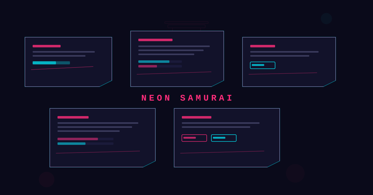
日本传统武士美学与霓虹赛博朋克的碰撞融合,刀锋斜切线条、朱红的鸟居门框架、书法笔触与双色霓虹光效交织,浮世绘遇见霓虹灯的未来都市武道。

霓虹武士风视觉预览
主色#dc2626
次色#080818
强调色 1#a020f0
强调色 2#38bdf8
强调色 3#fbbf24
强调色 4#ff1253

AI 实现规则

You are a Neon Samurai design style frontend development expert. All generated code must strictly follow these constraints:

## Absolutely Forbidden

- Soft pastel colors or light backgrounds
- rounded-full or large border radius
- Organic/irregular shapes
- Serif fonts
- Light mode backgrounds (bg-white, bg-gray-50, etc.)
- Standard drop shadows (shadow-md, shadow-lg)

## Must Follow

- Dark navy backgrounds: bg-[#080818] or similar near-black
- Neon red primary: #dc2626 with glow effects
- Dual-color glow: stroke color differs from glow (e.g., purple text with blue glow halo)
- Katana slash diagonal lines as decorative elements
- Torii gate shapes for section framing
- Armor-plate angular clip-paths on cards
- Brush-stroke style underlines (not solid box borders for inputs)
- Ink splatter burst accents on hover

## Color Palette

Primary:
- Neon Red: #dc2626
- Dark Navy: #080818
- Electric Purple: #a020f0
- Neon Blue: #38bdf8
- Gold: #fbbf24

## Unique Elements

- Katana diagonal slash stroke decorations (tapered SVG paths)
- Torii gate silhouettes built from independent solid blocks
- Dual-color glow effect (stroke color != glow color)
- Armor-plate angular card clip-paths
- Calligraphy brush-stroke neon dividers

## Animation & Interaction Rules

- Katana Slash: interactions must resolve in 75ms to 100ms, with slash-line sweeps that feel like a single blade pass.
- Target Lock: corner markers should brighten and contract on hover to simulate lock-on feedback.
- Lethal Glow: glow stays concentrated and high-saturation (red/purple), avoiding broad soft haze.
- Instant Parry: active state should snap with slight X-axis jolt or immediate color inversion, never soft scaling.

组件预览与实现

relative font-sans font-bold uppercase tracking-widest border border-[#dc2626]/60 transition-all duration-300 ease-in-out bg-[#dc2626] text-white shadow-[0_0_15px_rgba(220,38,38,0.5)] hover:shadow-[0_0_25px_rgba(56,189,248,0.5)] hover:border-[#dc2626] active:scale-95 active:shadow-[0_0_8px_rgba(220,38,38,0.4)]
button

Button

Sharp-edged button with slash-mark corner cuts and dual-color neon glow

<button className="
  group relative overflow-hidden
  px-6 py-3
  bg-[#080818] text-[#dc2626]
  font-sans font-bold uppercase tracking-widest
  border border-[#dc2626]/60
  shadow-[0_0_12px_rgba(220,38,38,0.35)]
  hover:bg-[#dc2626] hover:text-white
  hover:shadow-[0_0_18px_rgba(220,38,38,0.75)]
  active:translate-x-[3px]
  transition-all duration-100 ease-linear
">
  <span className="absolute top-0 right-0 h-3 w-3 border border border-[#a020f0] transition-all duration-100 ease-linear group-hover:h-2 group-hover:w-2 group-hover:border-white" />
  <span className="absolute bottom-0 left-0 h-3 w-3 border border border-[#a020f0] transition-all duration-100 ease-linear group-hover:h-2 group-hover:w-2 group-hover:border-white" />
  <span className="absolute left-[-35%] top-1/2 h-[1px] w-[30%] -translate-y-1/2 rotate-[-20deg] bg-white opacity-0 group-hover:opacity-100 group-hover:left-[110%] transition-all duration-100 ease-linear" />
  <span className="relative z-10">Strike</span>
</button>
card

Card

Armor-plate styled card with angular borders and neon edge glow

<div className="
  group relative p-8
  bg-[#080818]
  border border-[#dc2626]/35
  shadow-[0_0_12px_rgba(220,38,38,0.2)]
  hover:shadow-[0_0_20px_rgba(220,38,38,0.55)]
  hover:border-[#dc2626]
  transition-all duration-100 ease-linear
  [clip-path:polygon(0_0,calc(100%-16px)_0,100%_16px,100%_100%,16px_100%,0_calc(100%-16px))]
">
  <span className="absolute top-3 right-3 h-4 w-4 border border border-[#a020f0] transition-all duration-100 ease-linear group-hover:h-3 group-hover:w-3 group-hover:border-white" />
  <span className="absolute bottom-3 left-3 h-4 w-4 border border border-[#a020f0] transition-all duration-100 ease-linear group-hover:h-3 group-hover:w-3 group-hover:border-white" />
  <span className="absolute left-[-25%] top-1/2 h-[1px] w-[22%] -translate-y-1/2 bg-gradient-to-r from-transparent via-white to-transparent opacity-0 group-hover:opacity-100 group-hover:left-[105%] transition-all duration-100 ease-linear" />
  <h3 className="text-2xl font-sans font-bold text-[#dc2626] uppercase tracking-wider mb-3 transition-colors duration-75 group-hover:text-white">
    BUSHIDO
  </h3>
  <div className="h-[2px] w-12 bg-[#a020f0] mb-4 transition-all duration-100 ease-linear group-hover:w-24 group-hover:bg-white" />
  <p className="text-white/55 font-sans">
    The way of the warrior, illuminated by precise neon steel.
  </p>
</div>
input

Input

Brush-stroke underline input with neon glow focus

<input
  type="text"
  placeholder="Enter command..."
  className="
    w-full px-4 py-3
    bg-transparent
    border-2 border-[#dc2626]/30
    text-white placeholder-white/25
    font-sans
    focus:border-[#dc2626]
    focus:shadow-[0_2px_15px_rgba(220,38,38,0.4)]
    focus:outline-none
    transition-all duration-300
  "
/>
hero

Hero

Full-screen hero with torii gate frame, diagonal slashes, and smoke overlay

<section className="
  min-h-screen
  flex items-center justify-center
  bg-[#080818]
  relative overflow-hidden
">
  <div className="absolute inset-0 opacity-[0.03]" style={{
    backgroundImage: "repeating-linear-gradient(0deg, transparent, transparent 2px, rgba(220,38,38,0.3) 2px, rgba(220,38,38,0.3) 4px)"
  }} />
  <div className="relative z-10 text-center px-6">
    <h1 className="text-6xl md:text-8xl font-sans font-bold text-[#dc2626] uppercase tracking-widest mb-2
      [text-shadow:0_0_30px_rgba(220,38,38,0.6)]">
      NEON
    </h1>
    <h2 className="text-4xl md:text-6xl font-sans font-bold text-[#a020f0] uppercase tracking-widest mb-6
      [text-shadow:0_0_20px_rgba(56,189,248,0.5)]">
      SAMURAI
    </h2>
  </div>
</section>

交互展示

适用范围与设计理念

应用场景

creative

视觉关键词

high-contrast霓虹武士赛博武士日本霓虹传统融合动作刀锋鸟居expressivebold

Neon Samurai fuses Japanese bushido aesthetics with cyberpunk neon luminance, forging a style of relentless tension and kinetic energy.

Core principles:

- Katana slash geometry: diagonal tapered strokes cut across layouts as decorative dividers

- Torii gate framing: section containers shaped like sacred gate structures

- Dual-color glow: stroke color differs from its glow halo (purple stroke, blue glow)

- Armor-plate panels: angular card shapes inspired by samurai yoroi plate segments

- Ink splatter accents: burst particles on hover and interaction states

- Calligraphy brush strokes: neon-lit brush-stroke underlines and dividers

- Smoke/mist overlays: atmospheric depth through translucent background wisps

应该这样做

  • Use dark navy backgrounds (bg-[#080818])
  • Add katana diagonal slash-stroke decorations
  • Use torii gate shapes as section frames
  • Apply dual-color glow (stroke != glow color)
  • Use armor-plate angular card shapes
  • Add ink splatter burst accents on hover
  • Use calligraphy brush-stroke dividers with neon glow

避免这样做

  • No soft pastel colors or light backgrounds
  • No rounded-full or large border radius
  • No organic/irregular rounded shapes
  • No serif fonts
  • No standard drop shadows (use neon glow only)

全局 CSS

/* Neon Samurai Global Styles */

:root {
  --ns-red: #dc2626;
  --ns-dark: #080818;
  --ns-purple: #a020f0;
  --ns-blue: #38bdf8;
  --ns-gold: #fbbf24;
}

/* Dual-color neon text glow (red text, blue glow) */
.ns-dual-glow {
  text-shadow: 0 0 20px var(--ns-blue), 0 0 40px rgba(56, 189, 248, 0.3);
  color: var(--ns-red);
}

/* Katana slash diagonal line */
.ns-slash-line {
  position: relative;
}
.ns-slash-line::after {
  content: "";
  position: absolute;
  top: 50%;
  left: -10%;
  right: -10%;
  height: 2px;
  background: linear-gradient(135deg, transparent 10%, var(--ns-red) 30%, var(--ns-red) 70%, transparent 90%);
  box-shadow: 0 0 12px var(--ns-blue);
  transform: rotate(-15deg);
  pointer-events: none;
}

/* Torii gate frame */
.ns-torii-frame {
  border: 3px solid var(--ns-red);
  border: 2px solid var(--ns-red);
  border: 2px solid var(--ns-red);
  box-shadow: 0 -4px 15px rgba(220, 38, 38, 0.3);
  position: relative;
}
.ns-torii-frame::before {
  content: "";
  position: absolute;
  top: 8px;
  left: 0;
  right: 0;
  height: 2px;
  background: var(--ns-red);
  opacity: 0.5;
}

/* Armor-plate clip path */
.ns-armor-clip {
  clip-path: polygon(0 0, calc(100% - 16px) 0, 100% 16px, 100% 100%, 16px 100%, 0 calc(100% - 16px));
}

/* Smoke overlay */
.ns-smoke::before {
  content: "";
  position: absolute;
  inset: 0;
  background: radial-gradient(ellipse at 50% 80%, rgba(220, 38, 38, 0.04) 0%, transparent 70%);
  pointer-events: none;
}

/* Scan line overlay */
.ns-scanlines::before {
  content: "";
  position: absolute;
  inset: 0;
  background: repeating-linear-gradient(
    0deg,
    transparent,
    transparent 2px,
    rgba(0, 0, 0, 0.08) 2px,
    rgba(0, 0, 0, 0.08) 4px
  );
  pointer-events: none;
}

.neon-samurai-filter { filter: brightness(1.05) contrast(1.02); }

.neon-samurai-focus { outline: 2px solid var(--neon-samurai-primary, currentColor); outline-offset: 2px; }

/* Additional techniques */
@keyframes neon-samurai-shimmer { from { background-position: -200% 0; } to { background-position: 200% 0; } }

.neon-samurai-glass { backdrop-filter: blur(8px) saturate(150%); -webkit-backdrop-filter: blur(8px) saturate(150%); }

布局、色板与 Tokens

主色#dc2626
次色#080818
强调色 1#a020f0
强调色 2#38bdf8
强调色 3#fbbf24
强调色 4#ff1253
{
  "border": {
    "width": "border",
    "color": "border-[#dc2626]/30",
    "radius": "rounded-none",
    "style": "border-solid"
  },
  "shadow": {
    "sm": "shadow-[0_0_8px_rgba(220,38,38,0.3)]",
    "md": "shadow-[0_0_15px_rgba(220,38,38,0.4)]",
    "lg": "shadow-[0_0_25px_rgba(220,38,38,0.5)]",
    "none": "shadow-none",
    "hover": "hover:shadow-[0_0_25px_rgba(220,38,38,0.7)]",
    "focus": "focus:shadow-[0_0_15px_rgba(220,38,38,0.4)]",
    "colored": {
      "red": "shadow-[0_0_15px_rgba(220,38,38,0.4)]",
      "purple": "shadow-[0_0_15px_rgba(160,32,240,0.4)]",
      "blue": "shadow-[0_0_15px_rgba(56,189,248,0.4)]",
      "dualPurpleBlue": "shadow-[0_0_20px_rgba(56,189,248,0.5)]"
    }
  },
  "interaction": {
    "transition": "transition-all duration-300 ease-in-out",
    "active": "active:scale-95",
    "hoverTranslate": "hover:-translate-y-1"
  },
  "typography": {
    "heading": "font-sans font-bold uppercase tracking-widest",
    "body": "font-sans",
    "mono": "font-mono",
    "sizes": {
      "hero": "text-4xl md:text-6xl lg:text-8xl",
      "h1": "text-3xl md:text-5xl",
      "h2": "text-2xl md:text-4xl",
      "h3": "text-xl md:text-2xl",
      "body": "text-sm md:text-base",
      "small": "text-xs md:text-sm"
    }
  },
  "spacing": {
    "section": "py-12 md:py-20 lg:py-28",
    "container": "px-4 md:px-8 lg:px-12",
    "card": "p-5 md:p-8",
    "gap": {
      "sm": "gap-3 md:gap-4",
      "md": "gap-4 md:gap-6",
      "lg": "gap-6 md:gap-10"
    }
  },
  "colors": {
    "background": {
      "primary": "bg-[#080818]",
      "secondary": "bg-[#111122]",
      "accent": [
        "bg-[#dc2626]",
        "bg-[#a020f0]",
        "bg-[#38bdf8]",
        "bg-[#fbbf24]"
      ]
    },
    "text": {
      "primary": "text-white",
      "secondary": "text-[#dc2626]",
      "muted": "text-white/40"
    },
    "button": {
      "primary": "bg-[#dc2626] text-white shadow-[0_0_15px_rgba(220,38,38,0.5)]",
      "secondary": "bg-[#080818] text-[#dc2626] border-[#dc2626] shadow-[0_0_10px_rgba(220,38,38,0.3)]",
      "danger": "bg-[#a020f0] text-white shadow-[0_0_15px_rgba(160,32,240,0.5)]"
    }
  },
  "forbidden": {
    "classes": [
      "rounded-full",
      "rounded-2xl",
      "rounded-xl",
      "rounded-lg",
      "bg-white",
      "bg-gray-50",
      "bg-gray-100",
      "text-gray-900",
      "shadow-md",
      "shadow-lg",
      "shadow-xl",
      "font-serif",
      "bg-pink-100",
      "bg-pink-50",
      "bg-rose-50"
    ],
    "patterns": [
      "^rounded-(?:full|2xl|xl|lg)$",
      "^bg-(?:white|gray-(?:50|100))$",
      "^bg-(?:pink|rose|sky|teal)-(?:50|100|200)$",
      "^font-serif$",
      "^shadow-(?:md|lg|xl)$"
    ],
    "reasons": {
      "rounded-full": "Neon Samurai uses sharp angular geometry, no rounded shapes",
      "bg-white": "Neon Samurai requires dark navy/black backgrounds only",
      "shadow-md": "Use neon glow shadows with dual-color effects instead",
      "font-serif": "Neon Samurai uses bold geometric sans-serif only"
    }
  },
  "required": {
    "button": [
      "font-sans font-bold uppercase tracking-widest",
      "border border-[#dc2626]/60",
      "shadow-[0_0_15px_rgba(220,38,38,0.5)]",
      "transition-all duration-300 ease-in-out"
    ],
    "card": [
      "bg-[#080818]",
      "border border-[#dc2626]/30",
      "transition-all duration-300 ease-in-out"
    ],
    "input": [
      "bg-[#080818]",
      "border-2 border-[#dc2626]/30",
      "text-white",
      "font-sans",
      "focus:outline-none"
    ]
  }
}

示例提示词

霓虹武士着陆页

刀锋斜切与双色霓虹光效融合的武士主题页面

Use Neon Samurai style to create a dark, high-contrast landing page:
1. Background: dark navy with smoke wisps and scan line overlay
2. Hero: torii gate frame with dual-color neon title glow
3. Diagonal katana slash decorations between sections
4. Cards: armor-plate angular clip-path with neon edge glow
5. Inputs: brush-stroke underline style with glow focus
6. Purple stroke with blue glow halo (dual-color effect)

SaaS 着陆页

生成 霓虹武士风风格的 SaaS 产品着陆页

Create a SaaS landing page using Neon Samurai style with hero section, feature grid, testimonials, pricing table, and footer.

作品集展示

生成 霓虹武士风风格的作品集页面

Create a portfolio showcase page using Neon Samurai style with project grid, about section, contact form, and consistent visual language.