返回风格库
视觉风格modern

霓虹东京

Neon Tokyo

东京歌舞伎町霓虹夜景风格,湿润的街道倒影、叠层霓虹招牌、赛博朋克城市夜色。不同于cyberpunk-neon的科幻感,更偏向真实都市夜景。

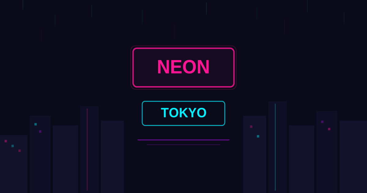
霓虹东京视觉预览
主色#ff1493
次色#0a0a1a
强调色 1#00f0ff
强调色 2#ff6b00
强调色 3#bc13fe
强调色 4#97b6ff

AI 实现规则

STYLE: Neon Tokyo
TYPE: Urban nightscape interface

MUST USE:
- Dark night sky background: bg-[#0a0a1a]
- Multi-color neon glows (not single-color)
- Primary pink: text-[#ff1493], border-[#ff1493]
- Cyan accent: text-[#00f0ff]
- Warm neon: text-[#ff6b00]
- Purple neon: text-[#bc13fe]
- Glow shadows with color: shadow-[0_0_20px_rgba(255,20,147,0.5)]
- backdrop-blur for glass/reflection effect
- font-bold uppercase tracking-wider for labels
- rounded-sm for subtle edge softness

MUST AVOID:
- Light/white backgrounds
- Low saturation or muted colors
- Regular shadows (shadow-md)
- Serif fonts (except for Japanese decorative text)
- Single-color neon palettes
- Corporate or overly clean layouts

COLOR RULES:
- Neon Pink: #ff1493 (primary)
- Night Sky: #0a0a1a (background)
- Cyan Neon: #00f0ff
- Warm Neon: #ff6b00
- Purple Neon: #bc13fe

DIFFERENCE FROM CYBERPUNK-NEON:
- Warmer, more organic feel
- Multi-color neon mixing (not cyan-dominant)
- Street photography aesthetic, not sci-fi
- Wet reflections, not scan lines

## Animation & Interaction Rules

- Rain-Slicked Reflections: bottom reflection gradients should intensify on hover with higher opacity and mixed-color refraction.
- Signboard Flicker: primary neon headings can use subtle irregular flicker to mimic aging street signage.
- Bleeding Glows: hover state should expand pink/cyan/orange glow layers simultaneously so light bleeds at the edges.
- Damp Atmosphere: transitions stay smooth (duration-300 to 500) to preserve wet-night ambience rather than sharp arcade motion.

组件预览与实现

font-mono font-bold uppercase tracking-widest rounded-none border-2 transition-all duration-200 bg-[#ff1493] text-[#0a0a1a] border-[#ff1493] shadow-[0_0_20px_rgba(255,20,147,0.5)] hover:shadow-[0_0_35px_rgba(255,20,147,0.7)] hover:scale-105 hover:tracking-[0.2em] active:scale-[0.96]
button

按钮

霓虹东京风格的发光按钮

<button className="
  group relative
  px-6 py-3
  bg-[#0a0a1a]/80 backdrop-blur-md
  border-2 border-[#ff1493]
  text-[#ff1493] font-bold uppercase tracking-wider
  shadow-[0_0_15px_rgba(255,20,147,0.4),0_0_20px_rgba(0,240,255,0.15),inset_0_0_12px_rgba(255,20,147,0.08)]
  hover:text-white hover:border-[#00f0ff] hover:bg-[#ff1493]/10
  hover:shadow-[0_0_28px_rgba(255,20,147,0.7),0_0_36px_rgba(0,240,255,0.45),0_0_44px_rgba(255,107,0,0.3)]
  active:bg-[#ff1493]/20
  transition-all duration-500
  rounded-sm
">
  Enter
</button>
card

卡片

霓虹东京风格的街景卡片

<div className="group relative overflow-hidden bg-[#0a0a1a]/80 backdrop-blur-md border border-[#ff1493]/30 rounded-sm p-6 shadow-[0_0_15px_rgba(255,20,147,0.15)] hover:border-[#ff1493]/60 hover:shadow-[0_0_28px_rgba(255,20,147,0.35),0_0_44px_rgba(0,240,255,0.18)] transition-all duration-500">
  <div className="absolute inset-x-0 bottom-0 h-1/2 bg-gradient-to-t from-[#ff1493]/10 via-[#00f0ff]/0 to-transparent pointer-events-none transition-all duration-500 group-hover:from-[#ff1493]/30 group-hover:via-[#00f0ff]/15" />
  <div className="absolute inset-x-0 bottom-0 h-1/3 bg-gradient-to-t from-[#ff6b00]/10 to-transparent pointer-events-none opacity-60 transition-opacity duration-500 group-hover:opacity-100" />

  <div className="relative">
    <div className="flex items-center justify-between mb-4">
      <span className="text-[#00f0ff] text-xs font-bold uppercase tracking-widest transition-colors duration-300 group-hover:text-white">Kabukicho</span>
      <div className="flex gap-1">
        <div className="w-1.5 h-1.5 bg-[#ff1493] shadow-[0_0_6px_rgba(255,20,147,0.8)] transition-all duration-300 group-hover:scale-150 group-hover:shadow-[0_0_14px_rgba(255,20,147,1)]" />
        <div className="w-1.5 h-1.5 bg-[#00f0ff] shadow-[0_0_6px_rgba(0,240,255,0.8)] transition-all duration-300 delay-75 group-hover:scale-150 group-hover:shadow-[0_0_14px_rgba(0,240,255,1)]" />
        <div className="w-1.5 h-1.5 bg-[#ff6b00] shadow-[0_0_6px_rgba(255,107,0,0.8)] transition-all duration-300 delay-150 group-hover:scale-150 group-hover:shadow-[0_0_14px_rgba(255,107,0,1)]" />
      </div>
    </div>
    <h3 className="text-white text-xl font-bold mb-3 animate-[neon-flicker_3s_linear_infinite] transition-all duration-300 group-hover:[text-shadow:0_0_16px_rgba(255,20,147,0.8),0_0_28px_rgba(0,240,255,0.35)]">
      Midnight Alley
    </h3>
    <p className="text-gray-400 leading-relaxed text-sm transition-colors duration-300 group-hover:text-gray-200">
      Neon signs flicker above rain-slicked streets, casting liquid color across the pavement.
    </p>
  </div>
</div>
input

输入框

霓虹东京风格的输入框

<div className="space-y-2">
  <label className="block text-[#00f0ff] text-xs font-bold uppercase tracking-widest">Location</label>
  <div className="relative">
    <input
      type="text"
      className="w-full px-4 py-3 bg-[#0a0a1a]/80 backdrop-blur-sm border border-[#ff1493]/30 rounded-sm text-white placeholder-gray-600 focus:outline-none focus:border-[#ff1493] focus:shadow-[0_0_15px_rgba(255,20,147,0.3)] transition-all duration-300"
      placeholder="Search the neon streets..."
    />
    <div className="absolute right-3 top-1/2 -translate-y-1/2 w-2 h-2 bg-[#ff1493] shadow-[0_0_8px_rgba(255,20,147,0.8)] animate-pulse" />
  </div>
</div>

交互展示

适用范围与设计理念

应用场景

creativemarketing

视觉关键词

high-contrast霓虹东京夜景歌舞伎町都市招牌倒影moderncontemporarysleek

Neon Tokyo(霓虹东京)灵感源自东京歌舞伎町、新宿和涩谷的霓虹夜景。不同于 Cyberpunk Neon 的科幻未来感,这个风格更贴近真实的都市夜色——雨后的街道倒映着层叠的霓虹招牌,暖色与冷色交织在潮湿的沥青上。

核心理念:

- 都市夜色:以近黑的深蓝灰为基底,模拟东京深夜的城市天际线

- 霓虹招牌:多色霓虹灯光叠加,粉色、青色、橙色和紫色交错闪烁

- 湿润反射:元素带有微妙的反射感,如同雨后街道上的霓虹倒影

- 层次纵深:前景明亮、背景幽暗,模拟城市街巷的视觉纵深

与 Cyberpunk Neon 的关键区别在于:Neon Tokyo 更温暖、更有机、更接近真实摄影质感。它不追求冰冷的科技感,而是捕捉深夜独行者在霓虹丛林中的那种孤独浪漫。

适合场景:夜生活应用、音乐流媒体、潮流品牌、城市摄影作品集、日式居酒屋菜单。

应该这样做

  • 背景使用深夜蓝黑 bg-[#0a0a1a] 或 bg-gradient-to-b from-[#0a0a1a] to-[#12041e]
  • 霓虹粉色文字 text-[#ff1493] 搭配发光 [text-shadow:0_0_10px_rgba(255,20,147,0.6)]
  • 多色霓虹边框交替使用 border-[#ff1493]、border-[#00f0ff]、border-[#ff6b00]
  • 悬停时增强霓虹光晕 hover:shadow-[0_0_30px_rgba(255,20,147,0.5)]
  • 使用 sans-serif 粗体字搭配日文假名装饰元素
  • 卡片背景添加微透明 bg-[#0a0a1a]/80 backdrop-blur-md 模拟玻璃反射
  • 渐变文字效果 bg-gradient-to-r from-[#ff1493] to-[#00f0ff] bg-clip-text text-transparent
  • 使用 box-shadow 多层叠加模拟霓虹灯管的光晕扩散

避免这样做

  • 禁止使用白色或浅色背景
  • 禁止使用低饱和度、灰暗的颜色
  • 禁止使用常规阴影 shadow-md(必须是彩色发光阴影)
  • 禁止使用柔和的渐变(如柔粉、淡蓝)
  • 禁止使用衬线字体(除非作为日式装饰元素)
  • 禁止使用过于规整、企业化的布局
  • 禁止使用单一颜色的霓虹(必须多色交织)

全局 CSS

/* Neon Tokyo Global Styles */
@layer base {
  body {
    @apply bg-[#0a0a1a] text-white antialiased;
  }

  h1, h2, h3 {
    text-shadow: 0 0 15px rgba(255, 20, 147, 0.4);
  }

  ::selection {
    @apply bg-[#ff1493] text-white;
  }
}

/* Wet street reflection */
.neon-tokyo-reflect {
  position: relative;
}
.neon-tokyo-reflect::after {
  content: '';
  position: absolute;
  inset: 0;
  background: linear-gradient(
    to bottom,
    transparent 60%,
    rgba(255, 20, 147, 0.03) 80%,
    rgba(0, 240, 255, 0.03) 100%
  );
  pointer-events: none;
}

@keyframes neon-flicker {
  0%, 95%, 100% { opacity: 1; }
  96% { opacity: 0.6; }
  97% { opacity: 1; }
  98% { opacity: 0.8; }
}
/* Neon Tokyo Design Tokens */
:root {
  --neon-tokyo-primary: #ff1493;
  --neon-tokyo-secondary: #0a0a1a;
  --neon-tokyo-accent: #00f0ff;
  --neon-tokyo-glow: rgba(255, 20, 147, 0.3);
}

.neon-tokyo-frosted {
  backdrop-filter: blur(12px) saturate(180%);
  -webkit-backdrop-filter: blur(12px) saturate(180%);
  background: rgba(255, 20, 147, 0.08);
}

.neon-tokyo-accent-corner {
  clip-path: polygon(0 0, 100% 0, 100% calc(100% - 2rem), calc(100% - 2rem) 100%, 0 100%);
}

.neon-tokyo-animate-in {
  animation: neon-tokyo-fade-in 0.5s ease-out both;
}

.neon-tokyo-hover-lift { transition: transform 0.3s ease; }

.neon-tokyo-hover-lift:hover { transform: translateY(-2px); }

.neon-tokyo-focus { outline: 2px solid var(--neon-tokyo-primary, currentColor); outline-offset: 2px; }

布局、色板与 Tokens

主色#ff1493
次色#0a0a1a
强调色 1#00f0ff
强调色 2#ff6b00
强调色 3#bc13fe
强调色 4#97b6ff
{
  "border": {
    "width": "border-2",
    "color": "border-[#ff1493]/30",
    "radius": "rounded-sm",
    "style": "border-solid"
  },
  "shadow": {
    "sm": "shadow-[0_0_10px_rgba(255,20,147,0.2)]",
    "md": "shadow-[0_0_15px_rgba(255,20,147,0.3)]",
    "lg": "shadow-[0_0_25px_rgba(255,20,147,0.4)]",
    "none": "shadow-none",
    "hover": "hover:shadow-[0_0_30px_rgba(255,20,147,0.5)]",
    "focus": "focus:shadow-[0_0_20px_rgba(255,20,147,0.4)]",
    "colored": {
      "pink": "shadow-[0_0_20px_rgba(255,20,147,0.5)]",
      "cyan": "shadow-[0_0_20px_rgba(0,240,255,0.5)]",
      "orange": "shadow-[0_0_20px_rgba(255,107,0,0.5)]",
      "purple": "shadow-[0_0_20px_rgba(188,19,254,0.5)]"
    }
  },
  "interaction": {
    "transition": "transition-all duration-300",
    "active": "active:scale-95",
    "hoverScale": "hover:shadow-[0_0_30px_rgba(255,20,147,0.5)]"
  },
  "typography": {
    "heading": "font-bold",
    "body": "font-sans",
    "mono": "font-mono",
    "sizes": {
      "hero": "text-4xl md:text-6xl lg:text-8xl",
      "h1": "text-3xl md:text-5xl",
      "h2": "text-2xl md:text-3xl",
      "h3": "text-xl md:text-2xl",
      "body": "text-sm md:text-base",
      "small": "text-xs"
    }
  },
  "spacing": {
    "section": "py-16 md:py-24",
    "container": "px-4 md:px-8",
    "card": "p-6",
    "gap": {
      "sm": "gap-4",
      "md": "gap-6",
      "lg": "gap-8"
    }
  },
  "colors": {
    "background": {
      "primary": "bg-[#0a0a1a]",
      "secondary": "bg-[#0a0a1a]/80",
      "accent": [
        "bg-[#ff1493]",
        "bg-[#00f0ff]",
        "bg-[#ff6b00]",
        "bg-[#bc13fe]"
      ]
    },
    "text": {
      "primary": "text-white",
      "secondary": "text-[#ff1493]",
      "muted": "text-gray-400"
    },
    "button": {
      "primary": "bg-transparent text-[#ff1493] border-2 border-[#ff1493]",
      "secondary": "bg-[#00f0ff] text-[#0a0a1a]",
      "danger": "bg-red-600 text-white shadow-[0_0_15px_rgba(255,0,0,0.5)]"
    }
  },
  "forbidden": {
    "classes": [
      "bg-white",
      "bg-gray-50",
      "bg-gray-100",
      "shadow-sm",
      "shadow-md",
      "shadow-lg",
      "text-gray-900",
      "rounded-2xl",
      "rounded-3xl"
    ],
    "patterns": [
      "^bg-(?:white|gray-[1-3]|slate-[1-3])",
      "^shadow-(?!\\[|none)",
      "^rounded-(?:2xl|3xl)"
    ],
    "reasons": {
      "bg-white": "Neon Tokyo uses dark night-sky backgrounds only",
      "shadow-md": "Use colored neon glow: shadow-[0_0_20px_rgba(255,20,147,0.5)]",
      "rounded-2xl": "Keep corners minimal (rounded-sm max)"
    }
  },
  "required": {
    "button": [
      "px-6 py-3",
      "font-bold",
      "uppercase tracking-wider",
      "transition-all duration-300",
      "rounded-sm"
    ],
    "card": [
      "bg-[#0a0a1a]/80",
      "backdrop-blur-md",
      "border border-[#ff1493]/30",
      "rounded-sm"
    ],
    "input": [
      "bg-[#0a0a1a]/80",
      "border border-[#ff1493]/30",
      "rounded-sm",
      "text-white",
      "focus:border-[#ff1493]",
      "focus:shadow-[0_0_15px_rgba(255,20,147,0.3)]",
      "focus:outline-none"
    ]
  }
}

示例提示词

夜间餐厅菜单

霓虹东京风格的深夜食堂界面

Create a late-night restaurant menu using Neon Tokyo style:
- Dark background with neon sign decorations
- Menu items with warm orange and pink neon accents
- Category tabs with multi-color neon borders
- Hero section with flickering neon sign effect
- Wet street reflection aesthetic at the bottom
- Japanese text decorations for atmosphere

SaaS 着陆页

生成 霓虹东京风格的 SaaS 产品着陆页

Create a SaaS landing page using Neon Tokyo style with hero section, feature grid, testimonials, pricing table, and footer.

作品集展示

生成 霓虹东京风格的作品集页面

Create a portfolio showcase page using Neon Tokyo style with project grid, about section, contact form, and consistent visual language.