返回风格库
布局风格modern

固定侧边栏布局

Fixed Sidebar

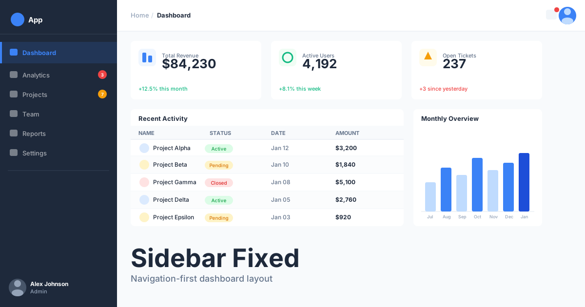
固定位置的侧边导航栏与可滚动主内容区的应用布局,适合后台管理、文档站点、仪表盘、SaaS 应用。

固定侧边栏布局视觉预览
主色#1e293b
次色#f8fafc
强调色 1#3b82f6
强调色 2#10b981
强调色 3#f59e0b
强调色 4#ef4444

AI 实现规则

You are a frontend expert specializing in Fixed Sidebar layout. All generated code must strictly follow these constraints:

## Absolute Prohibitions

- Do NOT make sidebar too wide (max 280px)
- Do NOT keep sidebar expanded on mobile
- Do NOT forget current page indicator
- Do NOT create overly deep navigation
- Do NOT ignore sidebar overflow scroll

## Must Follow

- Sidebar: fixed top-0 left-0 w-64 h-screen
- Main content: ml-64 (matches sidebar width)
- Mobile: sidebar hidden, hamburger menu trigger
- Active state: highlight current page
- Overflow: sidebar nav scrollable if needed

## Structure

Sidebar (top to bottom):
1. Logo/Brand area
2. Search (optional)
3. Main navigation (scrollable)
4. Secondary nav or settings
5. User profile/account

Main content:
- Left margin matches sidebar width
- Own scrolling context
- Header area for page title
- Content area below

## Responsive

Desktop (1024px+):
- Full sidebar visible
- Main content with left margin

Tablet/Mobile (< 1024px):
- Sidebar as off-canvas drawer
- Hamburger menu button
- Overlay when sidebar open
- Main content full width

## Navigation

- Group related items
- Use icons + labels
- Highlight active item
- Support nested items (accordion)
- Tooltips when collapsed

## Self-Check

After generating code, verify:
1. Sidebar is fixed position
2. Main content has correct margin
3. Mobile has hamburger menu
4. Current page is highlighted
5. Sidebar scrolls if content overflows

## Animation & Interaction Rules

- Frictionless Utility: 高交互区统一使用 duration-150,避免花哨动效打断效率。
- Magnetic Icon Shift: hover 时 icon 轻微右移(translate-x-0.5),引导视线进入主内容区。
- Solid Active State: 当前项使用完整边框与整块背景保持稳定状态,避免漂浮感。
- Content Lift: 主区卡片 hover 仅允许 -translate-y-0.5 和轻量阴影,保证阅读稳定。

组件预览与实现

font-medium rounded-lg flex items-center gap-2 transition-colors duration-200 bg-blue-500 text-white hover:bg-blue-600 active:bg-blue-700
button

侧边栏按钮

侧边栏中的操作按钮

<button className="
  w-full
  flex items-center gap-3
  px-4 py-3
  text-left
  text-zinc-600
  rounded-lg
  hover:bg-zinc-100
  hover:text-zinc-900
  transition-colors
">
  <svg className="w-5 h-5" fill="none" stroke="currentColor" viewBox="0 0 24 24">
    <path strokeLinecap="round" strokeLinejoin="round" strokeWidth={2} d="M12 4v16m8-8H4" />
  </svg>
  <span>New Item</span>
</button>
card

内容卡片

主内容区的卡片

<div className="
  p-6
  bg-white
  rounded-xl
  border border-zinc-200
  shadow-sm
  hover:-translate-y-0.5
  hover:shadow-[0_8px_20px_rgba(15,23,42,0.08)]
  transition-all duration-150 ease-out
">
  <h3 className="text-lg font-semibold text-zinc-900 mb-2">
    Card Title
  </h3>
  <p className="text-zinc-600 text-sm">
    Content for the main area card.
  </p>
</div>
input

侧边栏搜索

侧边栏中的搜索框

<div className="relative">
  <svg className="absolute left-3 top-1/2 -translate-y-1/2 w-4 h-4 text-zinc-400" fill="none" stroke="currentColor" viewBox="0 0 24 24">
    <path strokeLinecap="round" strokeLinejoin="round" strokeWidth={2} d="M21 21l-6-6m2-5a7 7 0 11-14 0 7 7 0 0114 0z" />
  </svg>
  <input
    type="text"
    placeholder="Search..."
    className="
      w-full pl-9 pr-4 py-2
      bg-zinc-100
      border-0
      rounded-lg
      text-sm text-zinc-900
      placeholder-zinc-400
      focus:outline-none focus:ring-2 focus:ring-blue-500/30
    "
  />
</div>
nav

侧边导航

侧边栏的导航菜单

<nav className="space-y-1 w-64 p-4 border border-zinc-200 h-screen bg-white">
  <a href="#" className="
    group flex items-center gap-3 px-3 py-2.5
    border border-blue-200 bg-blue-50 text-blue-700 rounded-lg font-medium
    transition-colors duration-150
  ">
    <svg className="w-5 h-5" fill="none" stroke="currentColor" viewBox="0 0 24 24">
      <path strokeLinecap="round" strokeLinejoin="round" strokeWidth={2} d="M3 12l2-2m0 0l7-7 7 7M5 10v10a1 1 0 001 1h3m10-11l2 2m-2-2v10a1 1 0 01-1 1h-3m-6 0a1 1 0 001-1v-4a1 1 0 011-1h2a1 1 0 011 1v4a1 1 0 001 1m-6 0h6" />
    </svg>
    Dashboard
  </a>
  <a href="#" className="
    group flex items-center gap-3 px-3 py-2.5
    border border-transparent text-zinc-600 hover:bg-zinc-100 hover:text-zinc-900
    rounded-lg transition-colors duration-150
  ">
    <svg className="w-5 h-5 group-hover:translate-x-0.5 transition-transform duration-150" fill="none" stroke="currentColor" viewBox="0 0 24 24">
      <path strokeLinecap="round" strokeLinejoin="round" strokeWidth={2} d="M9 19v-6a2 2 0 00-2-2H5a2 2 0 00-2 2v6a2 2 0 002 2h2a2 2 0 002-2zm0 0V9a2 2 0 012-2h2a2 2 0 012 2v10m-6 0a2 2 0 002 2h2a2 2 0 002-2m0 0V5a2 2 0 012-2h2a2 2 0 012 2v14a2 2 0 01-2 2h-2a2 2 0 01-2-2z" />
    </svg>
    Analytics
  </a>
</nav>
hero

固定侧边栏布局

完整的侧边栏应用布局

<div className="h-[480px] flex overflow-hidden bg-zinc-50">
  {/* Sidebar */}
  <aside className="
    relative
    w-64 h-full
    bg-white
    border border-zinc-200
    flex flex-col
    flex-shrink-0
  ">
    {/* Logo */}
    <div className="p-6 border border-zinc-200">
      <span className="text-xl font-bold text-zinc-900">Logo</span>
    </div>

    {/* Search */}
    <div className="p-4">
      <div className="relative">
        <svg className="absolute left-3 top-1/2 -translate-y-1/2 w-4 h-4 text-zinc-400" fill="none" stroke="currentColor" viewBox="0 0 24 24">
          <path strokeLinecap="round" strokeLinejoin="round" strokeWidth={2} d="M21 21l-6-6m2-5a7 7 0 11-14 0 7 7 0 0114 0z" />
        </svg>
        <input type="text" placeholder="Search..." className="w-full pl-9 pr-4 py-2 bg-zinc-100 border-0 rounded-lg text-sm" />
      </div>
    </div>

    {/* Navigation */}
    <nav className="flex-1 px-4 py-2 space-y-1 overflow-y-auto">
      <a href="#" className="flex items-center gap-3 px-4 py-3 bg-blue-50 text-blue-600 rounded-lg font-medium">
        <svg className="w-5 h-5" fill="none" stroke="currentColor" viewBox="0 0 24 24"><path strokeLinecap="round" strokeLinejoin="round" strokeWidth={2} d="M3 12l2-2m0 0l7-7 7 7M5 10v10a1 1 0 001 1h3m10-11l2 2m-2-2v10a1 1 0 01-1 1h-3m-6 0a1 1 0 001-1v-4a1 1 0 011-1h2a1 1 0 011 1v4a1 1 0 001 1m-6 0h6" /></svg>
        Dashboard
      </a>
      <a href="#" className="flex items-center gap-3 px-4 py-3 text-zinc-600 hover:bg-zinc-100 rounded-lg">
        <svg className="w-5 h-5" fill="none" stroke="currentColor" viewBox="0 0 24 24"><path strokeLinecap="round" strokeLinejoin="round" strokeWidth={2} d="M9 19v-6a2 2 0 00-2-2H5a2 2 0 00-2 2v6a2 2 0 002 2h2a2 2 0 002-2z" /></svg>
        Analytics
      </a>
      <a href="#" className="flex items-center gap-3 px-4 py-3 text-zinc-600 hover:bg-zinc-100 rounded-lg">
        <svg className="w-5 h-5" fill="none" stroke="currentColor" viewBox="0 0 24 24"><path strokeLinecap="round" strokeLinejoin="round" strokeWidth={2} d="M12 4.354a4 4 0 110 5.292M15 21H3v-1a6 6 0 0112 0v1z" /></svg>
        Users
      </a>
    </nav>

    {/* User */}
    <div className="p-4 border border-zinc-200">
      <div className="flex items-center gap-3">
        <div className="w-10 h-10 bg-zinc-200 rounded-full" />
        <div>
          <div className="font-medium text-zinc-900 text-sm">John Doe</div>
          <div className="text-zinc-500 text-xs">Admin</div>
        </div>
      </div>
    </div>
  </aside>

  {/* Main Content */}
  <main className="flex-1 p-8 overflow-y-auto">
    {/* Header */}
    <div className="mb-8">
      <h1 className="text-2xl font-bold text-zinc-900">Dashboard</h1>
      <p className="text-zinc-600">Welcome back, John!</p>
    </div>

    {/* Content Grid */}
    <div className="grid grid-cols-1 md:grid-cols-2 lg:grid-cols-3 gap-6">
      <div className="p-6 bg-white rounded-xl border border-zinc-200">
        <h3 className="font-semibold text-zinc-900 mb-2">Total Users</h3>
        <p className="text-3xl font-bold text-blue-600">12,345</p>
      </div>
      <div className="p-6 bg-white rounded-xl border border-zinc-200">
        <h3 className="font-semibold text-zinc-900 mb-2">Revenue</h3>
        <p className="text-3xl font-bold text-emerald-600">$45,678</p>
      </div>
      <div className="p-6 bg-white rounded-xl border border-zinc-200">
        <h3 className="font-semibold text-zinc-900 mb-2">Orders</h3>
        <p className="text-3xl font-bold text-amber-600">1,234</p>
      </div>
    </div>
  </main>
</div>

交互展示

适用范围与设计理念

应用场景

admindocsdashboard

视觉关键词

responsive侧边栏后台管理导航仪表盘应用moderncontemporarysleek现代

Fixed Sidebar(固定侧边栏布局)是应用型界面的经典布局,提供持久可见的导航同时最大化内容展示空间。

核心理念:

- 导航常驻:重要入口始终可及

- 内容优先:主区域最大化利用

- 层级清晰:侧边栏体现信息架构

- 响应适配:小屏幕优雅收起

设计原则:

- 视觉一致性:所有组件必须遵循统一的视觉语言,从色彩到字体到间距保持谐调

- 层次分明:通过颜色深浅、字号大小、留白空间建立清晰的信息层级

- 交互反馈:每个可交互元素都必须有明确的 hover、active、focus 状态反馈

- 响应式适配:设计必须在移动端、平板、桌面端上保持一致的体验

- 无障碍性:确保色彩对比度符合 WCAG 2.1 AA 标准,所有交互元素可键盘访问

应该这样做

  • 侧边栏使用 fixed 或 sticky 定位
  • 主内容区设置左边距 ml-64 或 pl-64
  • 移动端侧边栏可收起为抽屉或汉堡菜单
  • 提供展开/收起侧边栏的控制
  • 侧边栏宽度统一 w-64 (256px) 或 w-72 (288px)
  • 当前页面在侧边栏中高亮显示
  • 侧边栏可以包含品牌 logo、导航、用户信息
  • 导航项交互保持快速克制(duration-150),优先颜色和轻微图标位移反馈
  • 当前激活项使用完整边框与整块背景表达稳定状态
  • 主内容卡片 hover 仅允许微弱抬升和轻量阴影扩散

避免这样做

  • 禁止侧边栏过宽影响主内容区
  • 禁止移动端仍保持展开侧边栏
  • 禁止忽略当前页面状态指示
  • 禁止导航层级过深难以操作
  • 禁止侧边栏内容溢出无滚动
  • 禁止侧边栏菜单使用弹跳、旋转等花哨动画
  • 禁止激活项缺少清晰视觉锚点

全局 CSS

/* Fixed Sidebar Global Styles */

/* Sidebar base */
.sidebar {
  position: fixed;
  top: 0;
  left: 0;
  width: 16rem; /* 256px */
  height: 100vh;
  background: white;
  border: 1px solid #e2e8f0;
  display: flex;
  flex-direction: column;
  z-index: 40;
  transition: transform 0.3s ease;
}

/* Main content offset */
.main-content {
  margin-left: 16rem;
  min-height: 100vh;
}

/* Mobile sidebar hidden by default */
@media (max-width: 1024px) {
  .sidebar {
    transform: translateX(-100%);
  }

  .sidebar.open {
    transform: translateX(0);
  }

  .main-content {
    margin-left: 0;
  }
}

/* Sidebar overlay for mobile */
.sidebar-overlay {
  position: fixed;
  inset: 0;
  background: rgba(0, 0, 0, 0.5);
  z-index: 30;
  opacity: 0;
  visibility: hidden;
  transition: opacity 0.3s, visibility 0.3s;
}

.sidebar-overlay.visible {
  opacity: 1;
  visibility: visible;
}

/* Collapsed sidebar variant */
.sidebar-collapsed {
  width: 4rem; /* 64px */
}

.sidebar-collapsed .sidebar-label {
  display: none;
}

.sidebar-collapsed + .main-content {
  margin-left: 4rem;
}

/* Navigation item active state */
.nav-item {
  display: flex;
  align-items: center;
  gap: 0.75rem;
  padding: 0.75rem 1rem;
  border-radius: 0.5rem;
  color: #64748b;
  transition: all 0.2s;
}

.nav-item:hover {
  background: #f1f5f9;
  color: #0f172a;
}

.nav-item.active {
  background: #eff6ff;
  color: #2563eb;
  font-weight: 500;
}
/* Fixed Sidebar Design Tokens */
:root {
  --sidebar-fixed-primary: #1e293b;
  --sidebar-fixed-secondary: #f8fafc;
  --sidebar-fixed-accent: #3b82f6;
  --sidebar-fixed-glow: rgba(30, 41, 59, 0.3);
}

@keyframes sidebar-fixed-fade-in {
  from { opacity: 0; transform: translateY(8px); }
  to { opacity: 1; transform: translateY(0); }
}

@keyframes sidebar-fixed-pulse {
  0%, 100% { opacity: 1; }
  50% { opacity: 0.7; }
}

.sidebar-fixed-card {
  position: relative;
  overflow: hidden;
}

.sidebar-fixed-card::before {
  content: "";
  position: absolute;
  inset: 0;
  opacity: 0;
  transition: opacity 0.3s ease;
  background: linear-gradient(135deg, rgba(30, 41, 59, 0.05), transparent);
  pointer-events: none;
}

.sidebar-fixed-card:hover::before {
  opacity: 1;
}

.sidebar-fixed-gradient {
  background: linear-gradient(135deg, #1e293b, #3b82f6);
}

.sidebar-fixed-gradient-text {
  background: linear-gradient(135deg, #1e293b, #3b82f6);
  -webkit-background-clip: text;
  -webkit-text-fill-color: transparent;
  background-clip: text;
}

.sidebar-fixed-frosted {
  backdrop-filter: blur(12px) saturate(180%);
  -webkit-backdrop-filter: blur(12px) saturate(180%);
  background: rgba(30, 41, 59, 0.08);
}

.sidebar-fixed-accent-corner {
  clip-path: polygon(0 0, 100% 0, 100% calc(100% - 2rem), calc(100% - 2rem) 100%, 0 100%);
}

.sidebar-fixed-animate-in {
  animation: sidebar-fixed-fade-in 0.5s ease-out both;
}

布局、色板与 Tokens

主色#1e293b
次色#f8fafc
强调色 1#3b82f6
强调色 2#10b981
强调色 3#f59e0b
强调色 4#ef4444
{
  "border": {
    "width": "border",
    "color": "border-zinc-200",
    "radius": "rounded-lg",
    "style": "border-solid"
  },
  "shadow": {
    "sm": "shadow-sm",
    "md": "shadow-sm",
    "lg": "shadow-md",
    "none": "shadow-none",
    "hover": "hover:shadow-md",
    "focus": "focus:shadow-sm",
    "colored": {}
  },
  "interaction": {
    "transition": "transition-colors duration-200",
    "active": "active:scale-95",
    "hoverOpacity": "hover:opacity-90"
  },
  "typography": {
    "heading": "font-semibold tracking-tight",
    "body": "font-sans",
    "mono": "font-mono",
    "sizes": {
      "hero": "text-2xl md:text-3xl",
      "h1": "text-xl md:text-2xl",
      "h2": "text-lg md:text-xl",
      "h3": "text-base md:text-lg",
      "body": "text-sm",
      "small": "text-xs"
    }
  },
  "spacing": {
    "section": "py-6 md:py-8",
    "container": "px-4 md:px-6 lg:px-8",
    "card": "p-4 md:p-6",
    "gap": {
      "sm": "gap-2 md:gap-3",
      "md": "gap-4 md:gap-6",
      "lg": "gap-6 md:gap-8"
    }
  },
  "colors": {
    "background": {
      "primary": "bg-zinc-50",
      "secondary": "bg-white",
      "accent": [
        "bg-blue-500",
        "bg-emerald-500",
        "bg-amber-500",
        "bg-red-500"
      ]
    },
    "text": {
      "primary": "text-zinc-900",
      "secondary": "text-zinc-600",
      "muted": "text-zinc-400"
    },
    "button": {
      "primary": "bg-blue-500 text-white",
      "secondary": "bg-zinc-100 text-zinc-700",
      "danger": "bg-red-500 text-white"
    }
  },
  "forbidden": {
    "classes": [
      "rounded-2xl",
      "rounded-3xl",
      "rounded-full",
      "shadow-2xl",
      "font-black",
      "font-extrabold",
      "text-4xl",
      "text-5xl",
      "text-6xl"
    ],
    "patterns": [
      "^rounded-(?:2xl|3xl|full)",
      "^shadow-2xl",
      "^text-[456]xl"
    ],
    "reasons": {
      "rounded-2xl": "Sidebar Fixed uses compact rounded-lg for functional UI elements",
      "shadow-2xl": "Sidebar Fixed uses subtle shadows for a clean dashboard feel",
      "text-5xl": "Sidebar Fixed uses compact typography appropriate for data-dense layouts"
    }
  },
  "required": {
    "button": [
      "rounded-lg",
      "text-sm font-medium",
      "transition-colors"
    ],
    "card": [
      "bg-white",
      "rounded-xl",
      "border border-zinc-200",
      "shadow-sm"
    ],
    "input": [
      "bg-zinc-100",
      "border-0",
      "rounded-lg",
      "text-sm",
      "focus:outline-none focus:ring-2 focus:ring-blue-500/30"
    ]
  }
}

示例提示词

管理后台

完整的后台管理布局

Create an admin dashboard with fixed sidebar:
1. Fixed sidebar with logo, search, navigation, user
2. Navigation groups: Dashboard, Content, Users, Settings
3. Active page highlighted in nav
4. Main area with header and content grid
5. Mobile: hamburger menu, slide-out sidebar
6. Collapsible sidebar option (icons only)
7. User dropdown at bottom of sidebar
Professional look with blue accent color

文档站点

技术文档的侧边导航布局

Create a documentation site with fixed sidebar:
1. Sidebar with doc sections (Getting Started, API, Examples)
2. Nested navigation with accordion expand
3. Search at top of sidebar
4. Main content area with article
5. Right sidebar with table of contents (optional)
6. Previous/Next article navigation at bottom
7. Mobile: slide-out sidebar menu
Clean minimal design focused on readability

SaaS 应用

SaaS 产品的应用框架

Create a SaaS application shell with fixed sidebar:
1. Sidebar with workspace switcher at top
2. Main nav: Home, Projects, Team, Reports
3. Secondary nav at bottom: Settings, Help
4. Notification badge on nav item
5. Main content with toolbar and data table
6. Mobile: slide-out navigation
7. Collapsible sidebar with keyboard shortcut hint
Modern SaaS aesthetic with subtle shadows