返回风格库
视觉风格modern

柔和界面风

Soft UI

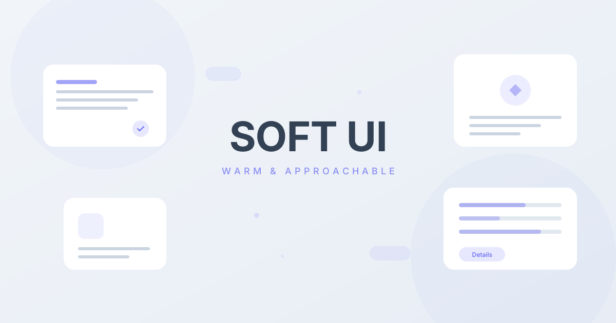
温和友好的界面风格,柔和的阴影、圆润的边角、低饱和度的配色。适合消费类应用、社交产品、生活服务类 App。

柔和界面风视觉预览
主色#6366f1
次色#f1f5f9
强调色 1#ec4899
强调色 2#10b981
强调色 3#f59e0b
强调色 4#d15d1a

AI 实现规则

STYLE: Soft UI
TYPE: Friendly, approachable interface design

MUST USE:
- rounded-2xl or rounded-3xl for all components
- shadow-lg with color tint: shadow-[color]/20
- Soft backgrounds: bg-slate-50, bg-gray-50
- Hover lift effect: hover:-translate-y-0.5 hover:shadow-xl
- Low saturation primary colors
- Circular icon backgrounds: rounded-full bg-[color]/10

MUST AVOID:
- Sharp corners (rounded-none, rounded-sm)
- Pure black (#000000)
- High saturation pure colors
- Hard borders (border-black, border-2)
- Hard shadows (no blur)
- Tight spacing

COLOR RULES:
- Primary: Indigo/Purple tones (indigo-500)
- Background: Slate/Gray soft (slate-50, gray-50)
- Text: Gray-800 for headings, gray-500 for body
- Shadows: Always with color tint and opacity

SPACING:
- Card padding: p-6 md:p-8
- Section padding: py-16 md:py-24
- Gap: gap-6 md:gap-8

## Animation & Interaction Rules

- Cloud Float: hover 以上浮加阴影扩散为主,阴影保持彩色且柔和,避免脏灰硬影。
- Pillow Press: active 状态用轻微缩放和内阴影,呈现按入枕面的柔软反馈。
- Friendly Viscosity: 交互节奏推荐 duration-300 和 ease-in-out,避免突兀速度变化。
- Halo Focus: 表单 focus 使用大半径低不透明度 ring 与柔光阴影,不依赖硬边框。

## Layout & Spacing
- Section padding: py-16 md:py-24
- Card padding: p-6 md:p-8
- Gap between cards: gap-6 md:gap-8
- Max content width: max-w-6xl mx-auto

## Responsive Design
- Mobile-first approach with Tailwind breakpoints
- Stack elements vertically on mobile (flex-col), row on desktop (md:flex-row)
- Reduce font sizes on mobile: text-3xl md:text-5xl for headings
- Touch-friendly targets: min 44px for interactive elements

## Self-Check Verification
After generating code, verify:
1. All interactive elements have hover/focus/active states
2. Color contrast meets WCAG 2.1 AA (4.5:1 for text)
3. Layout is responsive across breakpoints
4. Typography hierarchy is clear (h1 > h2 > h3 > body)
5. Spacing is consistent using the defined scale
6. All animations respect prefers-reduced-motion

组件预览与实现

font-medium border-0 rounded-2xl transition-all duration-200 bg-indigo-500 text-white shadow-lg shadow-indigo-500/30 hover:shadow-xl hover:shadow-indigo-500/40 hover:-translate-y-0.5 active:scale-[0.98]
button

按钮

Soft UI 风格的按钮

// Primary Button
<button className="px-6 py-3 bg-indigo-500 text-white rounded-2xl shadow-[0_10px_24px_rgba(99,102,241,0.25)] hover:shadow-[0_18px_32px_rgba(99,102,241,0.35)] hover:-translate-y-1 active:translate-y-[2px] active:scale-[0.96] active:shadow-[inset_0_4px_10px_rgba(67,56,202,0.28)] transition-all duration-300 ease-in-out font-medium">
  Get Started
</button>

// Secondary Button
<button className="px-6 py-3 bg-white text-gray-700 rounded-2xl shadow-[0_10px_24px_rgba(148,163,184,0.25)] hover:shadow-[0_16px_30px_rgba(148,163,184,0.35)] hover:-translate-y-1 active:translate-y-[2px] active:scale-[0.97] active:shadow-[inset_0_4px_10px_rgba(148,163,184,0.2)] transition-all duration-300 ease-in-out font-medium">
  Learn More
</button>

// Soft Ghost
<button className="px-6 py-3 text-indigo-500 bg-indigo-50 rounded-2xl hover:bg-indigo-100 active:shadow-[inset_0_3px_8px_rgba(99,102,241,0.15)] transition-all duration-300 ease-in-out font-medium">
  Cancel
</button>
card

卡片

Soft UI 风格的卡片

<div className="group bg-white rounded-3xl shadow-[0_12px_32px_rgba(148,163,184,0.25)] p-8 hover:shadow-[0_24px_48px_rgba(99,102,241,0.2)] hover:-translate-y-2 transition-all duration-500 ease-in-out">
  <div className="w-14 h-14 bg-indigo-100 rounded-2xl flex items-center justify-center mb-6 group-hover:scale-110 group-hover:bg-indigo-50 transition-all duration-300 ease-in-out">
    <Icon className="w-7 h-7 text-indigo-500" />
  </div>
  <h3 className="text-xl font-semibold text-gray-800 mb-3 group-hover:text-indigo-600 transition-colors duration-300">Feature Title</h3>
  <p className="text-gray-500 leading-relaxed">
    Soft, friendly description that puts users at ease.
  </p>
</div>
input

输入框

Soft UI 风格的输入框

<div className="space-y-2">
  <label className="block text-sm font-medium text-gray-600">Email</label>
  <input
    type="email"
    className="w-full px-5 py-3.5 bg-gray-50 border-0 rounded-2xl text-gray-800 placeholder:text-gray-400 focus:outline-none focus:bg-white focus:ring-4 focus:ring-indigo-500/20 focus:shadow-[0_10px_26px_rgba(99,102,241,0.14)] transition-all duration-300 ease-in-out"
    placeholder="you@example.com"
  />
</div>

交互展示

适用范围与设计理念

应用场景

saasmarketingecommerce

视觉关键词

柔和圆润友好消费类App社交生活服务moderncontemporarysleek

Soft UI 设计风格强调友好、亲和、舒适的视觉体验,让用户感到放松和愉悦。

核心理念:

- 温和友好:通过柔和的阴影和圆角传达亲和力

- 低对比度:避免强烈对比,使用柔和的色彩过渡

- 触感设计:让界面元素看起来可以触摸

- 情感连接:通过设计传达温暖和关怀

设计原则:

- 视觉一致性:所有组件必须遵循统一的视觉语言,从色彩到字体到间距保持谐调

- 层次分明:通过颜色深浅、字号大小、留白空间建立清晰的信息层级

- 交互反馈:每个可交互元素都必须有明确的 hover、active、focus 状态反馈

- 响应式适配:设计必须在移动端、平板、桌面端上保持一致的体验

- 无障碍性:确保色彩对比度符合 WCAG 2.1 AA 标准,所有交互元素可键盘访问

应该这样做

  • 使用 rounded-2xl 或 rounded-3xl 作为主要圆角
  • 使用 shadow-lg 或 shadow-xl 配合透明度 shadow-[accent]/20
  • 背景使用浅色调 bg-slate-50, bg-gray-50
  • 使用低饱和度的主色调
  • 按钮使用 hover:shadow-xl hover:-translate-y-0.5 的悬浮效果
  • 卡片间使用 gap-6 或 gap-8 的宽松间距
  • 图标使用圆形背景 rounded-full bg-[color]/10

避免这样做

  • 禁止使用尖锐边角 rounded-none
  • 禁止使用纯黑色 #000000
  • 禁止使用高饱和度的纯色
  • 禁止使用硬边框 border-black
  • 禁止使用硬阴影(无模糊的阴影)
  • 禁止元素间距过于紧凑

全局 CSS

/* Soft UI Global Styles */
@layer base {
  :root {
    --soft-shadow: 0 10px 40px -10px rgba(0, 0, 0, 0.1);
  }

  body {
    @apply bg-slate-50 text-gray-800 antialiased;
  }

  h1, h2, h3, h4 {
    @apply font-semibold text-gray-800;
  }
}
@keyframes soft-ui-fade-in {
  from { opacity: 0; transform: translateY(8px); }
  to { opacity: 1; transform: translateY(0); }
}

@keyframes soft-ui-pulse {
  0%, 100% { opacity: 1; }
  50% { opacity: 0.7; }
}

.soft-ui-card {
  position: relative;
  overflow: hidden;
}

.soft-ui-card::before {
  content: "";
  position: absolute;
  inset: 0;
  opacity: 0;
  transition: opacity 0.3s ease;
  background: linear-gradient(135deg, rgba(99, 102, 241, 0.05), transparent);
  pointer-events: none;
}

.soft-ui-card:hover::before {
  opacity: 1;
}

.soft-ui-gradient {
  background: linear-gradient(135deg, #6366f1, #ec4899);
}

.soft-ui-gradient-text {
  background: linear-gradient(135deg, #6366f1, #ec4899);
  -webkit-background-clip: text;
  -webkit-text-fill-color: transparent;
  background-clip: text;
}

.soft-ui-frosted {
  backdrop-filter: blur(12px) saturate(180%);
  -webkit-backdrop-filter: blur(12px) saturate(180%);
  background: rgba(99, 102, 241, 0.08);
}

.soft-ui-accent-corner {
  clip-path: polygon(0 0, 100% 0, 100% calc(100% - 2rem), calc(100% - 2rem) 100%, 0 100%);
}

.soft-ui-animate-in {
  animation: soft-ui-fade-in 0.5s ease-out both;
}

布局、色板与 Tokens

主色#6366f1
次色#f1f5f9
强调色 1#ec4899
强调色 2#10b981
强调色 3#f59e0b
强调色 4#d15d1a
{
  "border": {
    "width": "border-0",
    "color": "border-transparent",
    "radius": "rounded-2xl",
    "style": "border-none"
  },
  "shadow": {
    "sm": "shadow-md shadow-gray-200/50",
    "md": "shadow-lg shadow-gray-200/50",
    "lg": "shadow-xl shadow-gray-200/50",
    "none": "shadow-none",
    "hover": "shadow-xl shadow-indigo-500/20",
    "focus": "ring-2 ring-indigo-500/50",
    "colored": {
      "indigo": "shadow-lg shadow-indigo-500/30",
      "pink": "shadow-lg shadow-pink-500/30",
      "green": "shadow-lg shadow-emerald-500/30"
    }
  },
  "interaction": {
    "transition": "transition-all duration-200",
    "active": "active:scale-95",
    "hoverScale": "hover:-translate-y-0.5",
    "hoverOpacity": "hover:shadow-xl"
  },
  "typography": {
    "heading": "font-semibold",
    "body": "font-normal",
    "mono": "font-mono",
    "sizes": {
      "hero": "text-4xl md:text-5xl lg:text-6xl",
      "h1": "text-3xl md:text-4xl",
      "h2": "text-2xl md:text-3xl",
      "h3": "text-xl md:text-2xl",
      "body": "text-sm md:text-base",
      "small": "text-xs"
    }
  },
  "spacing": {
    "section": "py-16 md:py-24",
    "container": "px-4 md:px-6 lg:px-8",
    "card": "p-6 md:p-8",
    "gap": {
      "sm": "gap-4",
      "md": "gap-6 md:gap-8",
      "lg": "gap-8 md:gap-12"
    }
  },
  "colors": {
    "background": {
      "primary": "bg-slate-50",
      "secondary": "bg-white",
      "accent": [
        "bg-indigo-500",
        "bg-pink-500",
        "bg-emerald-500"
      ]
    },
    "text": {
      "primary": "text-gray-800",
      "secondary": "text-gray-600",
      "muted": "text-gray-400"
    },
    "button": {
      "primary": "bg-indigo-600 text-white shadow-lg shadow-indigo-600/30",
      "secondary": "bg-white text-gray-700 shadow-lg shadow-gray-200/50",
      "danger": "bg-red-600 text-white shadow-lg shadow-red-600/30"
    }
  },
  "forbidden": {
    "classes": [
      "rounded-none",
      "rounded-sm",
      "border-2",
      "border-4",
      "border-black",
      "shadow-[",
      "bg-black"
    ],
    "patterns": [
      "^rounded-none",
      "^rounded-sm$",
      "^border-[24]",
      "^border-black"
    ],
    "reasons": {
      "rounded-none": "Soft UI requires large rounded corners (rounded-2xl+)",
      "border-2": "Soft UI avoids visible borders, uses shadows instead",
      "border-black": "Soft UI uses soft colors, never hard black borders"
    }
  },
  "required": {
    "button": [
      "px-6 py-3",
      "rounded-2xl",
      "font-medium",
      "shadow-lg",
      "hover:-translate-y-0.5",
      "hover:shadow-xl",
      "transition-all duration-200"
    ],
    "card": [
      "bg-white",
      "rounded-3xl",
      "shadow-xl shadow-gray-200/50",
      "hover:shadow-2xl",
      "hover:-translate-y-1",
      "transition-all duration-300"
    ],
    "input": [
      "px-5 py-3.5",
      "bg-gray-50",
      "border-0",
      "rounded-2xl",
      "focus:ring-2 focus:ring-indigo-500/50",
      "focus:bg-white",
      "transition-all duration-200"
    ]
  }
}

示例提示词

消费App

生成消费类 App 着陆页

Create a consumer app landing using Soft UI style:
- Hero with app mockup and soft floating cards
- Feature section with rounded cards and colored shadows
- Testimonial cards with avatar and soft shadows
- CTA with gradient button (soft gradient)
- All rounded-2xl or rounded-3xl
- Hover effects with lift and shadow expansion

SaaS 着陆页

生成 柔和界面风风格的 SaaS 产品着陆页

Create a SaaS landing page using Soft UI style with hero section, feature grid, testimonials, pricing table, and footer.

作品集展示

生成 柔和界面风风格的作品集页面

Create a portfolio showcase page using Soft UI style with project grid, about section, contact form, and consistent visual language.