返回风格库
布局风格modern

分屏布局

Split Screen

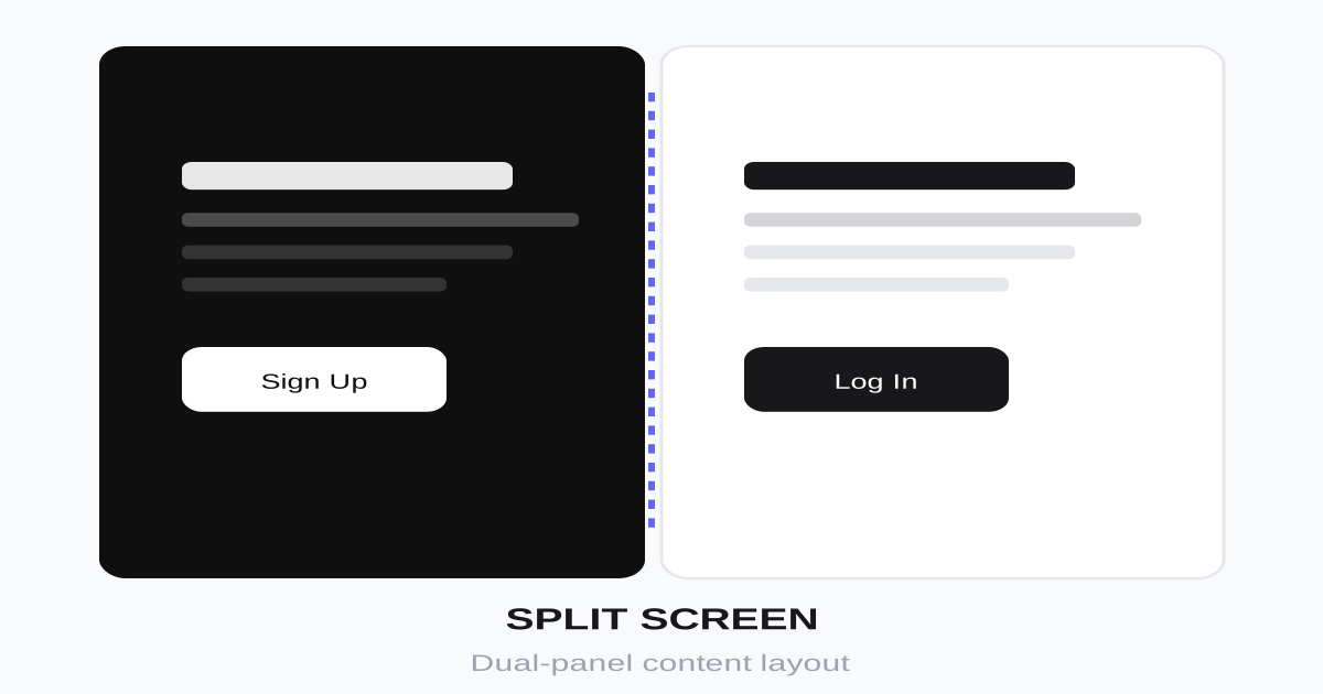
左右对称或不对称的分屏布局,通过对比和平衡创造视觉张力,常用于产品展示、品牌故事、比较页面。

分屏布局视觉预览
主色#0f0f0f
次色#ffffff
强调色 1#ff4757
强调色 2#2ed573
强调色 3#1e90ff
强调色 4#ffa502

AI 实现规则

You are a frontend expert specializing in Split Screen layout. All generated code must strictly follow these constraints:

## Absolute Prohibitions

- Do NOT keep split layout on mobile (too narrow)
- Do NOT have identical content on both sides
- Do NOT create visual imbalance between panels
- Do NOT ignore content reading order
- Do NOT use harsh divider lines

## Must Follow

- Use CSS Grid: grid grid-cols-1 lg:grid-cols-2
- Mobile: stack vertically (grid-cols-1)
- Desktop: side by side (lg:grid-cols-2)
- Each panel: min-h-[50vh] on mobile, min-h-screen on desktop
- Balance visual weight between panels
- One side visual, one side content

## Layout Patterns

50/50 Split:
- grid-cols-1 lg:grid-cols-2
- Both panels equal width

60/40 Split:
- grid-cols-1 lg:grid-cols-[60fr_40fr]
- Emphasize one side

Sticky Split:
- One panel sticky (position: sticky, top: 0)
- Other panel scrolls

## Panel Content

Visual Panel:
- Full background image/color/video
- Minimal text overlay
- Center-aligned content

Content Panel:
- Ample padding (p-8 lg:p-16)
- Left-aligned text
- Clear hierarchy

## Responsive

Mobile: Stack vertically, visual panel first
Tablet: May start splitting at md:
Desktop: Full split with proper ratios

## Self-Check

After generating code, verify:
1. Mobile layout stacks properly
2. Panels have contrasting content
3. Visual balance maintained
4. Reading order makes sense
5. Transitions are smooth

## Animation & Interaction Rules

- Counter-Weight Focus: hover one panel while the opposite panel gently desaturates or fades in prominence.
- Sharp Editorial Cuts: button hover uses direct black-white inversion with short duration and no gradient easing tricks.
- Screen-Spanning Lines: center divider or split seam can briefly intensify on focus change, but motion stays minimal.
- Static Text: descriptive text blocks must stay position-stable; avoid translate or scale on body copy.

组件预览与实现

font-semibold transition-colors duration-200 bg-black text-white hover:bg-zinc-800 active:bg-zinc-900
button

按钮

分屏布局中的对比按钮

<div className="flex gap-4">
  <button className="
    px-8 py-4
    bg-black text-white
    font-semibold
    border-2 border-black
    hover:bg-white hover:text-black
    transition-colors duration-150 ease-out
  ">
    Left Option
  </button>
  <button className="
    px-8 py-4
    bg-white text-black
    border-2 border-black
    font-semibold
    hover:bg-black hover:text-white
    transition-colors duration-150 ease-out
  ">
    Right Option
  </button>
</div>
card

分屏面板

分屏布局中的内容面板

<div className="grid grid-cols-1 lg:grid-cols-2 min-h-[60vh] overflow-hidden">
  <article className="peer/left group relative min-h-[50vh] lg:min-h-[60vh] bg-black text-white p-8 lg:p-16 flex flex-col justify-center transition-all duration-500 ease-out hover:flex-[1.1]">
    <div className="absolute inset-0 bg-[radial-gradient(circle_at_30%_30%,rgba(255,255,255,0.14),transparent_55%)] scale-100 group-hover:scale-105 transition-transform duration-500 ease-out" />
    <div className="relative z-10">
      <span className="text-sm uppercase tracking-[0.22em] text-white/60 mb-4 block">Night Edit</span>
      <h2 className="text-4xl lg:text-5xl font-bold mb-6">Dark Mode</h2>
      <p className="text-lg text-white/70 mb-8 max-w-md">
        High-contrast visual treatment for dramatic storytelling.
      </p>
      <button className="self-start px-8 py-4 border-2 border-white text-white font-semibold hover:bg-white hover:text-black transition-colors duration-150 ease-out">
        Select Dark
      </button>
    </div>
  </article>

  <article className="peer/right relative min-h-[50vh] lg:min-h-[60vh] bg-white text-black p-8 lg:p-16 flex flex-col justify-center transition-all duration-500 ease-out peer-hover/left:opacity-55 hover:opacity-100 hover:flex-[1.1]">
    <div className="absolute inset-0 bg-[radial-gradient(circle_at_70%_30%,rgba(0,0,0,0.08),transparent_55%)] scale-100 hover:scale-105 transition-transform duration-500 ease-out" />
    <div className="relative z-10">
      <span className="text-sm uppercase tracking-[0.22em] text-zinc-500 mb-4 block">Day Edit</span>
      <h2 className="text-4xl lg:text-5xl font-bold mb-6">Light Mode</h2>
      <p className="text-lg text-zinc-600 mb-8 max-w-md">
        Editorial clarity for long-form reading and daylight ergonomics.
      </p>
      <button className="self-start px-8 py-4 border-2 border-black bg-black text-white font-semibold hover:bg-white hover:text-black transition-colors duration-150 ease-out">
        Select Light
      </button>
    </div>
  </article>
</div>
input

输入框

分屏表单中的输入框

<input
  type="email"
  placeholder="Enter your email"
  className="
    w-full px-6 py-4
    bg-transparent
    border-2 border-zinc-300
    text-lg
    placeholder-zinc-400
    focus:outline-none focus:border-black
    transition-colors
  "
/>
nav

分屏导航

跨越分屏的固定导航

<nav className="
  fixed top-0 left-0 right-0 z-50
  px-8 py-6
  flex items-center justify-between
  mix-blend-difference
">
  <a href="/" className="text-white text-xl font-bold">
    Logo
  </a>
  <div className="flex items-center gap-8">
    <a href="#" className="text-white hover:opacity-70 transition-opacity">About</a>
    <a href="#" className="text-white hover:opacity-70 transition-opacity">Work</a>
    <a href="#" className="text-white hover:opacity-70 transition-opacity">Contact</a>
  </div>
</nav>
hero

分屏英雄区

完整的分屏布局展示

<section className="min-h-screen grid grid-cols-1 lg:grid-cols-2">
  {/* Left Panel - Visual */}
  <div className="
    relative
    bg-black
    min-h-[50vh] lg:min-h-screen
    flex items-center justify-center
    overflow-hidden
  ">
    <div className="absolute inset-0 bg-gradient-to-br from-purple-600 to-blue-600 opacity-80" />
    <div className="relative z-10 text-center text-white p-8">
      <span className="text-8xl font-bold">01</span>
    </div>
  </div>

  {/* Right Panel - Content */}
  <div className="
    bg-white
    min-h-[50vh] lg:min-h-screen
    flex items-center
    p-8 lg:p-16
  ">
    <div className="max-w-lg">
      <span className="text-sm uppercase tracking-widest text-zinc-400 mb-4 block">
        Featured Project
      </span>
      <h1 className="text-4xl lg:text-6xl font-bold text-zinc-900 mb-6">
        Split Screen Layout
      </h1>
      <p className="text-xl text-zinc-600 mb-8">
        A powerful layout technique that divides the viewport into two contrasting sections, creating visual tension and narrative flow.
      </p>
      <div className="flex gap-4">
        <button className="px-8 py-4 bg-black text-white font-semibold hover:bg-zinc-800 transition-colors">
          View Project
        </button>
        <button className="px-8 py-4 border-2 border-black text-black font-semibold hover:bg-zinc-100 transition-colors">
          Learn More
        </button>
      </div>
    </div>
  </div>
</section>

交互展示

适用范围与设计理念

应用场景

marketingportfoliocreative

视觉关键词

responsive分屏对比左右布局对称品牌展示moderncontemporarysleek现代

Split Screen(分屏布局)是一种将视口分为两个或多个区域的布局方式,通过对比创造视觉张力和叙事效果。

核心理念:

- 对比强调:通过左右对比突出差异或联系

- 视觉平衡:即使不对称也保持视觉重量平衡

- 叙事引导:引导用户视线在两侧之间流动

- 空间利用:充分利用宽屏显示器的优势

设计原则:

- 视觉一致性:所有组件必须遵循统一的视觉语言,从色彩到字体到间距保持谐调

- 层次分明:通过颜色深浅、字号大小、留白空间建立清晰的信息层级

- 交互反馈:每个可交互元素都必须有明确的 hover、active、focus 状态反馈

- 响应式适配:设计必须在移动端、平板、桌面端上保持一致的体验

- 无障碍性:确保色彩对比度符合 WCAG 2.1 AA 标准,所有交互元素可键盘访问

应该这样做

  • 使用 CSS Grid 或 Flexbox 实现分屏 grid grid-cols-2
  • 大屏幕保持分屏,小屏幕堆叠 lg:grid-cols-2 grid-cols-1
  • 使用对比色或互补内容
  • 一侧视觉元素,一侧文字内容
  • 保持两侧视觉重量平衡
  • 添加过渡动画增强体验
  • 考虑分屏滚动锁定效果

避免这样做

  • 禁止两侧内容完全相同(无意义分屏)
  • 禁止移动端仍保持分屏(太窄)
  • 禁止两侧视觉重量严重失衡
  • 禁止忽略内容阅读顺序
  • 禁止分割线过于突兀

全局 CSS

/* Split Screen Global Styles */

/* Base split container */
.split-screen {
  display: grid;
  grid-template-columns: 1fr;
  min-height: 100vh;
}

@media (min-width: 1024px) {
  .split-screen {
    grid-template-columns: 1fr 1fr;
  }
}

/* Ratio variants */
.split-screen-60-40 {
  grid-template-columns: 1fr;
}

@media (min-width: 1024px) {
  .split-screen-60-40 {
    grid-template-columns: 60fr 40fr;
  }
}

.split-screen-40-60 {
  grid-template-columns: 1fr;
}

@media (min-width: 1024px) {
  .split-screen-40-60 {
    grid-template-columns: 40fr 60fr;
  }
}

/* Panel styles */
.split-panel {
  display: flex;
  flex-direction: column;
  justify-content: center;
  padding: 2rem;
}

@media (min-width: 1024px) {
  .split-panel {
    padding: 4rem;
  }
}

/* Sticky scroll effect */
.split-sticky {
  position: sticky;
  top: 0;
  height: 100vh;
}

/* Diagonal split */
.split-diagonal {
  clip-path: polygon(0 0, 100% 0, 85% 100%, 0 100%);
}

@media (min-width: 1024px) {
  .split-diagonal {
    clip-path: polygon(0 0, 100% 0, 85% 100%, 0 100%);
  }
}

/* Hover reveal effect */
.split-hover-left:hover ~ .split-hover-right {
  flex: 0.3;
}

.split-hover-right:hover {
  flex: 0.7;
}

.split-hover-left, .split-hover-right {
  flex: 0.5;
  transition: flex 0.5s ease;
}
/* Split Screen Design Tokens */
:root {
  --split-screen-primary: #0f0f0f;
  --split-screen-secondary: #ffffff;
  --split-screen-accent: #ff4757;
  --split-screen-glow: rgba(15, 15, 15, 0.3);
}

@keyframes split-screen-fade-in {
  from { opacity: 0; transform: translateY(8px); }
  to { opacity: 1; transform: translateY(0); }
}

@keyframes split-screen-pulse {
  0%, 100% { opacity: 1; }
  50% { opacity: 0.7; }
}

.split-screen-card {
  position: relative;
  overflow: hidden;
}

.split-screen-card::before {
  content: "";
  position: absolute;
  inset: 0;
  opacity: 0;
  transition: opacity 0.3s ease;
  background: linear-gradient(135deg, rgba(15, 15, 15, 0.05), transparent);
  pointer-events: none;
}

.split-screen-card:hover::before {
  opacity: 1;
}

.split-screen-gradient {
  background: linear-gradient(135deg, #0f0f0f, #ff4757);
}

.split-screen-gradient-text {
  background: linear-gradient(135deg, #0f0f0f, #ff4757);
  -webkit-background-clip: text;
  -webkit-text-fill-color: transparent;
  background-clip: text;
}

.split-screen-frosted {
  backdrop-filter: blur(12px) saturate(180%);
  -webkit-backdrop-filter: blur(12px) saturate(180%);
  background: rgba(15, 15, 15, 0.08);
}

.split-screen-animate-in {
  animation: split-screen-fade-in 0.5s ease-out both;
}

布局、色板与 Tokens

主色#0f0f0f
次色#ffffff
强调色 1#ff4757
强调色 2#2ed573
强调色 3#1e90ff
强调色 4#ffa502
{
  "border": {
    "width": "border-0",
    "color": "border-zinc-300",
    "radius": "rounded-none",
    "style": "border-solid"
  },
  "shadow": {
    "sm": "shadow-none",
    "md": "shadow-none",
    "lg": "shadow-none",
    "none": "shadow-none",
    "hover": "shadow-none",
    "focus": "shadow-none",
    "colored": {}
  },
  "interaction": {
    "transition": "transition-all duration-500",
    "active": "active:scale-95",
    "hoverOpacity": "hover:opacity-90"
  },
  "typography": {
    "heading": "font-bold tracking-tight",
    "body": "font-sans",
    "mono": "font-mono",
    "sizes": {
      "hero": "text-4xl md:text-6xl lg:text-7xl",
      "h1": "text-3xl md:text-5xl",
      "h2": "text-2xl md:text-4xl",
      "h3": "text-xl md:text-2xl",
      "body": "text-base md:text-lg",
      "small": "text-sm"
    }
  },
  "spacing": {
    "section": "py-0",
    "container": "px-8 md:px-12 lg:px-16",
    "card": "p-8 lg:p-16",
    "gap": {
      "sm": "gap-2 md:gap-4",
      "md": "gap-4 md:gap-6",
      "lg": "gap-6 md:gap-8"
    }
  },
  "colors": {
    "background": {
      "primary": "bg-black",
      "secondary": "bg-white",
      "accent": [
        "bg-[#ff4757]",
        "bg-[#2ed573]",
        "bg-[#1e90ff]",
        "bg-[#ffa502]"
      ]
    },
    "text": {
      "primary": "text-white",
      "secondary": "text-zinc-900",
      "muted": "text-zinc-500"
    },
    "button": {
      "primary": "bg-black text-white",
      "secondary": "bg-white text-black border-2 border-black"
    }
  },
  "forbidden": {
    "classes": [
      "rounded-lg",
      "rounded-xl",
      "rounded-2xl",
      "rounded-full",
      "shadow-sm",
      "shadow-md",
      "shadow-lg",
      "shadow-xl"
    ],
    "patterns": [
      "^rounded-(?!none)",
      "^shadow-(?!none)"
    ],
    "reasons": {
      "rounded-lg": "Split Screen uses sharp edges for strong visual dividers",
      "shadow-lg": "Split Screen relies on contrast between panels, not shadows"
    }
  },
  "required": {
    "button": [
      "px-8 py-4",
      "font-semibold",
      "transition-colors"
    ],
    "card": [
      "min-h-[50vh] lg:min-h-screen",
      "flex flex-col justify-center"
    ],
    "input": [
      "bg-transparent",
      "border-2 border-zinc-300",
      "text-lg",
      "focus:outline-none focus:border-black",
      "transition-colors"
    ]
  }
}

示例提示词

品牌展示页

左侧视觉,右侧品牌故事

Create a brand showcase page with split screen:
1. Left panel: Full-height gradient background with large brand logo
2. Right panel: Brand story with heading, paragraphs, and CTA
3. Mobile: Stack with visual panel first
4. Desktop: 50/50 split with min-h-screen
5. Navigation fixed at top with mix-blend-difference
6. Smooth scroll to next section
Use grid grid-cols-1 lg:grid-cols-2, contrasting colors

产品对比页

两种产品或方案的对比展示

Create a product comparison split screen:
1. Left panel: Product A with dark background, white text
2. Right panel: Product B with light background, dark text
3. Each side: product image, features list, price, CTA
4. Hover effect: hovered side expands slightly
5. Mobile: Stack with A on top
6. Center divider with "VS" badge
Use contrasting colors, balanced visual weight

作品集项目页

左侧项目图片,右侧项目详情

Create a portfolio project page with split screen:
1. Left panel: Sticky full-height project image gallery
2. Right panel: Scrollable project details
3. Right content: title, description, tech stack, links
4. Image gallery with navigation dots
5. Mobile: Image at top, details below
6. Previous/Next project navigation at bottom
Use sticky positioning for image, smooth scroll for details