返回风格库
视觉风格retro

合成波

Synthwave

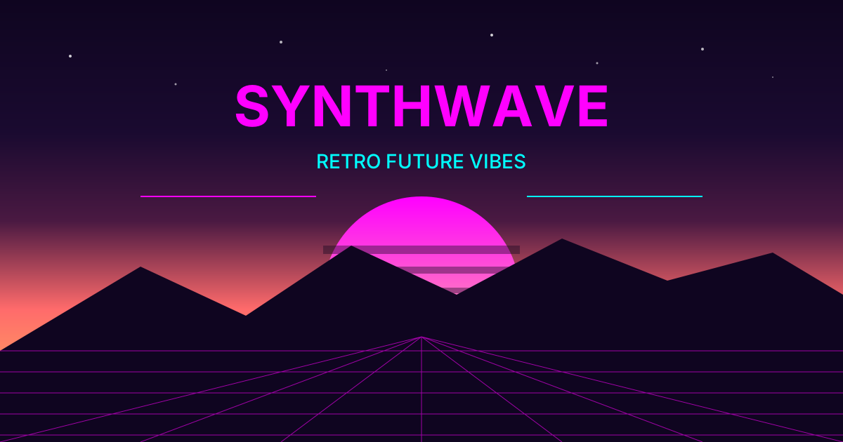
80年代复古未来主义音乐美学,霓虹粉紫配色、网格地平线、日落渐变和复古科技感,充满怀旧的未来想象。

合成波视觉预览
主色#ff00ff
次色#00ffff
强调色 1#ff6ec7
强调色 2#7b68ee
强调色 3#ff1493
强调色 4#f67d50

AI 实现规则

你是一个 Synthwave 设计风格的前端开发专家。生成的所有代码必须严格遵守以下约束:

## 绝对禁止

- 使用明亮的白色背景
- 使用现代简约的设计
- 省略霓虹发光效果
- 使用正式的字体

## 必须遵守

- 粉紫青配色 from-pink-500, from-purple-500, from-cyan-500
- 深色背景 bg-purple-900, bg-black
- 霓虹发光 shadow-[0_0_20px_rgba(255,0,255,0.5)]
- 网格背景装饰
- 日落渐变 from-orange-500 via-pink-500 to-purple-500

## 配色

主色调:
- 粉色: #ff00ff, from-pink-500
- 青色: #00ffff, from-cyan-500
- 紫色: #7b68ee, from-purple-500
- 橙色: #ff6ec7

## 特殊元素

- 透视网格地板
- 日落太阳
- 山脉剪影
- 扫描线效果

## Animation & Interaction Rules

- Arcade Pulse: Neon border elements use `hover:animate-pulse` — the arcade machine's CRT screen flickers to life when touched. Only trigger on hover, never on load.
- Multidimensional Neon: Button uses simultaneous inset cyan + outer pink: `shadow-[0_0_15px_rgba(255,0,255,0.4),inset_0_0_10px_rgba(0,255,255,0.2)]` at rest. On hover BOTH intensify together: `hover:shadow-[0_0_30px_rgba(0,255,255,0.8),inset_0_0_20px_rgba(255,0,255,0.6)]`. Never single-direction neon — two tubes always glow from opposite directions.
- Virtual Grid Shift: Background pixel grid uses `group-hover:opacity-30 group-hover:scale-110 transition-all duration-500` — the virtual space expands as the player approaches, creating depth through the monitor glass.
- Overvoltage Press: Active state causes a power surge: `active:scale-90 active:bg-white active:text-black active:shadow-[0_0_50px_#ffffff]` — all neon color drains to white as the circuit overloads at the moment of contact. The entire color system collapses to pure electricity.

组件预览与实现

font-bold uppercase tracking-widest rounded-lg transition-all duration-300 ease-in-out bg-gradient-to-r from-[#ff00ff] to-[#a020f0] text-white shadow-[0_0_16px_rgba(255,0,255,0.5)] md:shadow-[0_0_24px_rgba(255,0,255,0.5)] hover:shadow-[0_0_32px_rgba(0,255,255,0.7)] hover:scale-105 active:scale-95
button

按钮

合成波风格按钮,Multidimensional Neon 双向霓虹 + Overvoltage Press `active:scale-90 active:bg-white` 过载归零 + `duration-200 ease-out`

<button className="
  px-8 py-4
  bg-transparent
  border-2 border-[#ff00ff]
  text-[#00ffff] font-bold uppercase tracking-wider
  shadow-[0_0_15px_rgba(255,0,255,0.4),inset_0_0_10px_rgba(0,255,255,0.2)]
  hover:border-[#00ffff]
  hover:shadow-[0_0_30px_rgba(0,255,255,0.8),inset_0_0_20px_rgba(255,0,255,0.6)]
  active:scale-90
  active:bg-white active:text-black
  active:shadow-[0_0_50px_#ffffff]
  transition-all duration-200 ease-out
">
  Start
</button>
card

卡片

合成波风格卡片,Virtual Grid Shift `group-hover:scale-110 duration-500` + 强调条 `group-hover:bg-[#00ffff] group-hover:shadow-[0_0_10px_#00ffff]` + 标题渐变变色

<div className="group relative p-8 bg-gradient-to-b from-purple-900/80 to-black/80 border border-[#ff00ff]/50 shadow-[0_0_20px_rgba(255,0,255,0.2)] overflow-hidden cursor-pointer hover:shadow-[0_0_40px_rgba(255,0,255,0.4)] transition-shadow duration-300">
  {/* Virtual grid — shifts on hover (Virtual Grid Shift) */}
  <div className="absolute inset-0 opacity-10 group-hover:opacity-30 group-hover:scale-110 transition-all duration-500" style={{backgroundImage: 'linear-gradient(rgba(255,0,255,0.4) 1px, transparent 1px), linear-gradient(90deg, rgba(255,0,255,0.4) 1px, transparent 1px)', backgroundSize: '20px 20px'}} />
  <div className="relative z-10">
    {/* Neon accent bar */}
    <div className="h-[2px] w-8 bg-[#ff00ff] shadow-[0_0_6px_#ff00ff] group-hover:bg-[#00ffff] group-hover:shadow-[0_0_10px_#00ffff] transition-colors duration-300 mb-4" />
    <h3 className="text-2xl font-bold text-transparent bg-clip-text bg-gradient-to-r from-[#ff00ff] to-[#7b68ee] group-hover:from-white group-hover:to-[#00ffff] transition-all duration-500 mb-3">
      RETRO FUTURE
    </h3>
    <p className="text-pink-200/70">
      Back to the 80s
    </p>
  </div>
</div>
input

输入框

合成波风格输入框

<input
  type="text"
  placeholder="Enter text..."
  className="
    w-full px-6 py-4
    bg-black/50
    border-2 border-cyan-500/50
    text-cyan-100 placeholder-cyan-500/50
    shadow-[0_0_10px_rgba(0,255,255,0.1)]
    focus:border-pink-500
    focus:shadow-[0_0_20px_rgba(255,0,255,0.3)]
    focus:outline-none
    transition-all
  "
/>
hero

Hero 区块

合成波风格 Hero

<section className="
  min-h-screen
  flex items-center justify-center
  bg-gradient-to-b from-purple-900 via-pink-900 to-orange-900
  relative overflow-hidden
">
  {/* Sun */}
  <div className="absolute bottom-0 left-1/2 -translate-x-1/2 w-96 h-48 bg-gradient-to-t from-orange-500 via-pink-500 to-purple-500 rounded-t-full opacity-80" />

  {/* Grid floor */}
  <div className="absolute bottom-0 left-0 right-0 h-1/2 bg-[linear-gradient(transparent_0%,rgba(255,0,255,0.1)_100%)]">
    <div className="absolute inset-0 bg-[linear-gradient(90deg,rgba(255,0,255,0.3)_1px,transparent_1px),linear-gradient(rgba(255,0,255,0.3)_1px,transparent_1px)] bg-[size:60px_30px] [transform:perspective(500px)_rotateX(60deg)] origin-bottom" />
  </div>

  <div className="relative z-10 text-center px-6">
    <h1 className="text-6xl md:text-8xl font-bold text-transparent bg-clip-text bg-gradient-to-b from-pink-400 to-purple-600 mb-6" style="text-shadow: 0 0 40px rgba(255,0,255,0.5)">
      SYNTHWAVE
    </h1>
    <p className="text-xl text-pink-200/80 mb-8">
      Ride into the sunset
    </p>
    <button className="
      px-10 py-4
      bg-gradient-to-r from-pink-500 to-purple-500
      text-white font-bold uppercase tracking-wider
      shadow-[0_0_30px_rgba(255,0,255,0.5)]
      hover:shadow-[0_0_50px_rgba(255,0,255,0.8)]
      transition-all
    ">
      Drive
    </button>
  </div>
</section>

交互展示

适用范围与设计理念

应用场景

creativemarketing

视觉关键词

retrohigh-contrast合成波80年代霓虹复古未来网格日落retrovintagenostalgic复古

Synthwave(合成波)是一种源于2000年代中期的电子音乐流派和视觉美学,致敬80年代的科幻电影、电子游戏和合成器音乐。

核心理念:

- 复古未来:对80年代未来想象的怀旧

- 霓虹美学:粉色、紫色、青色的霓虹灯效果

- 网格地平线:透视网格延伸至地平线

- 日落渐变:橙粉紫的日落天空

设计原则:

- 视觉一致性:所有组件必须遵循统一的视觉语言,从色彩到字体到间距保持谐调

- 层次分明:通过颜色深浅、字号大小、留白空间建立清晰的信息层级

- 交互反馈:每个可交互元素都必须有明确的 hover、active、focus 状态反馈

- 响应式适配:设计必须在移动端、平板、桌面端上保持一致的体验

- 无障碍性:确保色彩对比度符合 WCAG 2.1 AA 标准,所有交互元素可键盘访问

应该这样做

  • 使用粉紫青霓虹配色
  • 添加透视网格背景
  • 使用日落渐变(橙→粉→紫)
  • 添加霓虹发光效果
  • 使用复古风格字体
  • 添加太阳/山脉剪影元素
  • Arcade Pulse: neon border and glow elements use `hover:animate-pulse` or flicker on hover — the arcade machine's CRT screen energizes when touched
  • Multidimensional Neon: button uses simultaneous inset cyan + outer pink shadows `shadow-[0_0_15px_rgba(255,0,255,0.4),inset_0_0_10px_rgba(0,255,255,0.2)]` — two neon tubes glow from opposite directions, intensify together on hover
  • Virtual Grid Shift: background pixel grid uses `group-hover:opacity-30 group-hover:scale-110 transition-all duration-500` — the virtual space expands as the player approaches
  • Overvoltage Press: active state causes power surge `active:scale-90 active:bg-white active:text-black active:shadow-[0_0_50px_#ffffff]` — all neon goes white as the circuit overloads at the moment of contact

避免这样做

  • 禁止使用明亮的白色背景
  • 禁止使用现代简约的设计
  • 禁止省略霓虹发光效果
  • 禁止使用过于正式的字体
  • 禁止使用单向霓虹光(Multidimensional Neon 要求 inset + outer 双向同时发光)
  • 禁止 hover 只改变一个 shadow 值(必须同时增强 inset cyan 和 outer pink 双轨)
  • 禁止 active 状态保留彩色(Overvoltage Press 要求 `active:bg-white active:text-black` — 过载一切归零)
  • 禁止 Virtual Grid 在非 group-hover 时变化(网格只在玩家接近时才激活)

全局 CSS

/* Synthwave 全局样式 */

:root {
  --synth-pink: #ff00ff;
  --synth-cyan: #00ffff;
  --synth-purple: #7b68ee;
  --synth-orange: #ff6ec7;
}

/* 霓虹发光 */
.synth-glow {
  text-shadow:
    0 0 10px var(--synth-pink),
    0 0 20px var(--synth-pink),
    0 0 40px var(--synth-pink);
}

/* 网格地板 */
.synth-grid {
  background-image:
    linear-gradient(90deg, rgba(255, 0, 255, 0.3) 1px, transparent 1px),
    linear-gradient(rgba(255, 0, 255, 0.3) 1px, transparent 1px);
  background-size: 60px 30px;
  transform: perspective(500px) rotateX(60deg);
  transform-origin: bottom;
}

/* 日落渐变 */
.synth-sunset {
  background: linear-gradient(
    to bottom,
    #1a0533 0%,
    #4a1942 30%,
    #ff6b6b 60%,
    #feca57 100%
  );
}

/* 扫描线 */
.synth-scanlines::after {
  content: "";
  position: absolute;
  inset: 0;
  background: repeating-linear-gradient(
    0deg,
    rgba(0, 0, 0, 0.15) 0px,
    rgba(0, 0, 0, 0.15) 1px,
    transparent 1px,
    transparent 2px
  );
  pointer-events: none;
}
@keyframes synthwave-fade-in {
  from { opacity: 0; transform: translateY(8px); }
  to { opacity: 1; transform: translateY(0); }
}

@keyframes synthwave-pulse {
  0%, 100% { opacity: 1; }
  50% { opacity: 0.7; }
}

.synthwave-frosted {
  backdrop-filter: blur(12px) saturate(180%);
  -webkit-backdrop-filter: blur(12px) saturate(180%);
  background: rgba(255, 0, 255, 0.08);
}

.synthwave-accent-corner {
  clip-path: polygon(0 0, 100% 0, 100% calc(100% - 2rem), calc(100% - 2rem) 100%, 0 100%);
}

.synthwave-animate-in {
  animation: synthwave-fade-in 0.5s ease-out both;
}

布局、色板与 Tokens

主色#ff00ff
次色#00ffff
强调色 1#ff6ec7
强调色 2#7b68ee
强调色 3#ff1493
强调色 4#f67d50
{
  "border": {
    "width": "border",
    "color": "border-[#ff00ff]/50",
    "radius": "rounded-lg",
    "style": "border-solid"
  },
  "shadow": {
    "sm": "shadow-[0_0_8px_rgba(255,0,255,0.4)] md:shadow-[0_0_12px_rgba(255,0,255,0.4)]",
    "md": "shadow-[0_0_16px_rgba(255,0,255,0.5)] md:shadow-[0_0_24px_rgba(255,0,255,0.5)]",
    "lg": "shadow-[0_0_24px_rgba(255,0,255,0.6)] md:shadow-[0_0_40px_rgba(255,0,255,0.6)]",
    "none": "shadow-none",
    "hover": "hover:shadow-[0_0_32px_rgba(0,255,255,0.7)]",
    "focus": "focus:shadow-[0_0_20px_rgba(0,255,255,0.6)]",
    "colored": {
      "magenta": "shadow-[0_0_20px_rgba(255,0,255,0.6)]",
      "cyan": "shadow-[0_0_20px_rgba(0,255,255,0.6)]",
      "purple": "shadow-[0_0_20px_rgba(160,32,240,0.6)]"
    }
  },
  "interaction": {
    "transition": "transition-all duration-300 ease-in-out",
    "active": "active:scale-95",
    "hoverScale": "hover:scale-105"
  },
  "typography": {
    "heading": "font-bold tracking-widest uppercase",
    "body": "font-sans",
    "mono": "font-mono",
    "sizes": {
      "hero": "text-4xl md:text-6xl lg:text-8xl",
      "h1": "text-3xl md:text-5xl",
      "h2": "text-2xl md:text-4xl",
      "h3": "text-xl md:text-2xl",
      "body": "text-sm md:text-base",
      "small": "text-xs md:text-sm"
    }
  },
  "spacing": {
    "section": "py-12 md:py-20 lg:py-28",
    "container": "px-4 md:px-8 lg:px-12",
    "card": "p-5 md:p-8",
    "gap": {
      "sm": "gap-3 md:gap-4",
      "md": "gap-4 md:gap-6",
      "lg": "gap-6 md:gap-10"
    }
  },
  "colors": {
    "background": {
      "primary": "bg-[#0a0a1a]",
      "secondary": "bg-[#1a0a2e]",
      "accent": [
        "bg-[#ff00ff]",
        "bg-[#00ffff]",
        "bg-[#a020f0]",
        "bg-[#ff1493]"
      ]
    },
    "text": {
      "primary": "text-[#ff00ff]",
      "secondary": "text-[#00ffff]",
      "muted": "text-[#a020f0]/70"
    },
    "button": {
      "primary": "bg-gradient-to-r from-[#ff00ff] to-[#a020f0] text-white",
      "secondary": "bg-[#00ffff]/10 text-[#00ffff] border border-[#00ffff]/50",
      "danger": "bg-[#ff1493] text-white"
    }
  },
  "forbidden": {
    "classes": [
      "rounded-none",
      "bg-white",
      "bg-gray-50",
      "bg-gray-100",
      "bg-[#f5f0e8]",
      "text-black",
      "text-gray-900",
      "text-[#3a3226]",
      "border-black",
      "shadow-[2px_2px_0px",
      "shadow-[4px_4px_0px",
      "bg-amber-",
      "bg-stone-",
      "bg-yellow-",
      "text-amber-",
      "text-stone-"
    ],
    "patterns": [
      "^rounded-none$",
      "^shadow-\\[\\d+px_\\d+px_0px",
      "^bg-(?:white|gray-|stone-|amber-|yellow-)",
      "^text-(?:black|gray-(?:[7-9])|stone-|amber-)"
    ],
    "reasons": {
      "rounded-none": "Synthwave uses rounded shapes (rounded-lg) for a retro-futuristic feel",
      "bg-white": "Synthwave uses dark backgrounds with neon accents, not light colors",
      "shadow-[4px_4px_0px": "Synthwave uses neon glow shadows (0_0_Xpx_rgba), not hard-edge",
      "text-black": "Synthwave uses neon-colored text on dark backgrounds"
    }
  },
  "required": {
    "button": [
      "rounded-lg",
      "shadow-[0_0_16px_rgba(255,0,255,0.5)]",
      "hover:shadow-[0_0_32px_rgba(0,255,255,0.7)]",
      "transition-all duration-300 ease-in-out",
      "font-bold uppercase"
    ],
    "card": [
      "rounded-lg",
      "bg-[#0a0a1a]/80",
      "border border-[#ff00ff]/50",
      "shadow-[0_0_16px_rgba(255,0,255,0.5)]"
    ],
    "input": [
      "rounded-lg",
      "border border-[#a020f0]/50",
      "bg-[#0a0a1a]/60",
      "text-[#00ffff]",
      "focus:shadow-[0_0_20px_rgba(0,255,255,0.6)]",
      "focus:outline-none"
    ]
  }
}

示例提示词

复古游戏界面

80年代风格游戏UI

用 Synthwave 风格创建一个复古游戏界面,要求:
1. 背景:日落渐变 + 网格地板
2. 标题:霓虹发光效果
3. 按钮:霓虹边框
4. 添加太阳和山脉剪影
5. 整体复古未来感

SaaS 着陆页

生成 合成波风格的 SaaS 产品着陆页

Create a SaaS landing page using Synthwave style with hero section, feature grid, testimonials, pricing table, and footer.

作品集展示

生成 合成波风格的作品集页面

Create a portfolio showcase page using Synthwave style with project grid, about section, contact form, and consistent visual language.