返回风格库
布局风格modern

Z型布局

Z-Pattern Layout

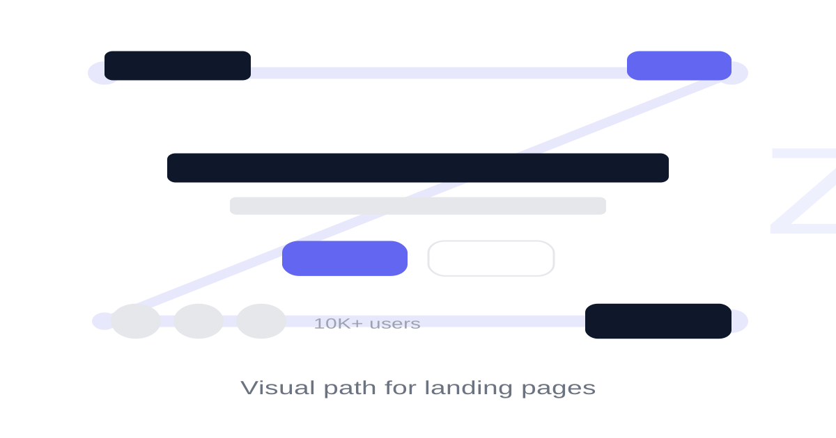
基于眼动追踪的Z型扫描布局,视线从左上到右上,斜穿到左下再到右下,形成Z字路径。适合着陆页、营销页面和简洁信息展示。

Z型布局视觉预览
主色#0f172a
次色#ffffff
强调色 1#6366f1
强调色 2#06b6d4
强调色 3#f59e0b
强调色 4#ec4899

AI 实现规则

你是一个 Z-Pattern Layout 布局专家。生成的所有代码必须严格遵守以下约束:

## 布局规则

Z型路径的四个关键点:
1. 左上角:Logo / 品牌标识
2. 右上角:导航 / 首要 CTA
3. 中间对角线:核心价值主张 / 主要内容
4. 左下角:信任标识 / 社会证明
5. 右下角:最终 CTA 按钮

## 内容规则

- 每一行信息独立完整
- 第一行建立品牌认知
- 对角线区域传递核心价值
- 最后一行促进转化
- 内容简洁,避免干扰路径

## 视觉引导

- 使用对比色突出 CTA
- 使用留白引导视线流动
- 中间区域使用居中布局
- 头尾使用 flex justify-between

## 响应式

桌面端:完整Z型路径
平板端:保持Z型,缩小间距
手机端:垂直堆叠,保持优先级顺序

## 自检

1. Logo在左上,CTA在右上
2. 核心内容居中显示
3. 最终CTA在右下
4. 视觉路径清晰流畅
5. 页面简洁不拥挤

## 动效与交互规则

- 漏斗聚焦(Funnel Focus):悬停核心区域(特性卡片、输入框)时,必须通过明显上浮(`hover:-translate-y-1`)和阴影扩展(`hover:shadow-xl`)牢牢锁住用户视线,强化转化节点的存在感。
- CTA 磁力(CTA Magnetism):位于Z路径关键节点的行动按钮,悬停时必须使用弹性放大(`hover:scale-[1.02]`)结合品牌色光晕,让按钮产生磁铁般的吸引力。
- 干脆利落(Crisp Progression):商业落地页不允许拖沓动效。强制使用 `duration-200 ease-out`,确保反馈干脆,不打断用户的Z型扫视节奏。
- 焦点暗示(Clear Focus):输入框聚焦时,在光圈外发光的基础上,将背景从灰/透明提亮至纯白,给出清晰的数据输入暗示。

组件预览与实现

font-semibold rounded-xl transition-all duration-300 bg-[#6366f1] text-white shadow-lg shadow-[#6366f1]/25 hover:shadow-xl hover:shadow-[#6366f1]/30 hover:-translate-y-0.5 active:scale-[0.98]
button

按钮

Z型布局中的 CTA 按钮

<button className="px-10 py-4 bg-[#6366f1] text-white rounded-xl font-bold text-lg shadow-[0_4px_14px_rgba(99,102,241,0.3)] hover:shadow-[0_8px_25px_rgba(99,102,241,0.5)] hover:-translate-y-1 hover:scale-[1.02] active:scale-95 active:translate-y-[2px] transition-all duration-200 ease-out">
  Start Free Trial
</button>
card

卡片

Z型布局中的特性卡片

<div className="group p-8 bg-white rounded-2xl shadow-sm border border-gray-100 hover:shadow-xl hover:border-indigo-100 hover:-translate-y-1.5 transition-all duration-300 ease-out cursor-pointer">
  <div className="w-14 h-14 bg-indigo-50 rounded-2xl flex items-center justify-center mb-5 group-hover:bg-indigo-500 group-hover:scale-110 transition-all duration-300 ease-out">
    <svg className="w-7 h-7 text-indigo-500 group-hover:text-white transition-colors duration-300" fill="none" viewBox="0 0 24 24" stroke="currentColor" strokeWidth="2">
      <path strokeLinecap="round" strokeLinejoin="round" d="M13 10V3L4 14h7v7l9-11h-7z" />
    </svg>
  </div>
  <h3 className="text-xl font-bold text-[#0f172a] mb-3 group-hover:text-indigo-600 transition-colors duration-200">
    Seamless Conversion
  </h3>
  <p className="text-gray-600 leading-relaxed">
    Every element on this path is engineered to guide the eye and encourage action without overwhelming the reader.
  </p>
</div>
input

输入框

邮箱订阅输入框

<div className="flex gap-3">
  <input
    type="email"
    placeholder="Enter your email..."
    className="
      flex-1 px-4 py-3
      bg-white
      border border-gray-200
      rounded-xl
      text-[#0f172a] placeholder-gray-400
      focus:outline-none focus:ring-2 focus:ring-[#6366f1]/20
      focus:border-[#6366f1]
      transition-all
    "
  />
  <button className="px-6 py-3 bg-[#6366f1] text-white rounded-xl font-medium">
    Subscribe
  </button>
</div>
hero

Z型布局完整示例

Z型布局的完整着陆页

<div className="min-h-screen bg-white">
  {/* Z的第一笔横线:Logo(左) → CTA(右) */}
  <header className="px-6 py-4">
    <div className="max-w-6xl mx-auto flex items-center justify-between">
      <div className="text-xl font-bold text-[#0f172a]">Brand</div>
      <button className="px-4 py-2 bg-[#6366f1] text-white rounded-lg text-sm font-medium">
        Sign Up
      </button>
    </div>
  </header>

  {/* Z的对角线:核心内容区 */}
  <section className="px-6 py-20">
    <div className="max-w-4xl mx-auto text-center">
      <h1 className="text-5xl font-bold text-[#0f172a] mb-6">
        Build Something Amazing
      </h1>
      <p className="text-xl text-gray-600 mb-10 max-w-2xl mx-auto">
        The fastest way to build modern applications with everything you need.
      </p>
      <div className="flex gap-3 justify-center">
        <button className="px-8 py-4 bg-[#6366f1] text-white rounded-xl font-semibold shadow-lg shadow-[#6366f1]/25">
          Start Free Trial
        </button>
        <button className="px-8 py-4 border border-gray-200 rounded-xl font-semibold text-[#0f172a]">
          Learn More
        </button>
      </div>
    </div>
  </section>

  {/* Z的第二笔横线:信任标识(左) → 最终CTA(右) */}
  <section className="px-6 py-16 bg-gray-50">
    <div className="max-w-6xl mx-auto flex items-center justify-between">
      <div className="flex items-center gap-8">
        <span className="text-sm text-gray-500">Trusted by 10,000+ teams</span>
      </div>
      <button className="px-6 py-3 bg-[#0f172a] text-white rounded-xl font-medium">
        Start Building
      </button>
    </div>
  </section>
</div>

交互展示

适用范围与设计理念

应用场景

marketingsaas

视觉关键词

responsiveZ型着陆页营销视觉引导CTA扫描路径moderncontemporarysleek现代

Z-Pattern Layout 基于用户在视觉简洁页面上的自然扫描路径。视线从左上角(logo/品牌)移到右上角(CTA),然后斜穿到左下角,最后移至右下角(最终CTA)。

核心理念:

- 视觉引导:利用Z型路径引导用户完成预设的信息接收顺序

- 关键点位:四个角是最重要的信息放置点

- 简洁明了:适合内容较少但需要强转化的页面

- 层层推进:每一行都是一个信息层级

设计原则:

- 视觉一致性:所有组件必须遵循统一的视觉语言,从色彩到字体到间距保持谐调

- 层次分明:通过颜色深浅、字号大小、留白空间建立清晰的信息层级

- 交互反馈:每个可交互元素都必须有明确的 hover、active、focus 状态反馈

- 响应式适配:设计必须在移动端、平板、桌面端上保持一致的体验

- 无障碍性:确保色彩对比度符合 WCAG 2.1 AA 标准,所有交互元素可键盘访问

应该这样做

  • 左上角放置 logo/品牌标识
  • 右上角放置导航或首要 CTA
  • 中间区域放置核心价值主张
  • 左下角放置辅助信息或信任标识
  • 右下角放置最终 CTA 按钮
  • 每一行信息独立完整,层层递进

避免这样做

  • 禁止在Z路径上放置不重要的内容
  • 禁止打断Z型视觉流动
  • 禁止使用过多的内容干扰路径
  • 禁止将 CTA 放在路径之外
  • 禁止让页面过于复杂和拥挤

全局 CSS

/* Z-Pattern Layout 全局样式 */

/* Z型布局容器 */
.z-layout {
  max-width: 1200px;
  margin: 0 auto;
}

/* Z的第一行:品牌 + 导航/CTA */
.z-top-bar {
  display: flex;
  align-items: center;
  justify-content: space-between;
  padding: 1rem 1.5rem;
}

/* Z的对角线区域:核心内容 */
.z-diagonal {
  text-align: center;
  padding: 5rem 1.5rem;
  max-width: 800px;
  margin: 0 auto;
}

/* Z的第二行:信任 + 最终CTA */
.z-bottom-bar {
  display: flex;
  align-items: center;
  justify-content: space-between;
  padding: 2rem 1.5rem;
}

/* Z路径上的关键点 */
.z-point {
  position: relative;
}

.z-point::after {
  content: '';
  position: absolute;
  width: 8px;
  height: 8px;
  background: #6366f1;
  border-radius: 50%;
}

/* 响应式 */
@media (max-width: 768px) {
  .z-top-bar,
  .z-bottom-bar {
    flex-direction: column;
    gap: 1rem;
    text-align: center;
  }
  .z-diagonal {
    padding: 3rem 1.5rem;
  }
}
/* Z-Pattern Layout Design Tokens */
:root {
  --z-pattern-layout-primary: #0f172a;
  --z-pattern-layout-secondary: #ffffff;
  --z-pattern-layout-accent: #6366f1;
  --z-pattern-layout-glow: rgba(15, 23, 42, 0.3);
}

@keyframes z-pattern-layout-fade-in {
  from { opacity: 0; transform: translateY(8px); }
  to { opacity: 1; transform: translateY(0); }
}

@keyframes z-pattern-layout-pulse {
  0%, 100% { opacity: 1; }
  50% { opacity: 0.7; }
}

.z-pattern-layout-gradient {
  background: linear-gradient(135deg, #0f172a, #6366f1);
}

.z-pattern-layout-gradient-text {
  background: linear-gradient(135deg, #0f172a, #6366f1);
  -webkit-background-clip: text;
  -webkit-text-fill-color: transparent;
  background-clip: text;
}

.z-pattern-layout-frosted {
  backdrop-filter: blur(12px) saturate(180%);
  -webkit-backdrop-filter: blur(12px) saturate(180%);
  background: rgba(15, 23, 42, 0.08);
}

.z-pattern-layout-accent-corner {
  clip-path: polygon(0 0, 100% 0, 100% calc(100% - 2rem), calc(100% - 2rem) 100%, 0 100%);
}

.z-pattern-layout-animate-in {
  animation: z-pattern-layout-fade-in 0.5s ease-out both;
}

布局、色板与 Tokens

主色#0f172a
次色#ffffff
强调色 1#6366f1
强调色 2#06b6d4
强调色 3#f59e0b
强调色 4#ec4899
{
  "border": {
    "width": "border",
    "color": "border-gray-200",
    "radius": "rounded-xl",
    "style": "border-solid"
  },
  "shadow": {
    "sm": "shadow-sm",
    "md": "shadow-md",
    "lg": "shadow-lg shadow-[#6366f1]/25",
    "none": "shadow-none",
    "hover": "hover:shadow-xl hover:shadow-[#6366f1]/30",
    "focus": "focus:shadow-md",
    "colored": {}
  },
  "interaction": {
    "transition": "transition-all duration-300",
    "active": "active:scale-95",
    "hoverTranslate": "hover:-translate-y-0.5"
  },
  "typography": {
    "heading": "font-bold tracking-tight",
    "body": "font-sans",
    "mono": "font-mono",
    "sizes": {
      "hero": "text-4xl md:text-5xl lg:text-6xl",
      "h1": "text-3xl md:text-4xl",
      "h2": "text-2xl md:text-3xl",
      "h3": "text-lg md:text-xl",
      "body": "text-base md:text-lg",
      "small": "text-sm"
    }
  },
  "spacing": {
    "section": "py-12 md:py-16 lg:py-20",
    "container": "px-4 md:px-6 lg:px-8",
    "card": "p-6 md:p-8",
    "gap": {
      "sm": "gap-3 md:gap-4",
      "md": "gap-4 md:gap-6",
      "lg": "gap-6 md:gap-10"
    }
  },
  "colors": {
    "background": {
      "primary": "bg-white",
      "secondary": "bg-gray-50",
      "accent": [
        "bg-[#6366f1]",
        "bg-[#06b6d4]",
        "bg-[#f59e0b]",
        "bg-[#ec4899]"
      ]
    },
    "text": {
      "primary": "text-[#0f172a]",
      "secondary": "text-gray-600",
      "muted": "text-gray-400"
    },
    "button": {
      "primary": "bg-[#6366f1] text-white shadow-lg shadow-[#6366f1]/25",
      "secondary": "bg-white text-[#0f172a] border border-gray-200"
    }
  },
  "forbidden": {
    "classes": [
      "rounded-none",
      "font-black",
      "border-4",
      "border-8"
    ],
    "patterns": [
      "^rounded-none$",
      "^border-[48]"
    ],
    "reasons": {
      "rounded-none": "Z-Pattern Layout uses soft rounding (rounded-xl) for modern appeal",
      "border-4": "Z-Pattern Layout uses subtle borders for clean, conversion-focused design"
    }
  },
  "required": {
    "button": [
      "rounded-xl",
      "font-semibold",
      "transition-all duration-300"
    ],
    "card": [
      "bg-white",
      "rounded-2xl",
      "shadow-sm",
      "border border-gray-100",
      "text-center"
    ],
    "input": [
      "bg-white",
      "border border-gray-200",
      "rounded-xl",
      "focus:outline-none",
      "focus:ring-2 focus:ring-[#6366f1]/20 focus:border-[#6366f1]",
      "transition-all"
    ]
  }
}

示例提示词

SaaS 着陆页

Z型布局的 SaaS 产品着陆页

用 Z-Pattern Layout 设计一个 SaaS 着陆页,要求:
1. 左上角:产品 logo
2. 右上角:Sign Up 按钮
3. 中间:产品标语 + 核心功能概述 + 主CTA
4. 中部:3个特性卡片
5. 底部左侧:客户logo/信任标识
6. 底部右侧:最终 CTA
7. 整体简洁,引导用户沿Z路径浏览

SaaS 着陆页

生成 Z型布局风格的 SaaS 产品着陆页

Create a SaaS landing page using Z-Pattern Layout style with hero section, feature grid, testimonials, pricing table, and footer.

作品集展示

生成 Z型布局风格的作品集页面

Create a portfolio showcase page using Z-Pattern Layout style with project grid, about section, contact form, and consistent visual language.